 Plus
Plus

Today, we're taking you to Sweden, particularly to Gotlands Bryggeri, a handcrafted beerhouse. This brand asked Neumeister Design to create its visual identity based on iconic, nordic architecture, specifically inspired by its landmark: an arc. It's not the first time in Mindsparkle that we showcase brand identities based on buildings or houses. We love the connection between different creative areas.
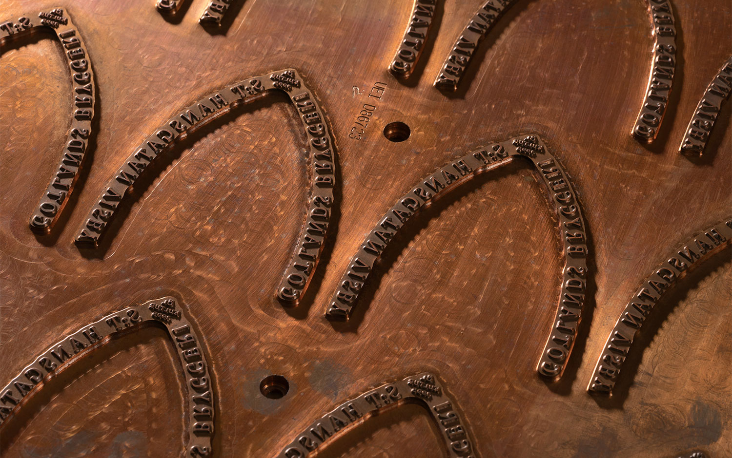
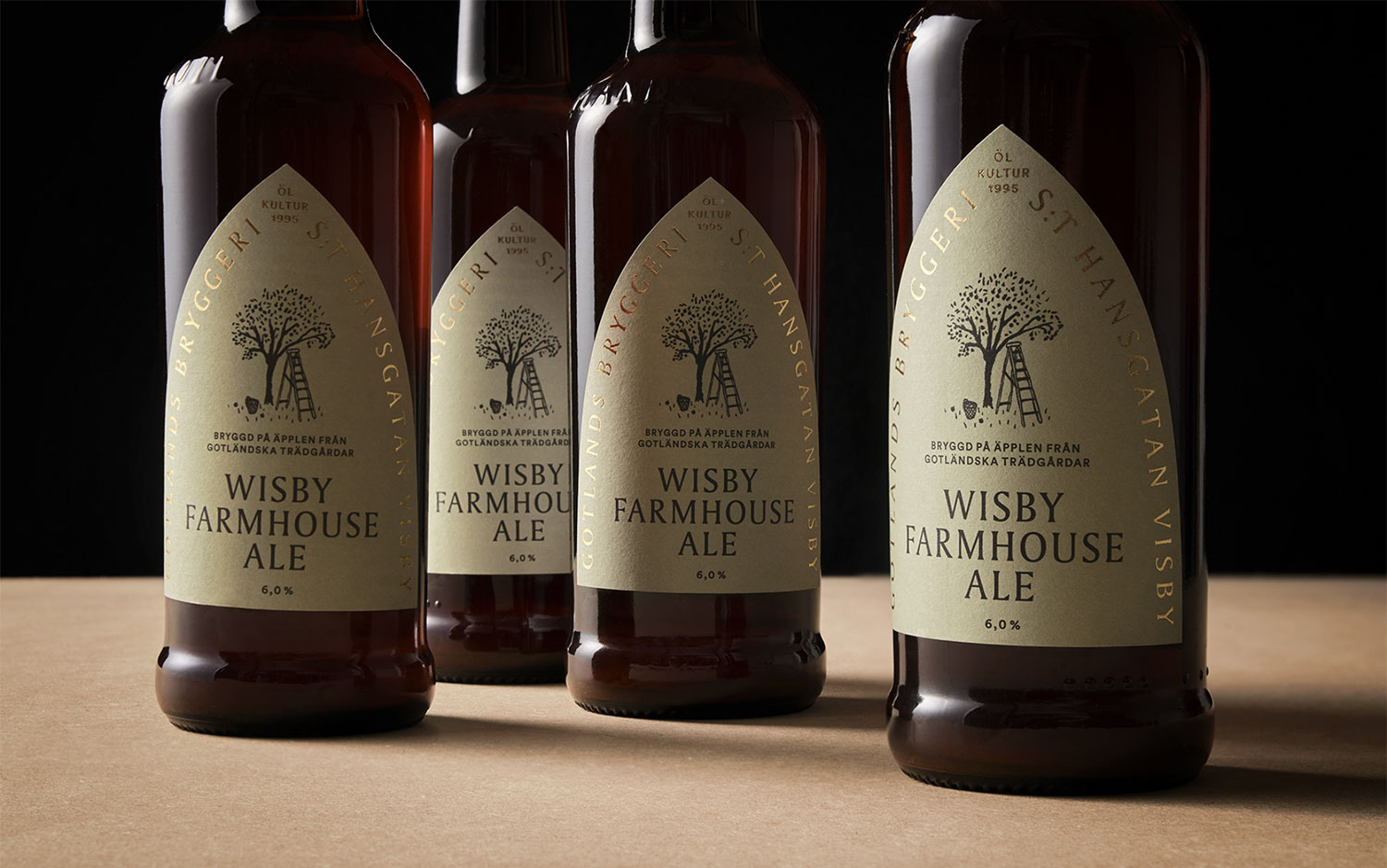
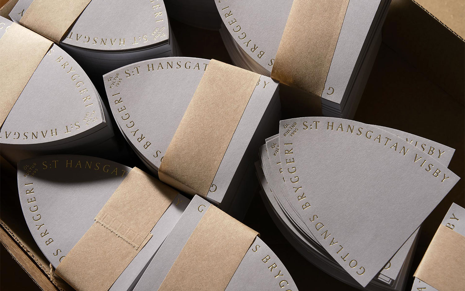
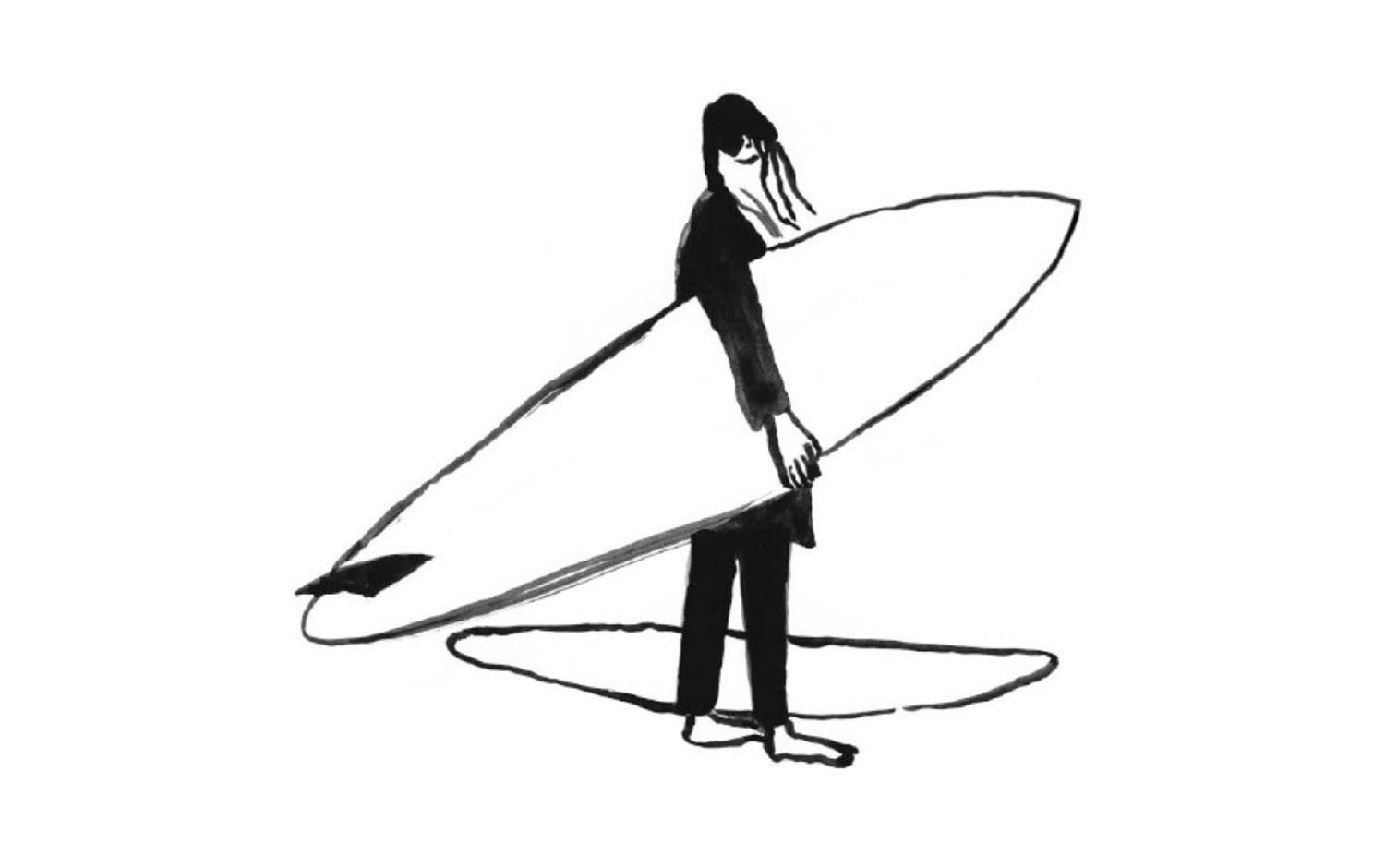
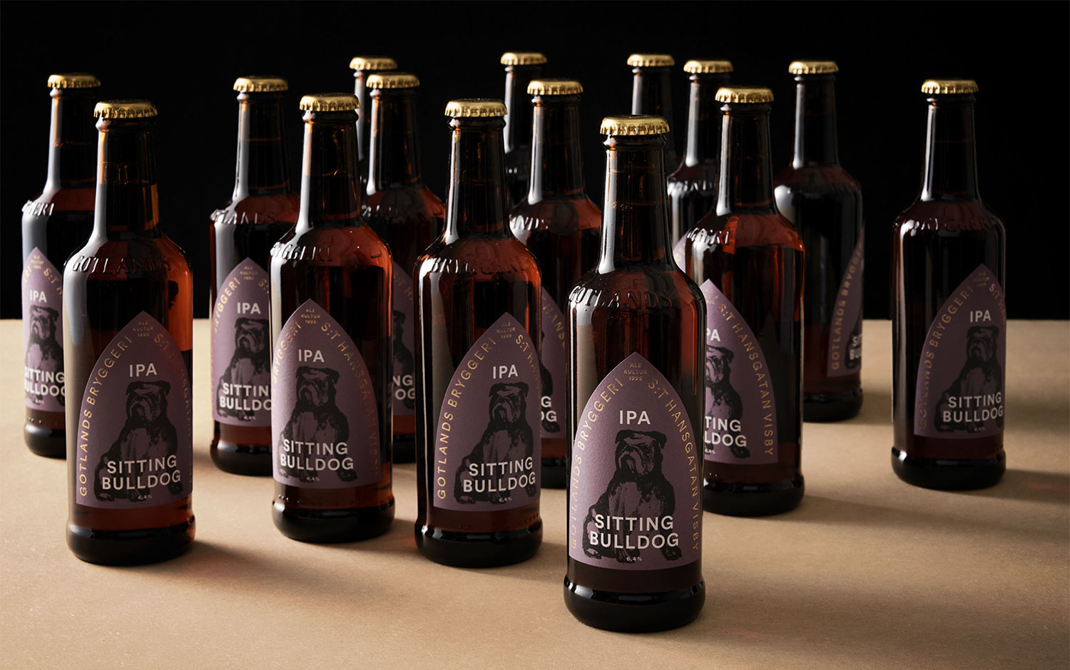
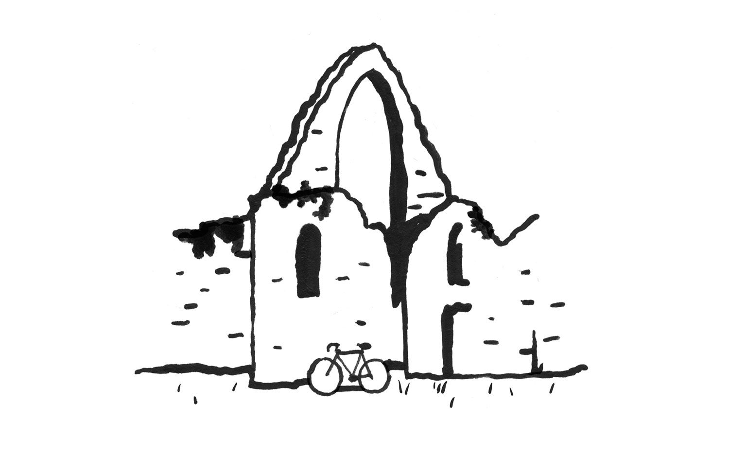
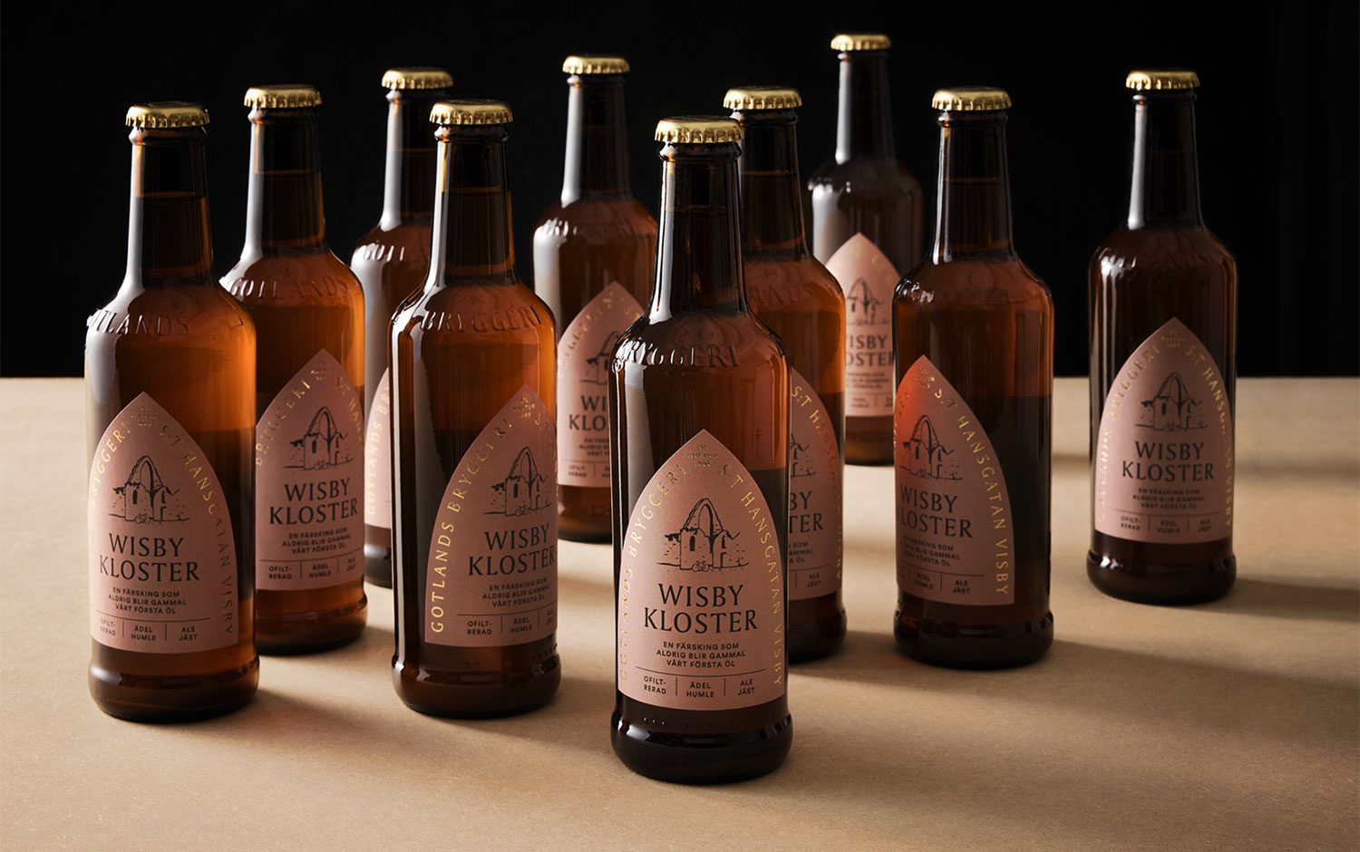
The creative team's brief for Gotlands Bryggeri was to keep it simple and return to the roots to find its essence. Undoubtedly, designers subtly replicated the iconic arc to position the brand's name. Along with the embossed labels in golden foil, even the press is a work of refined art. For the typography, the studio chose an all-caps serif font to give a mystical approach. The honest, simple, and clean logo's shape goes along with some sober and elegant colors. The palette has a relaxed feel, as well as the illustrations that complete the label design. Each of them represents a different brew made at Gotlands Bryggeri.
All in all, we have been enchanted with the brand's visual identity crafted for traditional and small-scale brewing. Always honest, never pretentious. Neumeister Design's attention to detail and sensitivity to compose this stunning aesthetic is incredible.
Credits: Neumeister Design
