 Plus
Plus

Spicer Warins, designed by Studio Bright Green, profile in the international market is based upon founderdirector Richard Spicers decades of experience, global connections, and restless determination to acquire fine jewellery and stones exclusively of the most superior quality and provenance. The collection includes pieces from great historical houses such as Cartier, Van Cleef & Arpels and Boucheron, they spring from true inspiration and the most exquisite craft.
Whilst loyalty and great warmth have developed over the past decades for the brand, Spicer Warins ambition is to expand its business into new territories and appeal to a younger generation. Thus, the new designs were developed to build a stronger and more contemporary identity with a focus on finding a balance of timeless and modern, a brand in which the magnificent diverse historical collection is as relevant today as when it was first conceived.
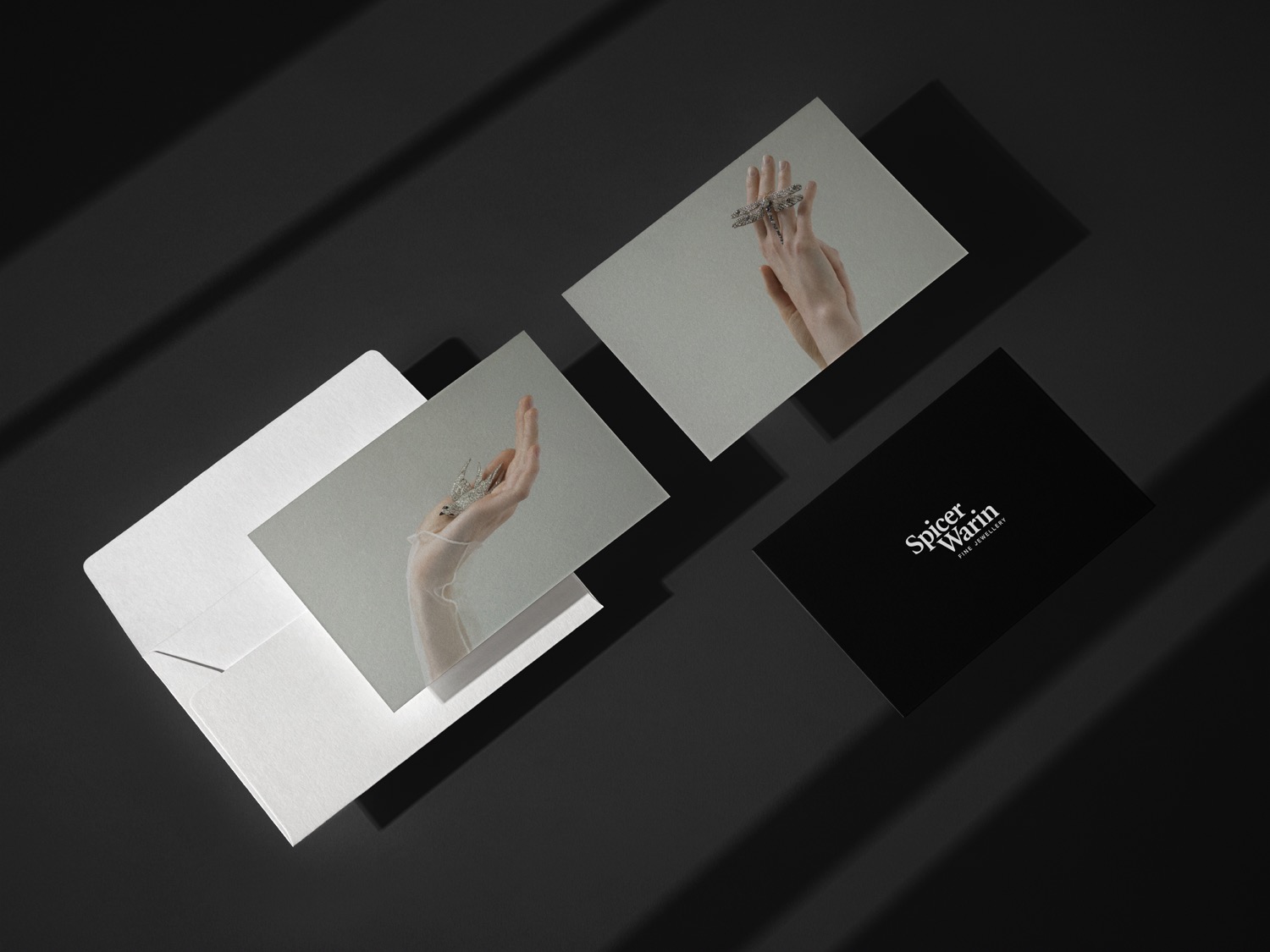
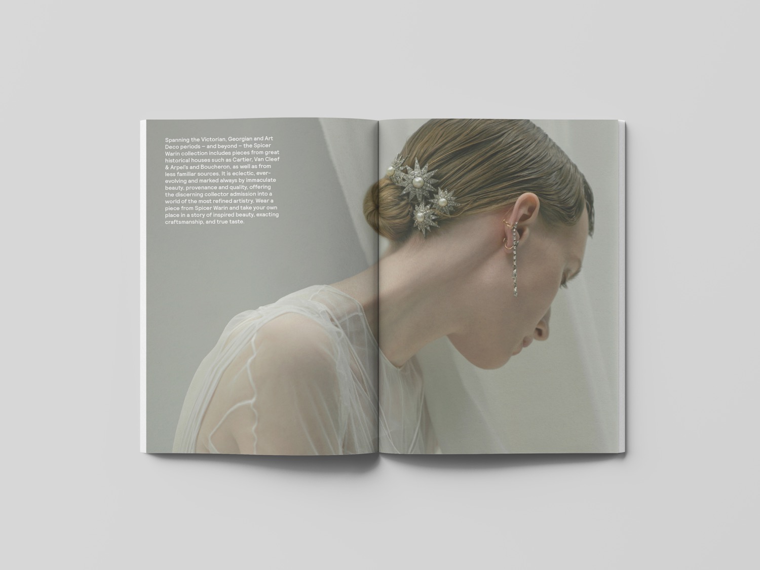
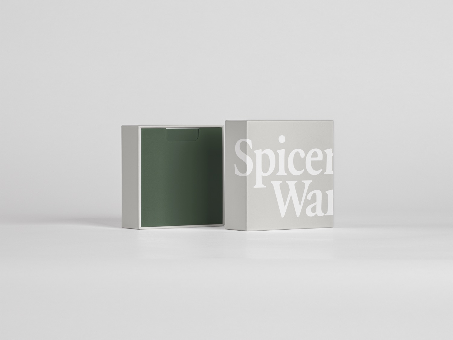
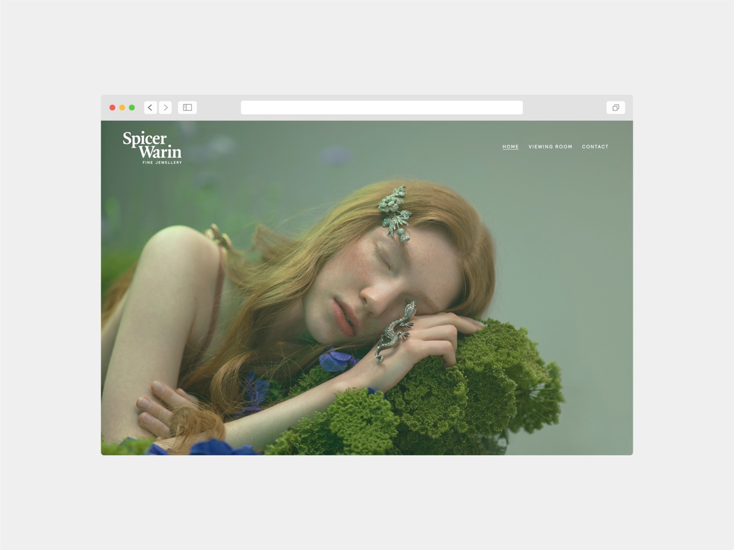
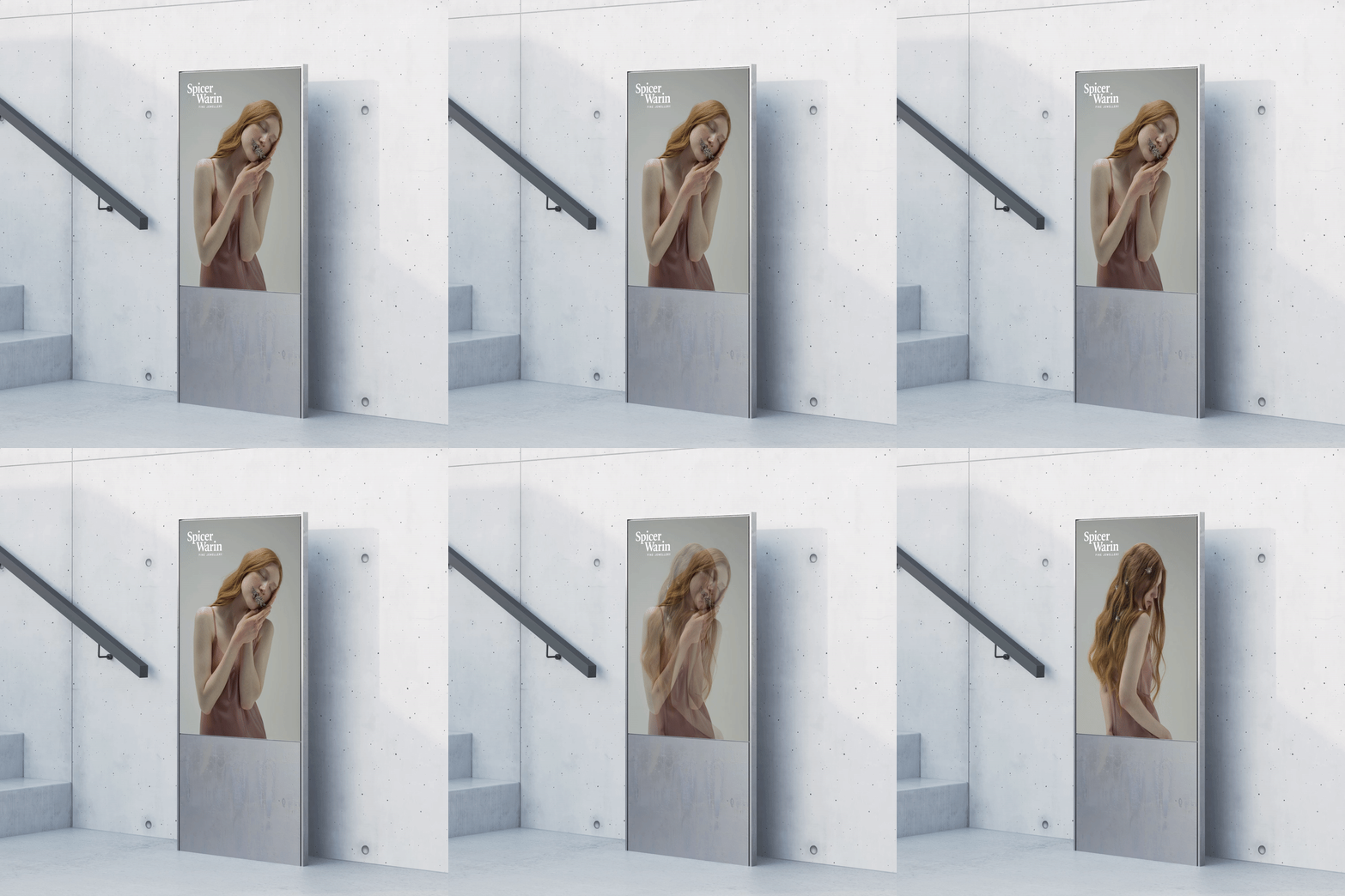
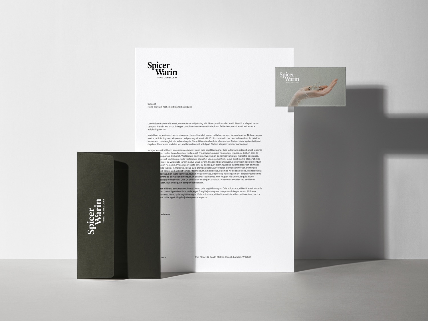
The new brand identity is designed to capture the spirit in which the pieces were conceived more than mere decorative jewellery, each piece is designed as an eclectic work of art. It features a new logotype and typeface, using Quadraat, a classic and delicate highcontrast serif typeface designed by Fred Smeijers, paired with Relative, a wellproportioned, geometric sansserif typeface designed by UKbased type foundry Colophon. The ethereal imagery enhances the beauty of the creations and transports us out of the everyday and into a place of mystery, contemplation and even enchantment.
Credits: Studio Bright Green
