Plus
Plus

 Menu
Menu


Chaptr
August 06, 2019
Mindsparkle Mag


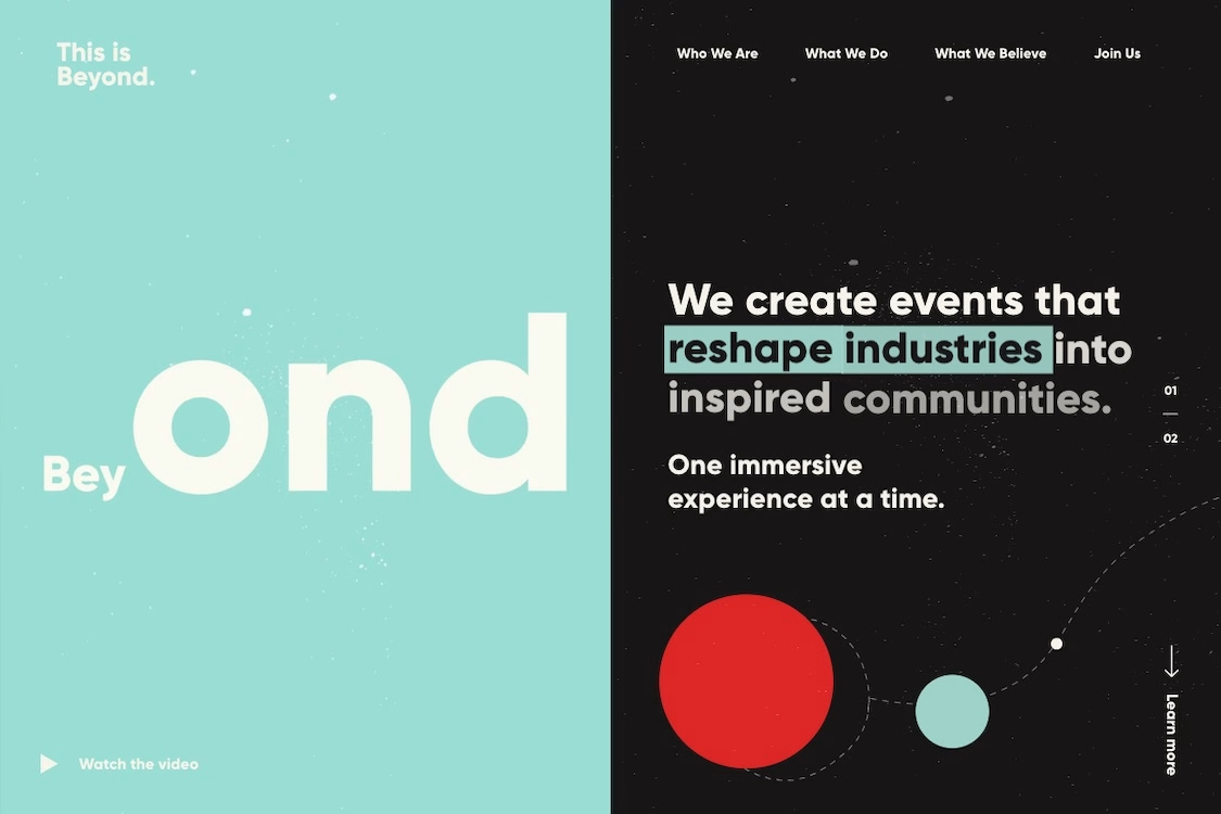
Chaptr gives events company This is Beyond a split-screen identity that feels genuinely otherworldly. On the left, a soft mint panel carries an oversized "Beyond" wordmark scattered with tiny star-like dots; on the right, a near-black field hosts the navigation and a bold statement — "We create events that reshape industries into inspired communities." A red planet and a smaller teal one trace a dotted orbit across the dark side, tying the cosmic metaphor together. The contrast of calm pastel and deep space is confident and memorable, and the typography is clean and self-assured throughout. A smart, atmospheric piece of brand-led web design.
Credits: Chaptr
More in Design Agency
Includes freebie bundle, unseen BTS insights and more.