Plus
Plus

 Menu
Menu


The Masonry Seattle
December 15, 2021
Mindsparkle Mag


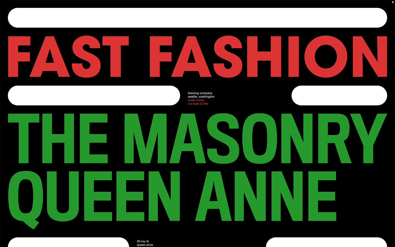
The Masonry Seattle throws restraint out the window on its site, with a loud, joyful homepage that reads like a punchy printed poster. Set against a pure black field, enormous condensed grotesque headlines stack in vivid red and green — “Fast Fashion” over “The Masonry Queen Anne” — while rounded white marquee bars slide across as animated dividers. A small block of centred copy quietly does the practical work, naming the brewing company, its Seattle location and links to order online and browse the beer and info. The clashing colours and oversized lettering give the pizzeria-and-brewery brand a fun, high-energy personality driven almost entirely by typography. It is a bold piece of web design that proves a food-and-drink site can be as playful as it is legible.
Credits: The Masonry Seattle
More in Restaurant & Food Websites
Includes freebie bundle, unseen BTS insights and more.