Plus
Plus

 Menu
Menu


Matt Rogers
November 02, 2021
Mindsparkle Mag


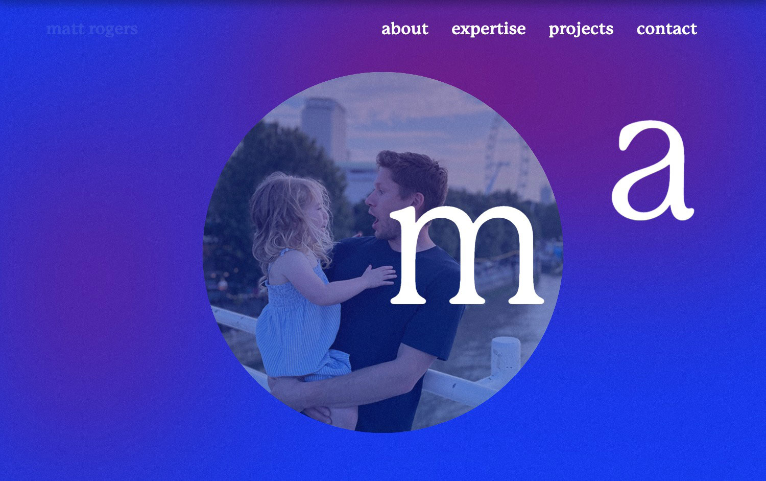
Matt Rogers gives his personal portfolio a warm, human touch, wrapping the page in a rich blue-to-magenta gradient. At its centre a circular photograph shows him laughing with a small child against the London skyline, framed by oversized serif letters “m” and “a” that hint at his initials. A simple serif navigation — about, expertise, projects, contact — keeps the focus on personality over noise. Friendly, colourful and confident, it is a charming little exercise in typography and personal web design.
Credits: Matt Rogers
More in Portfolio
Includes freebie bundle, unseen BTS insights and more.