Plus
Plus

 Menu
Menu


Gláuber Sampaio
September 18, 2019
Mindsparkle Mag


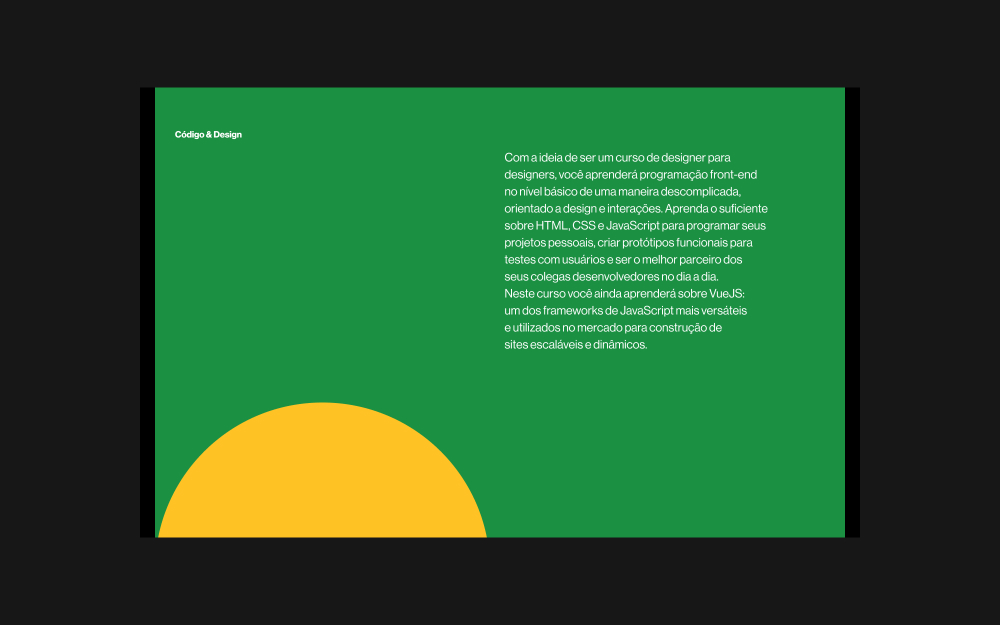
Gláuber Sampaio gives Código & Design the confident calm of a well-made poster. A single field of deep green fills the page, with a bold yellow half-circle rising from the bottom edge like a low sun, an economical device that carries the whole composition. Set against it, a neat column of white text introduces the project as a front-end course made for designers, kept quiet and legible so the colour does the talking. It is a lovely study in restraint, where two shapes and a paragraph feel like plenty. Warm, optimistic and unmistakably graphic, it is a fine piece of web design built on strong typography.
Credits: Gláuber Sampaio
More in Design Agency
Stay on top of this week's design. Insights, top picks & more.