


9842 Results found
Loading...
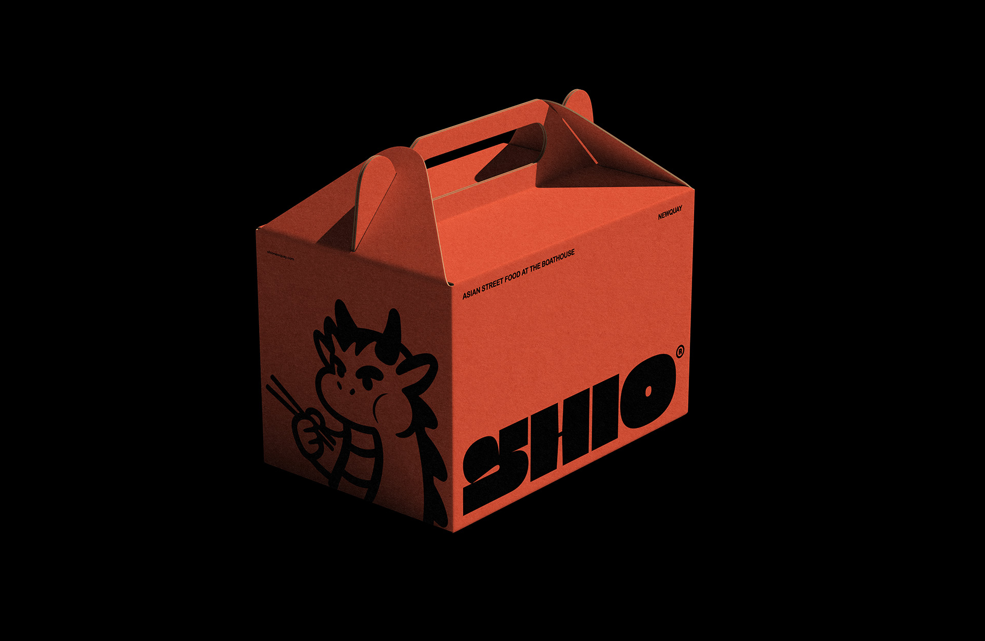
Design, Brand Identity
Shio Asian Street Food Branding

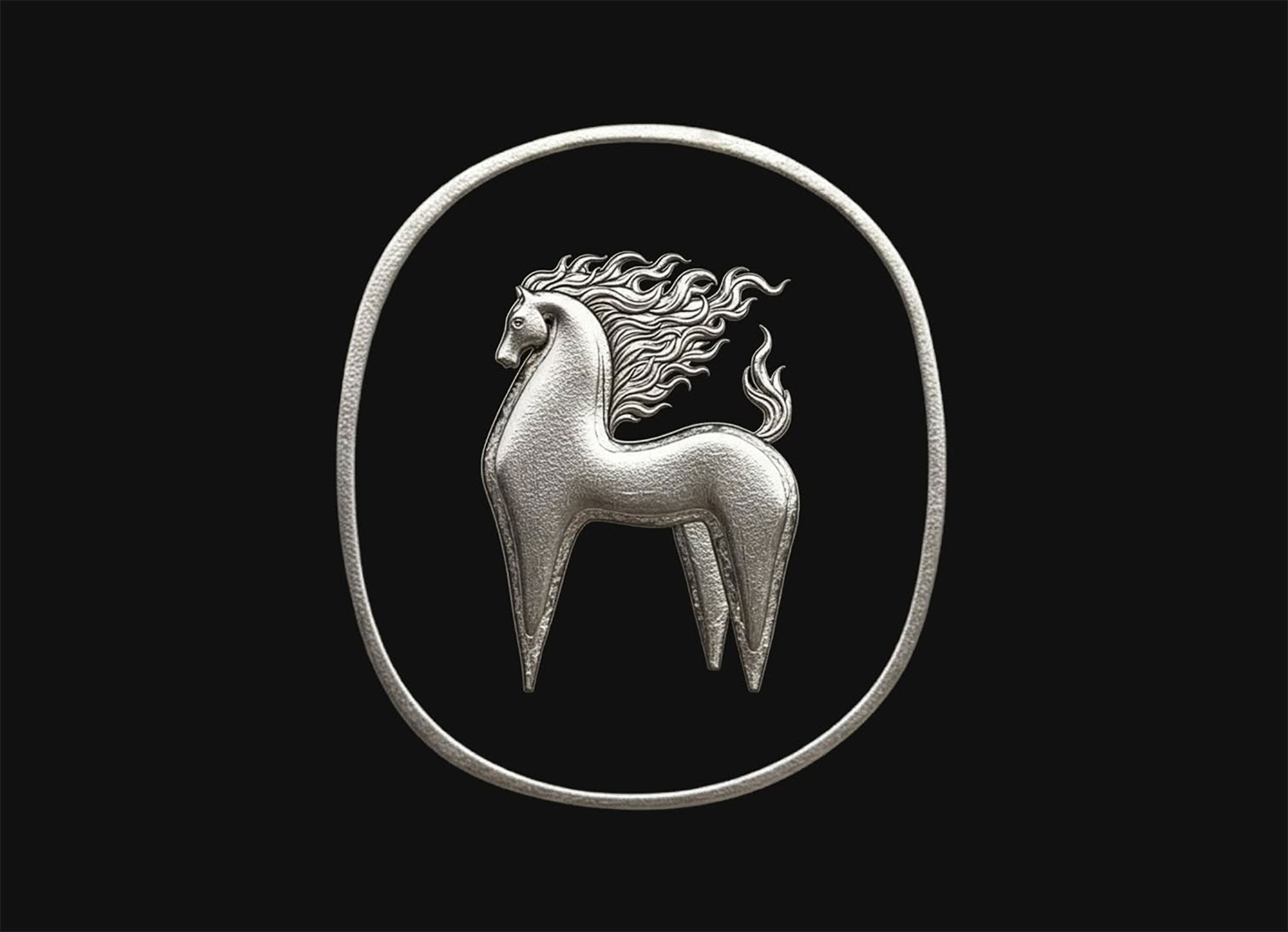
Design, 3D
Year of the Fire Horse Branding
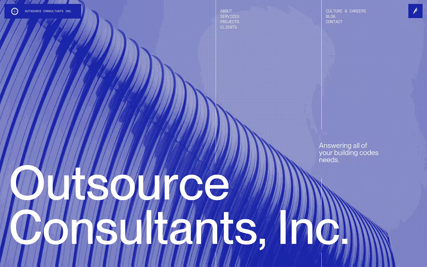
Website, Business & Corporate
Outsource Consultants Inc.
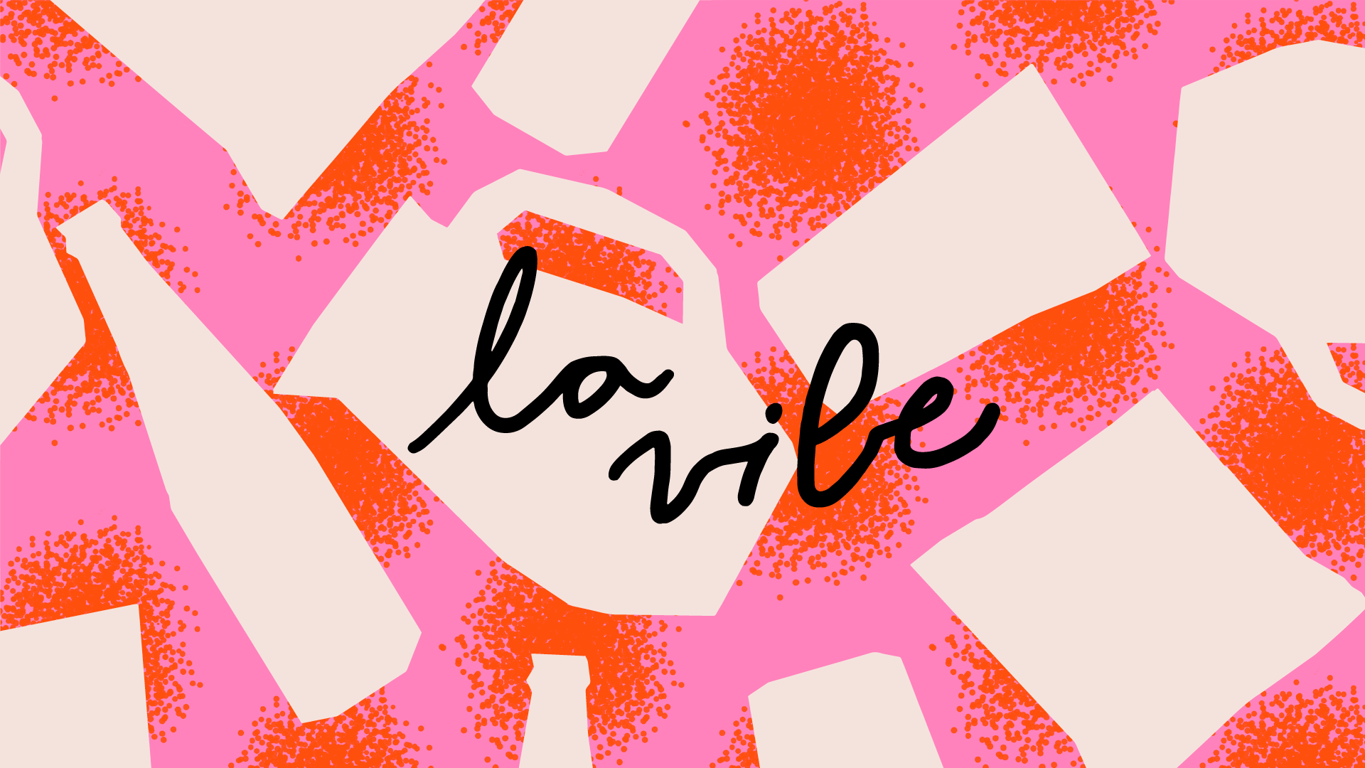
Design, Brand Identity
Playful "La Vibe" gift shop identity
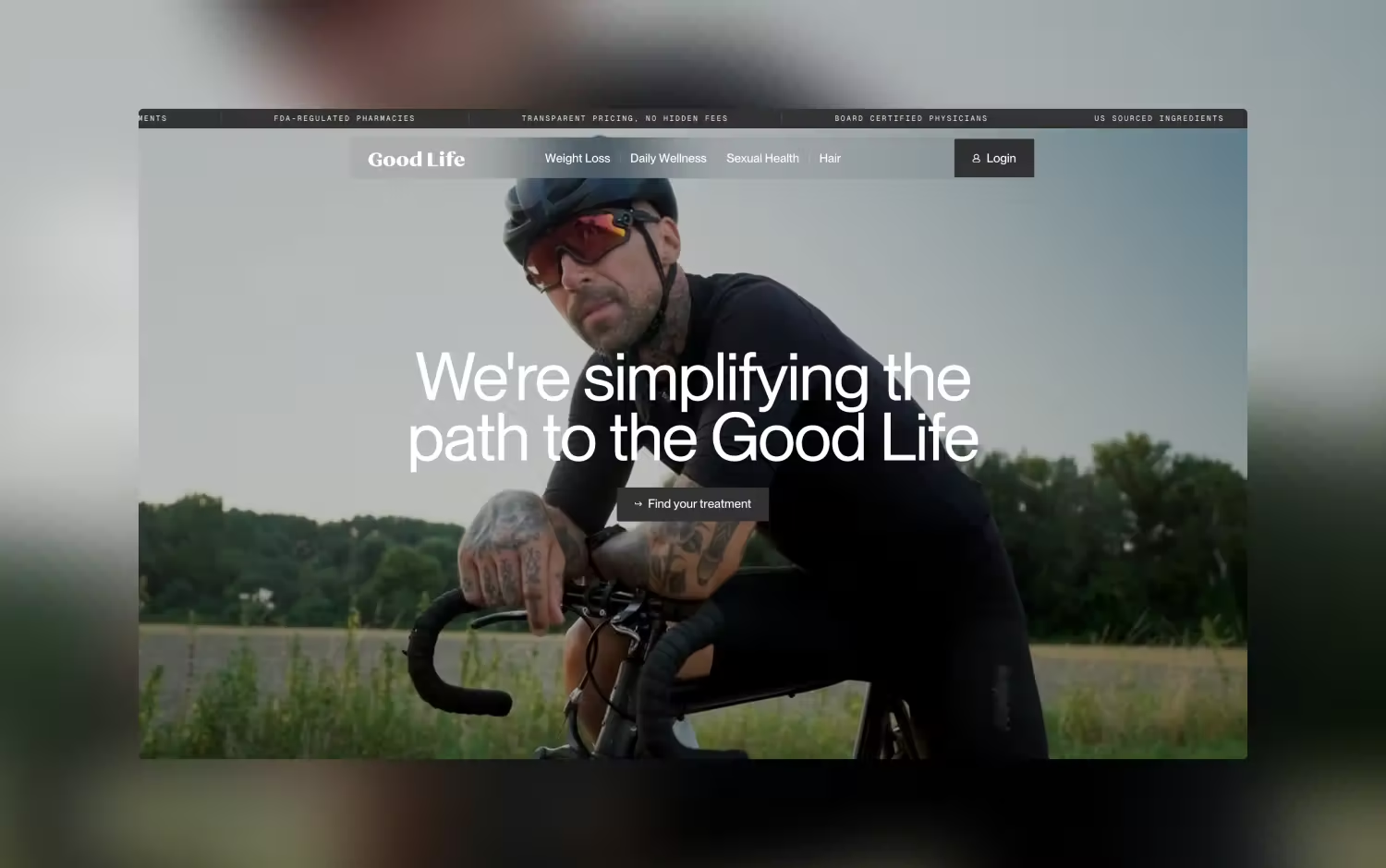
Website, Business & Corporate
Good life meds
Design, Brand Identity
Dogs Only Social Club Branding
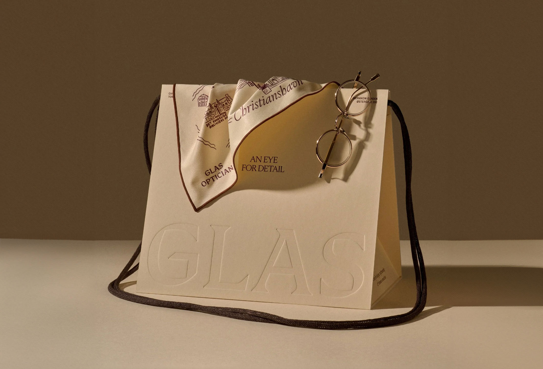
Design, Graphic Design
GLAS OPTICIAN Brand identity
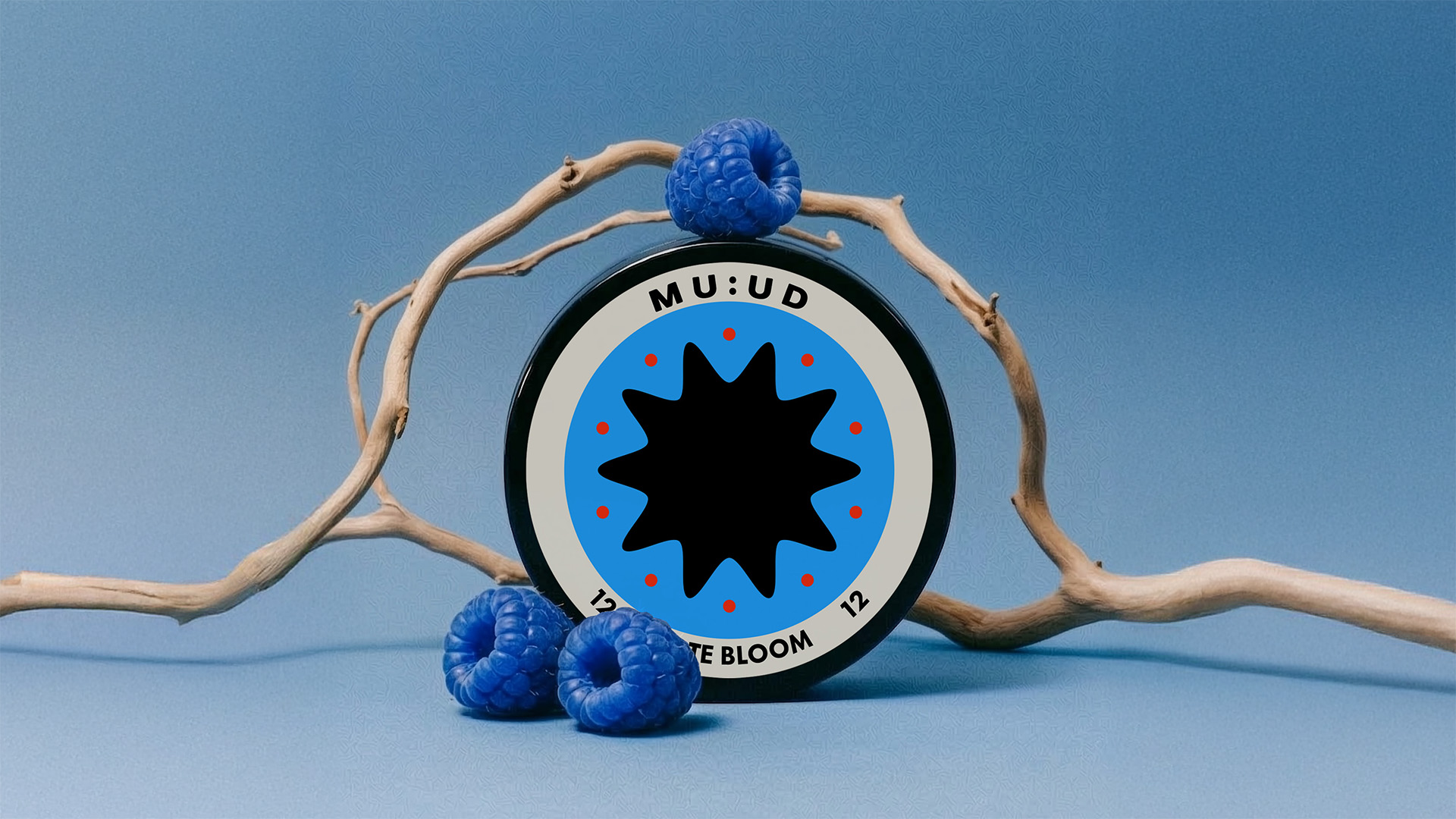
Design, Brand Identity
MU:UD Nicotine Pouches
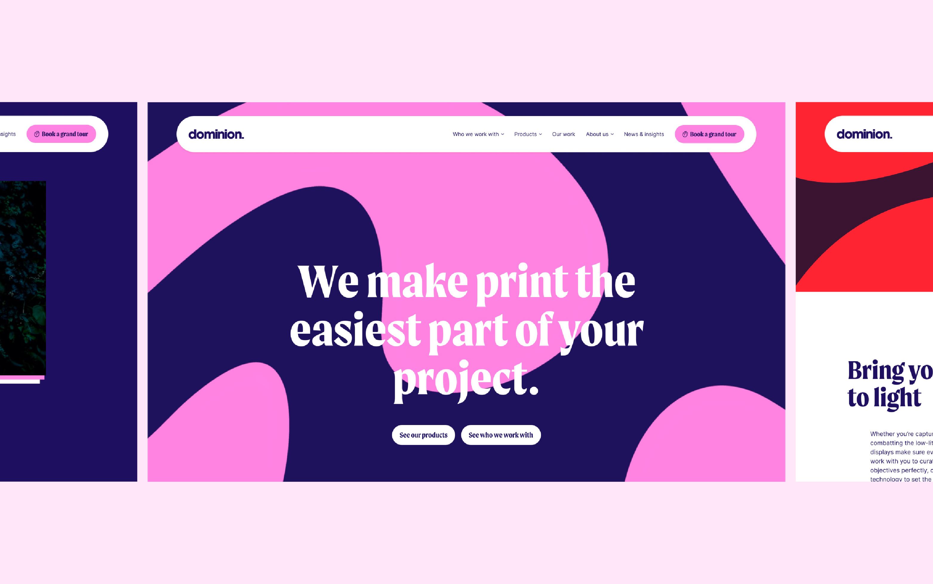
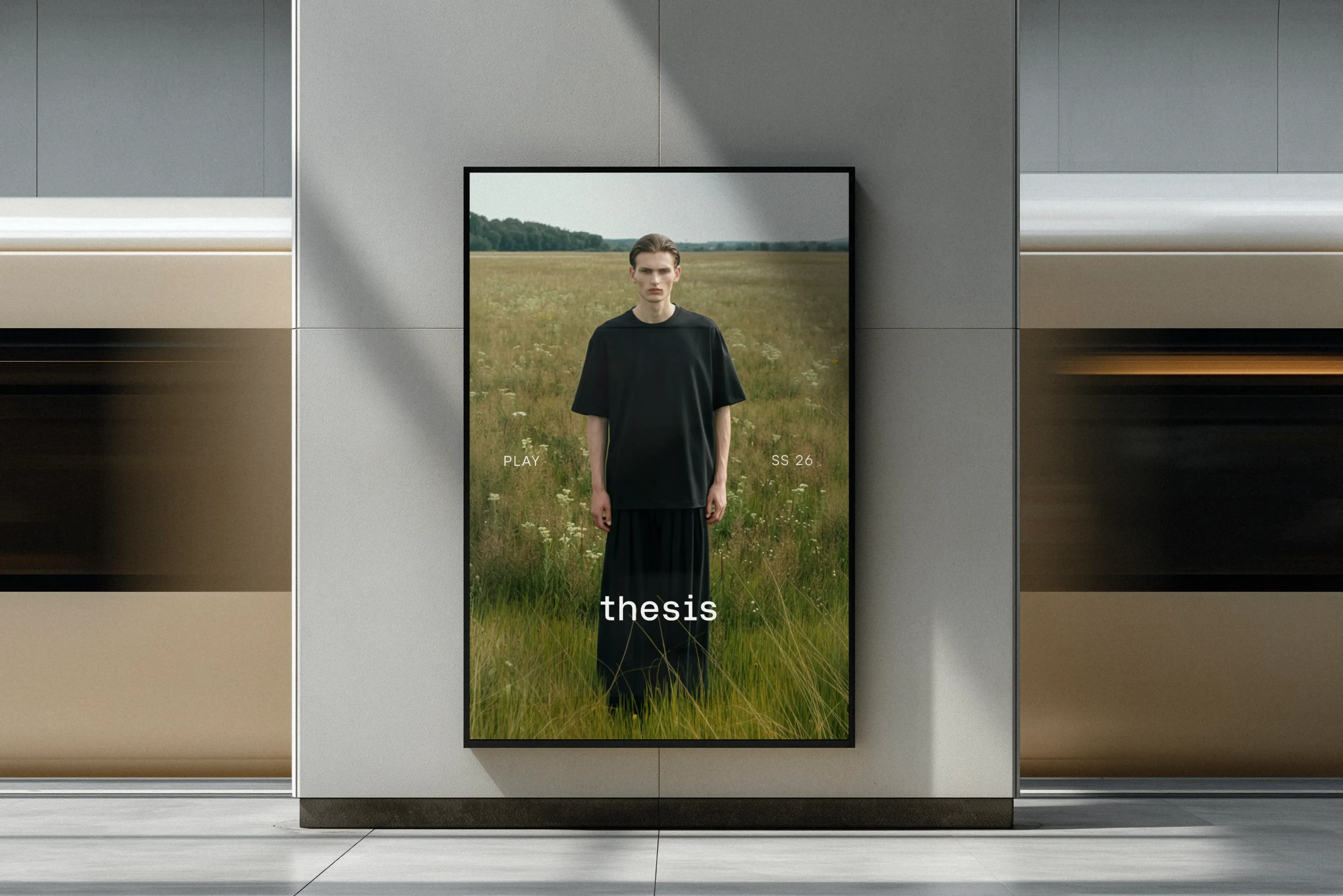
Website, Business & Corporate
Dominion
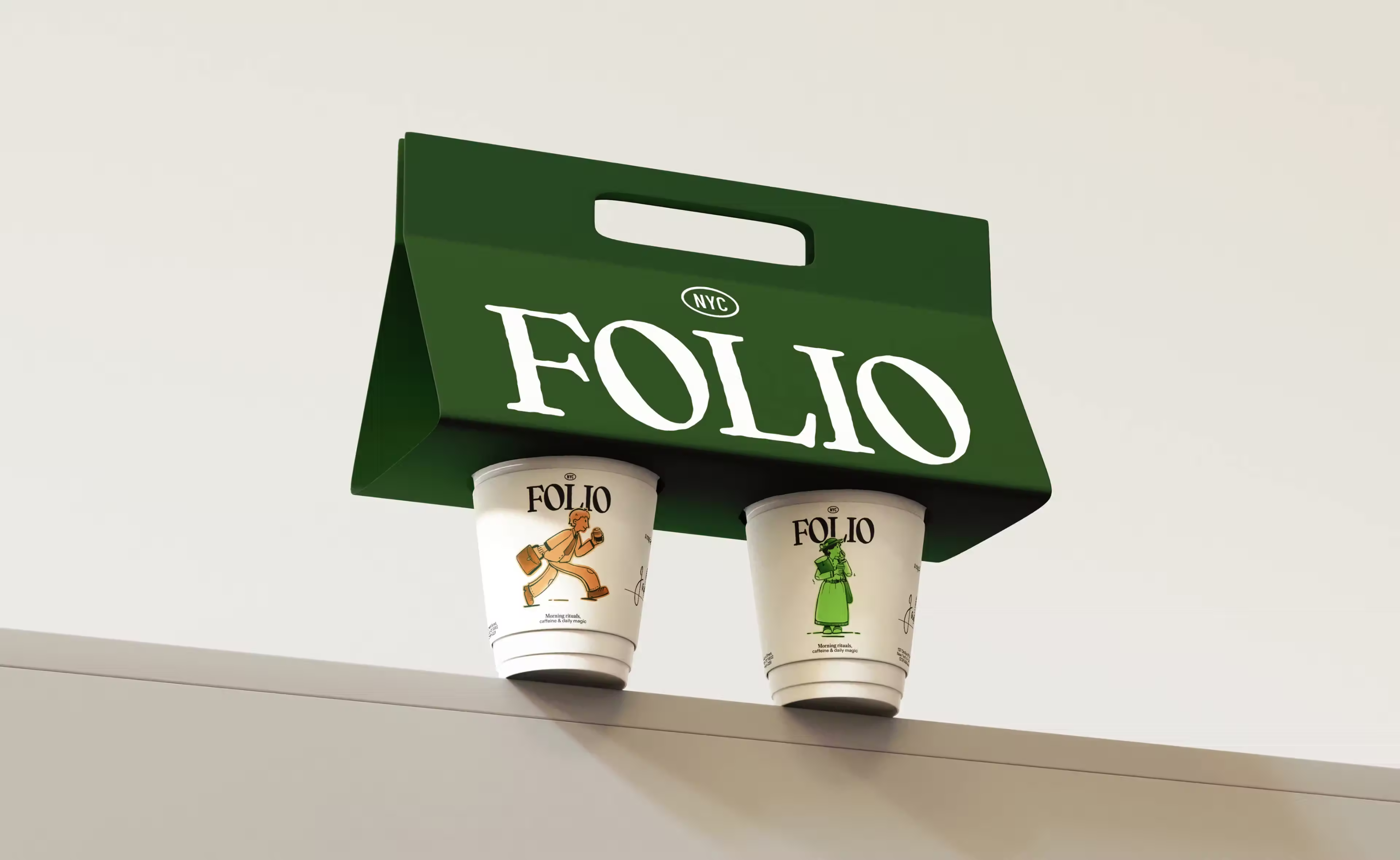
Design, Brand Identity
FOLIO CoffeePackaging
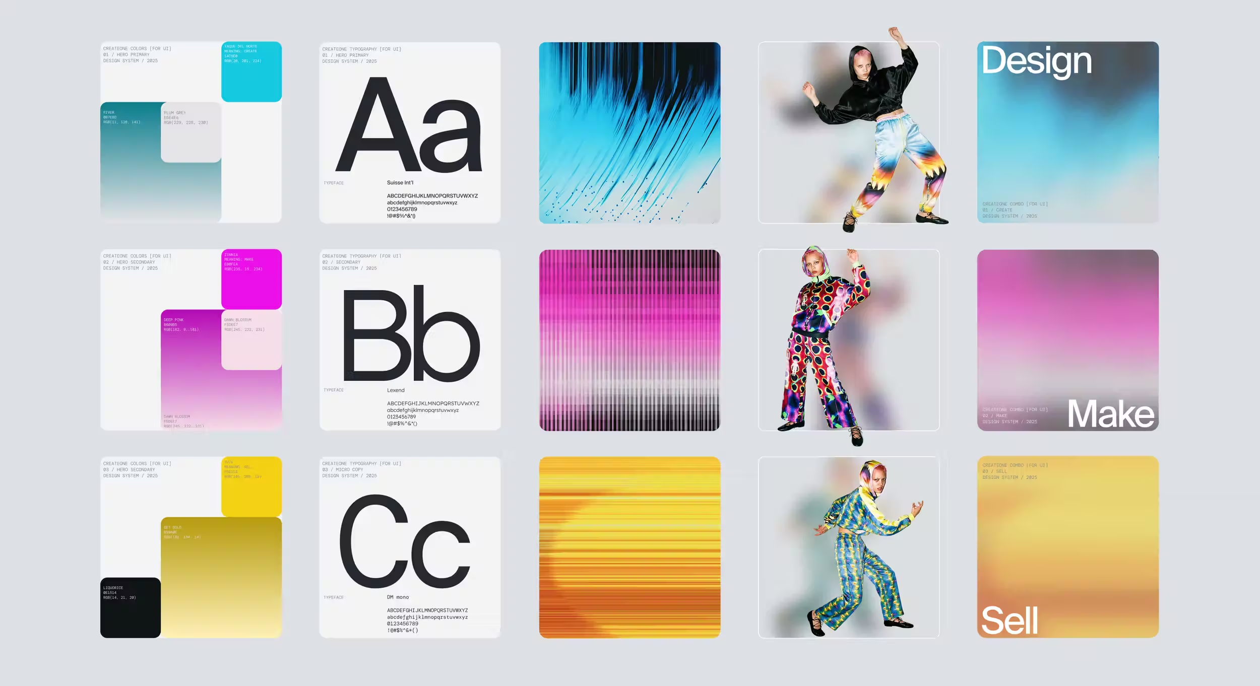
Design, Graphic Design
CreateOne – Branding for a Resonance's creator pla...
Design, Brand Identity


