


247 Studio
August 26, 2017
Mindsparkle Mag


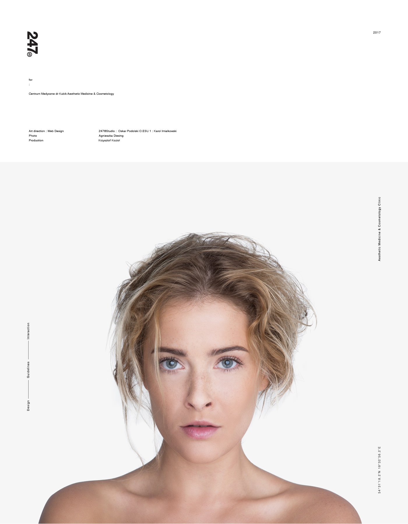
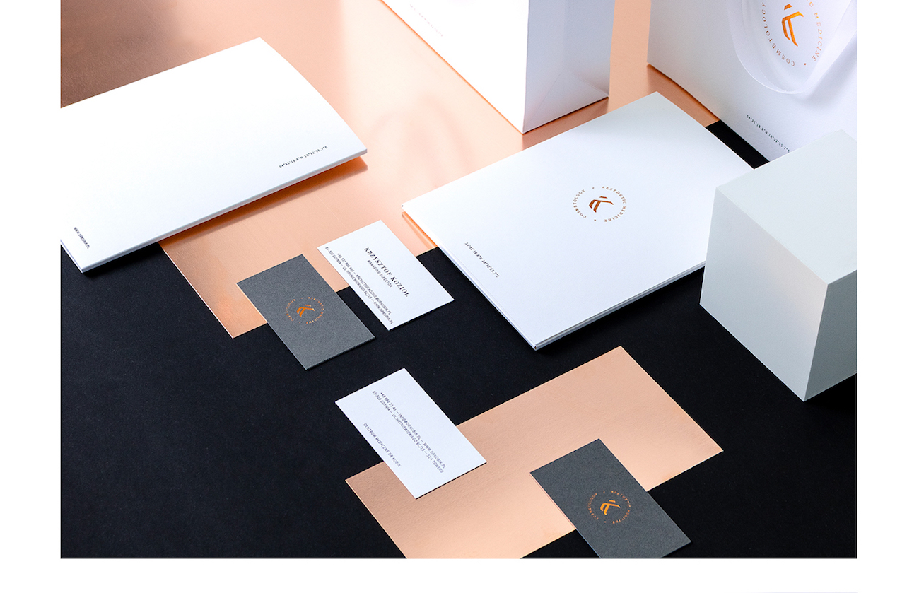
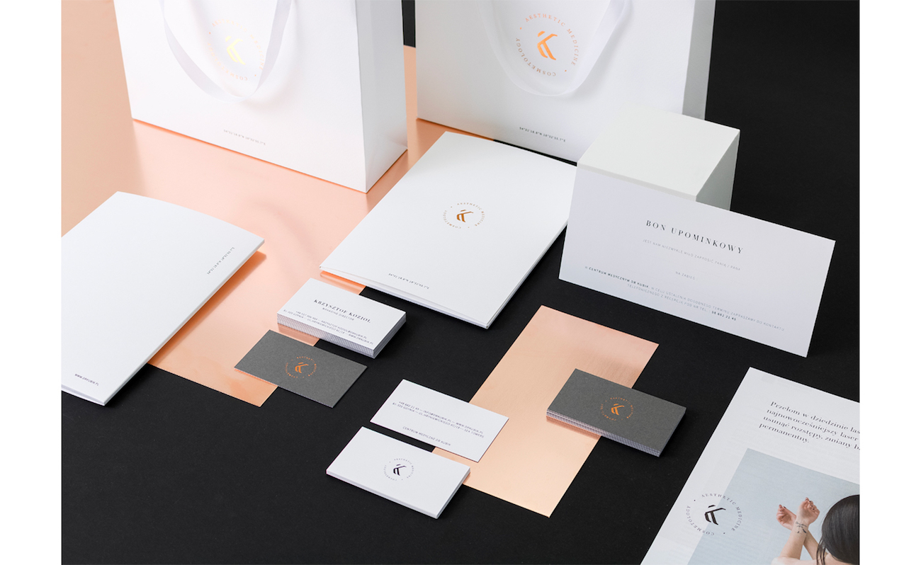
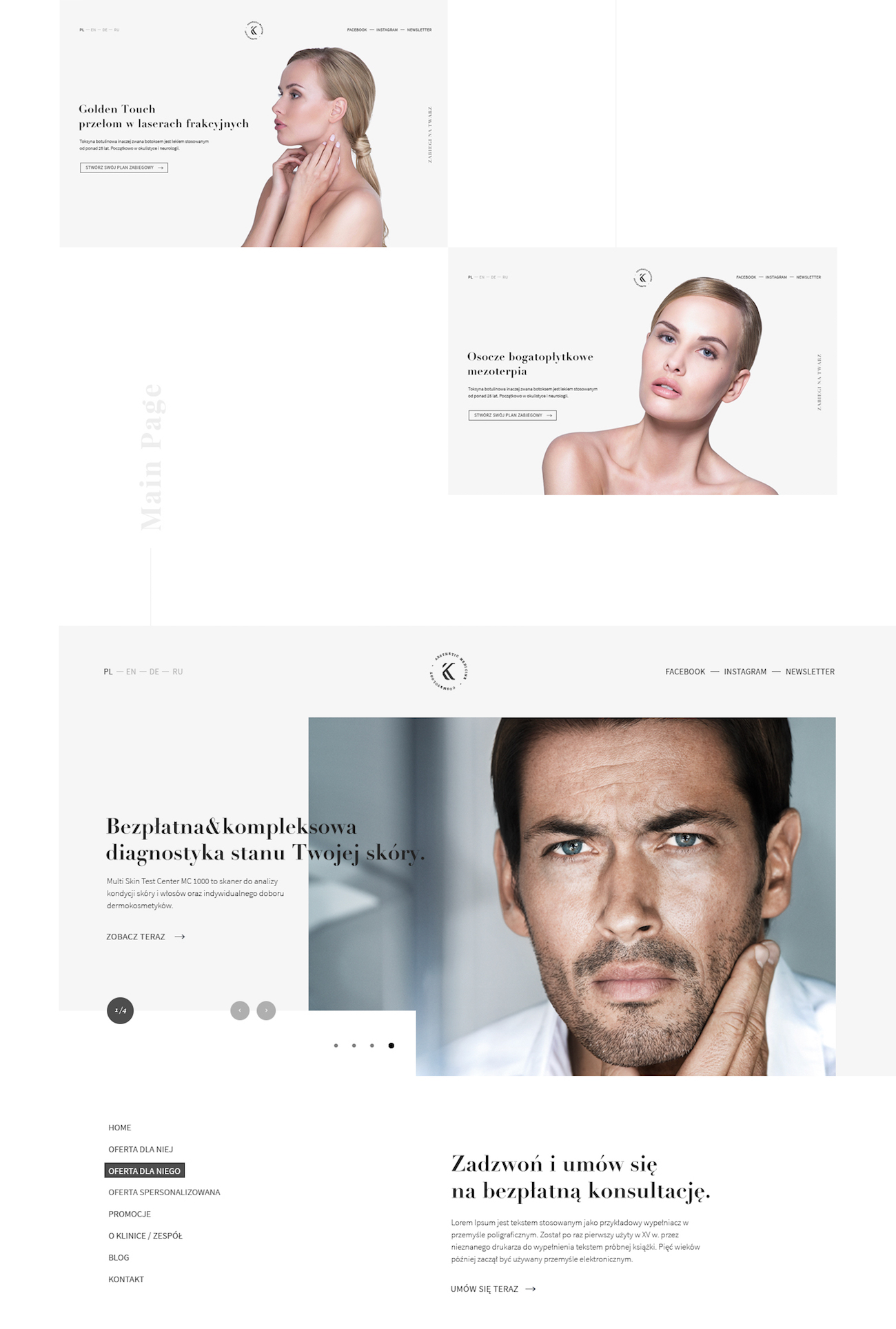
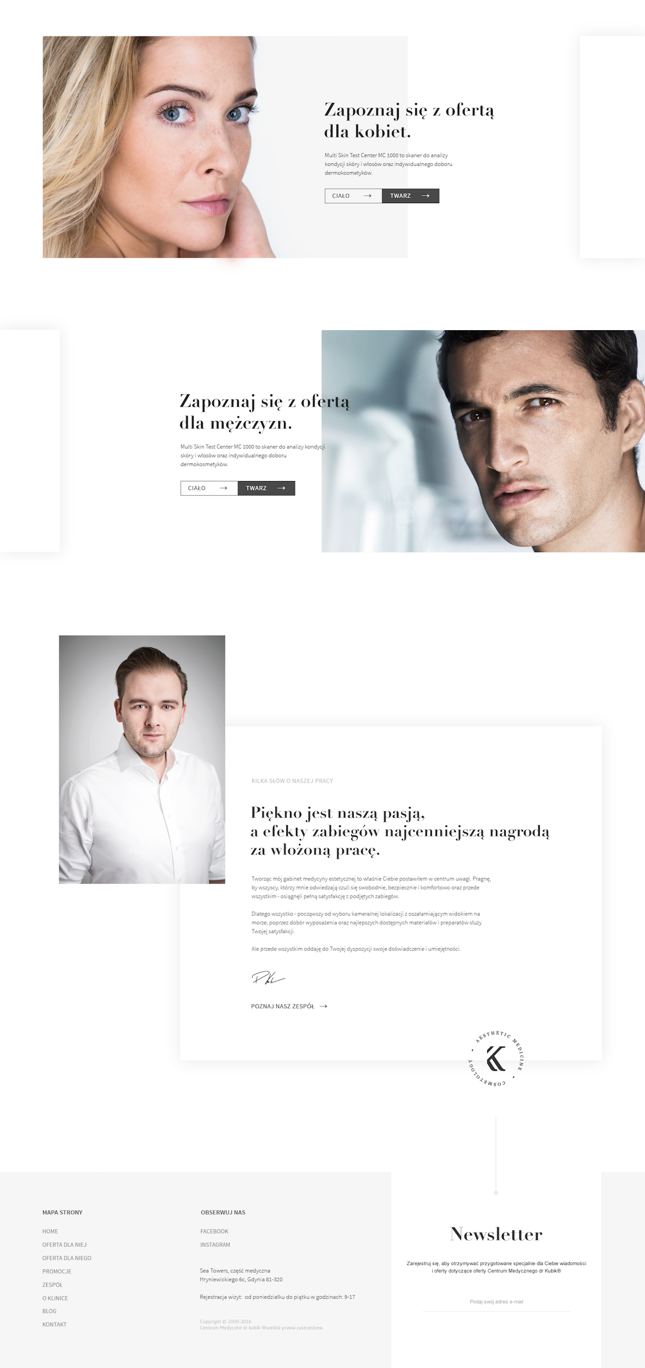
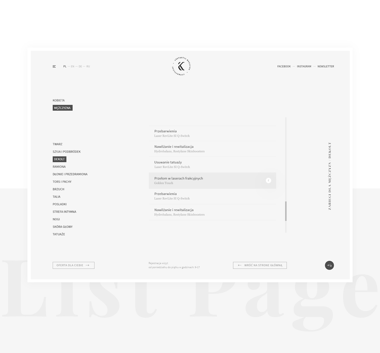
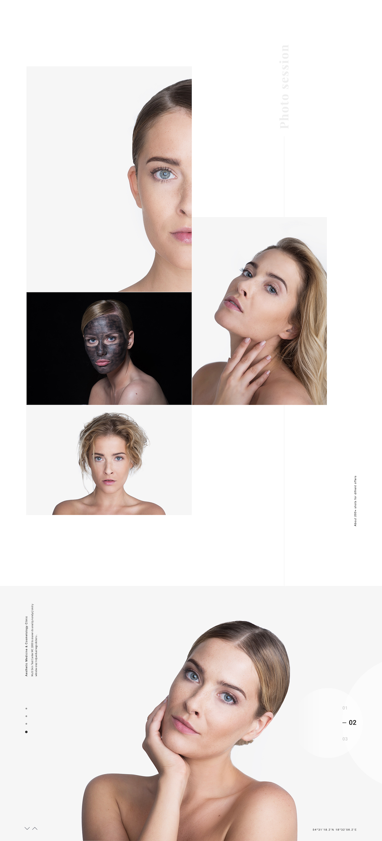
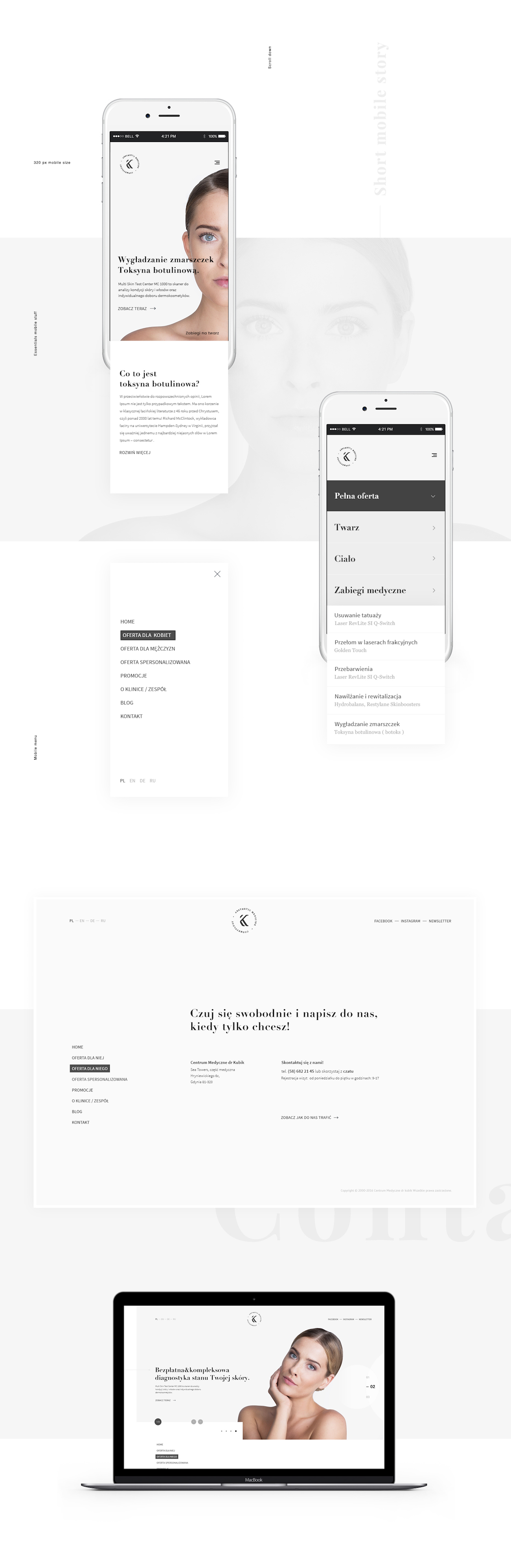
Designers Karol Imialkowski and Oskar Podolski from 247 Studio from Poland created the visual brand identity for dr Kubik Aesthetic Medicine & Cosmetology. The rebranding is used across their web design, packaging and collateral design.
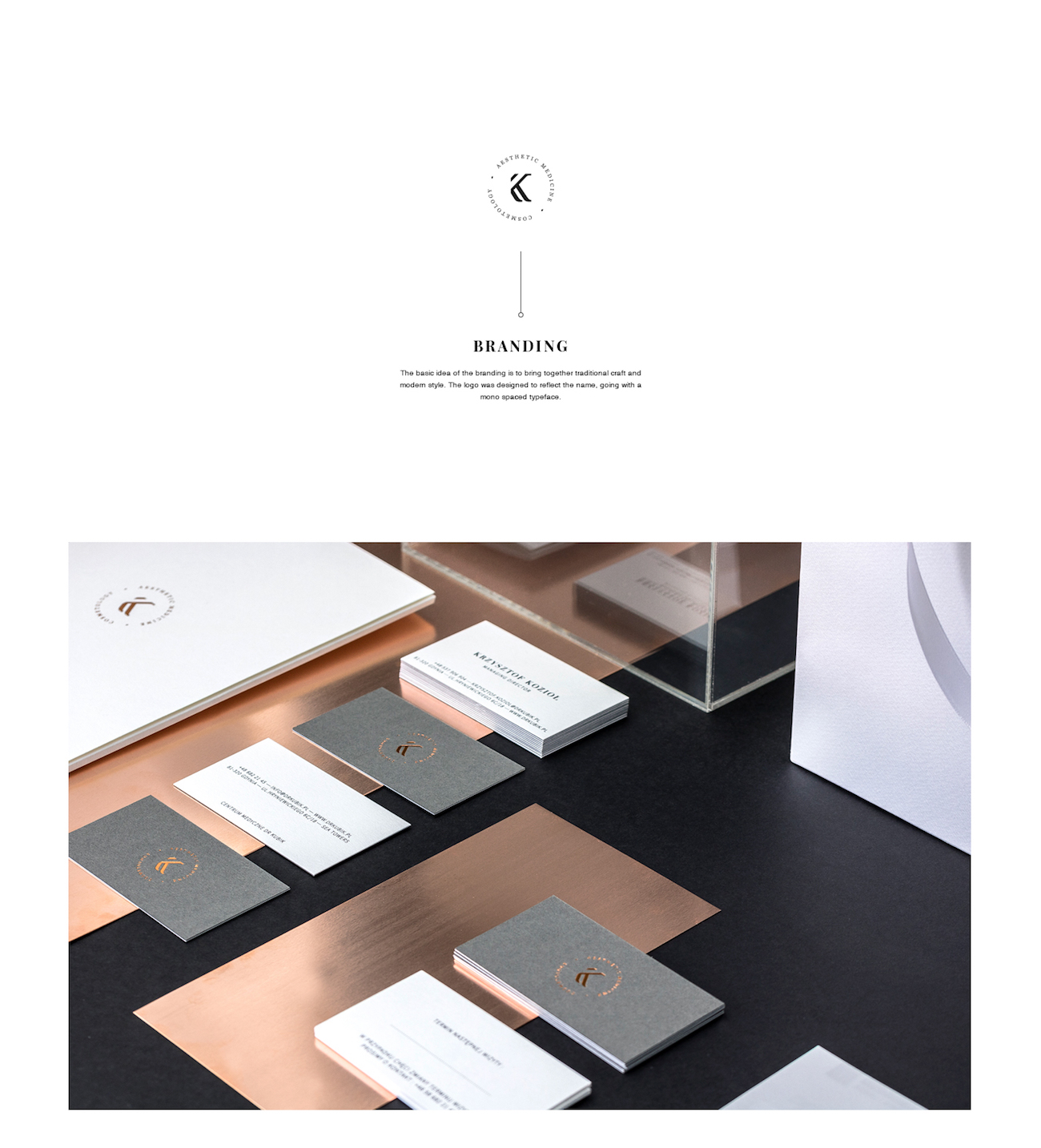
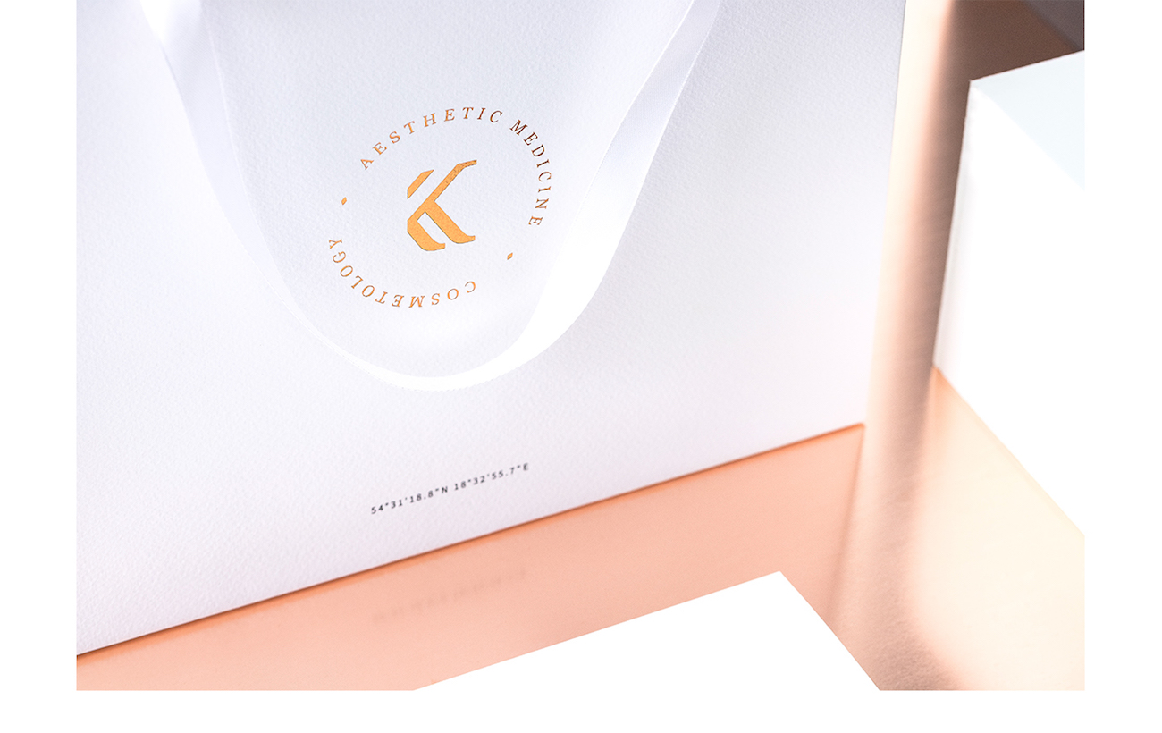
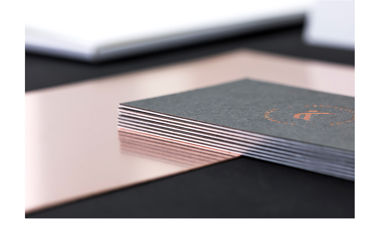
The branding aims to bring together traditional craft and modern style. The identity embraces simplicity with a very clean and minimal design and a light colour scheme, which suits the aesthetic of a medical cosmetology company.
The logomark reflects the name of the company and its design adds a contemporary element, playing with cut-outs to create the letter ‘K’. The typography circling the logo uses a simple, mono spaced typeface printed on their collateral in either black or embossed gold.
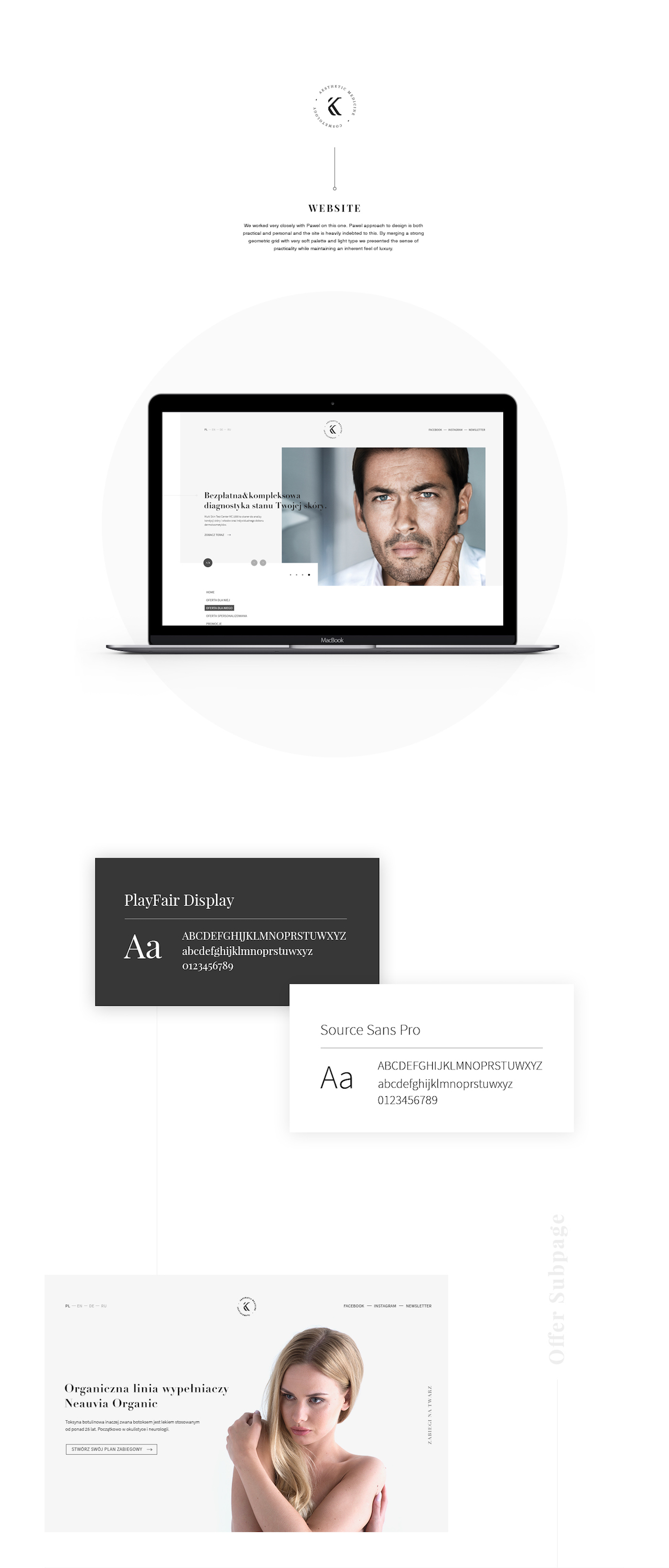
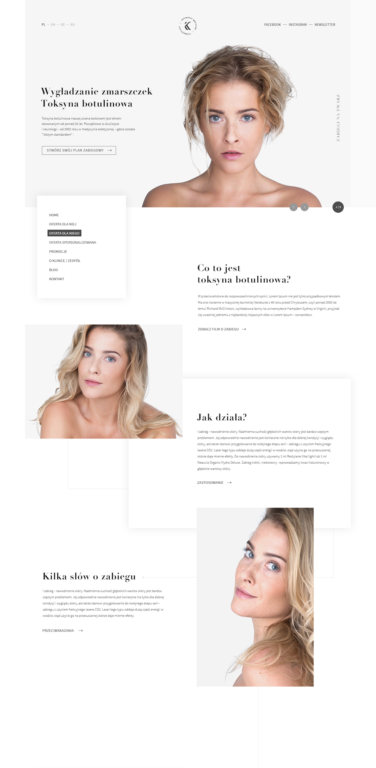
The web design is clean and contemporary while being practical. 247 Studio say, ‘by merging a strong geometric grid with a very soft palette and light type we presented the sense of practicality while maintaining an inherent feel of luxury.’
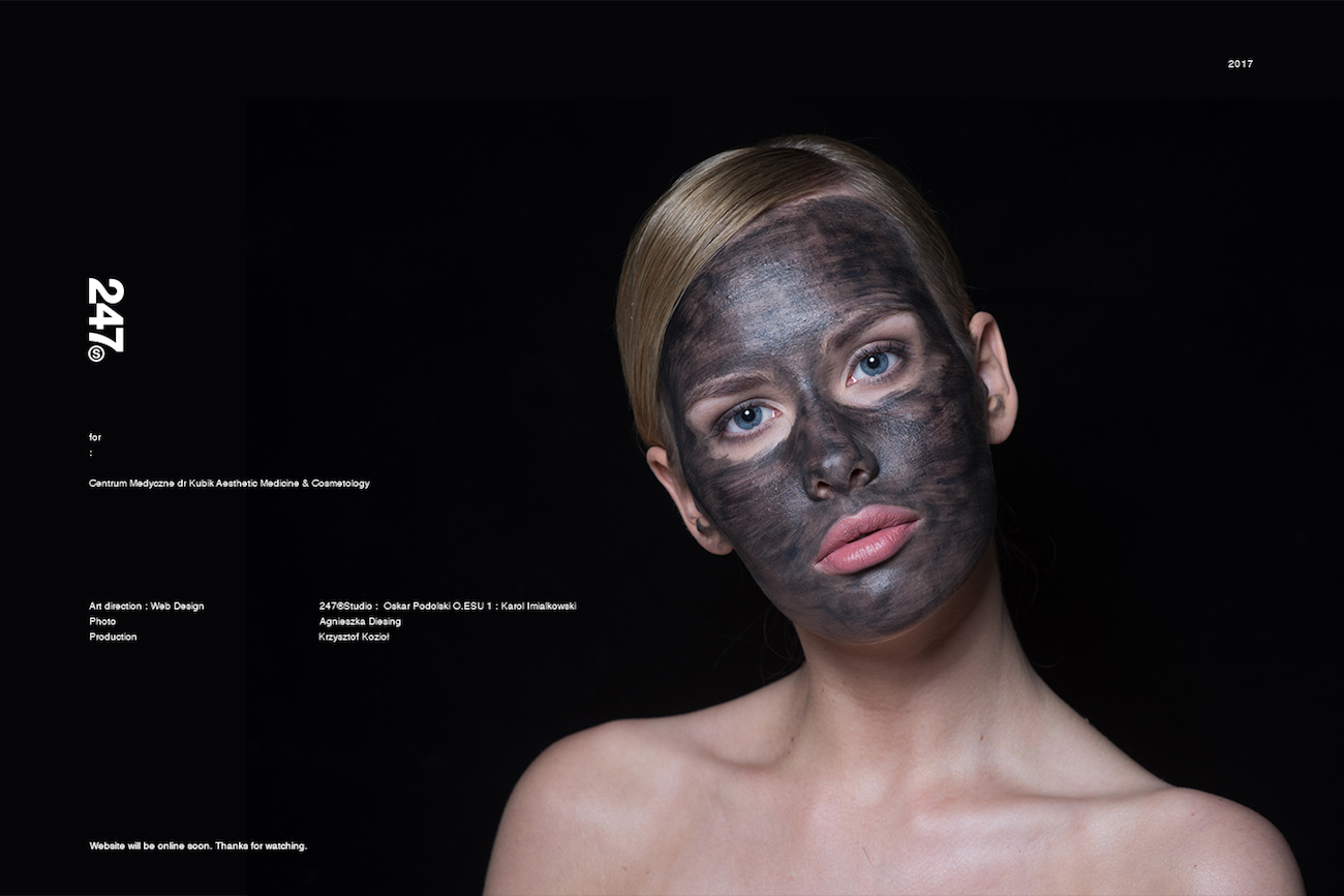
Credits: 247 Studio


