Léo Breton-Allaire, Ugo Varin, Vedran Vaskovic - Caserne
December 13, 2017
Mindsparkle Mag


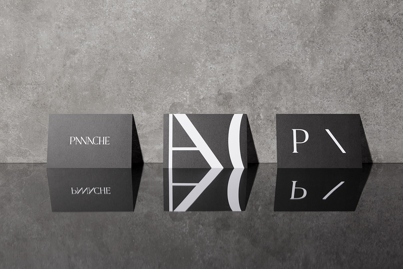
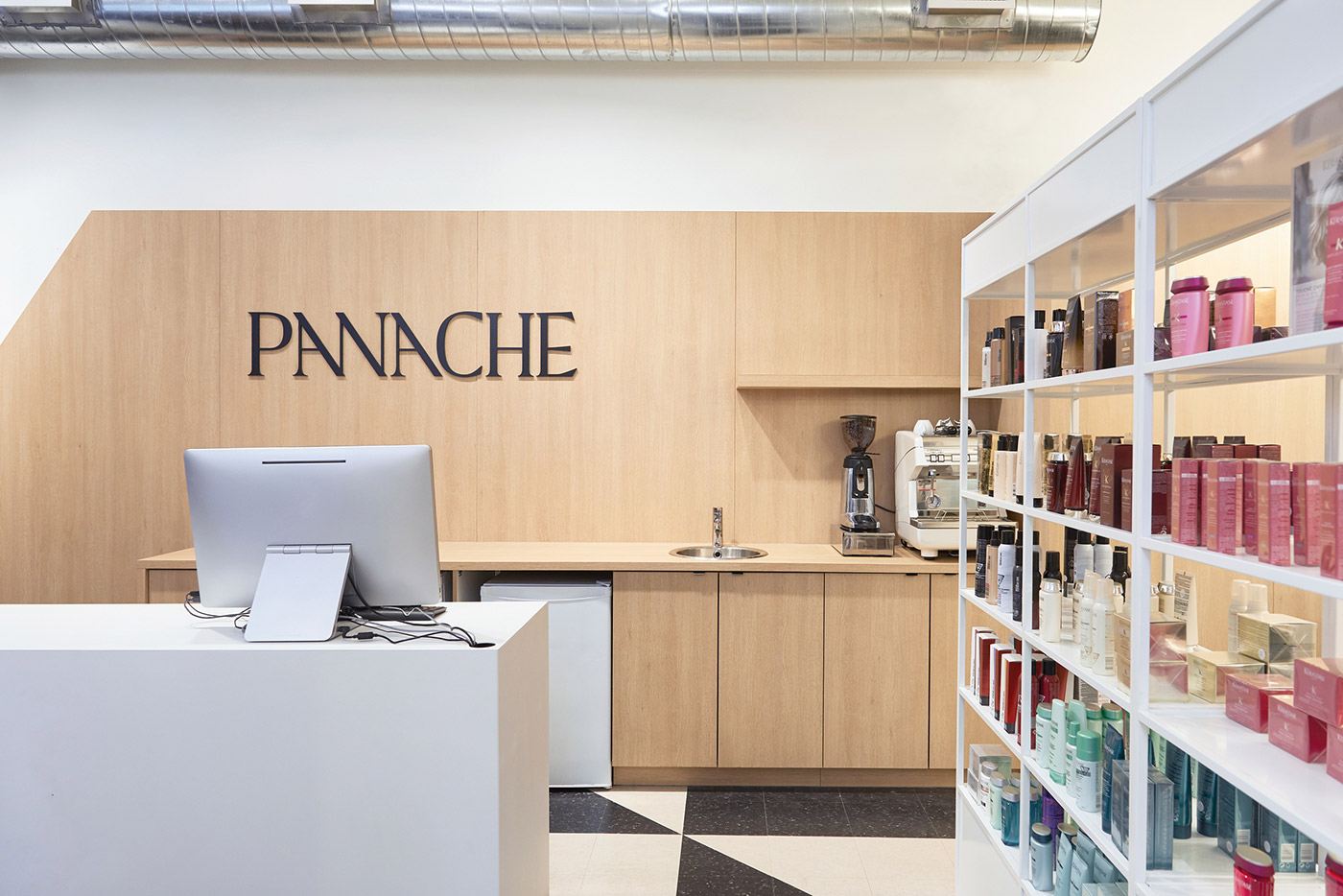
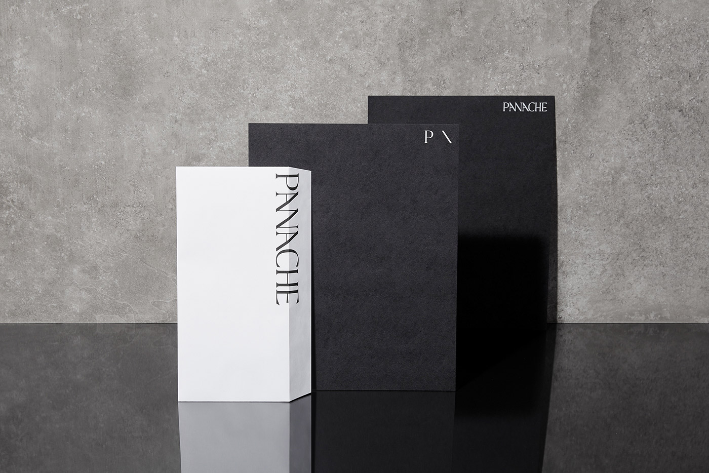
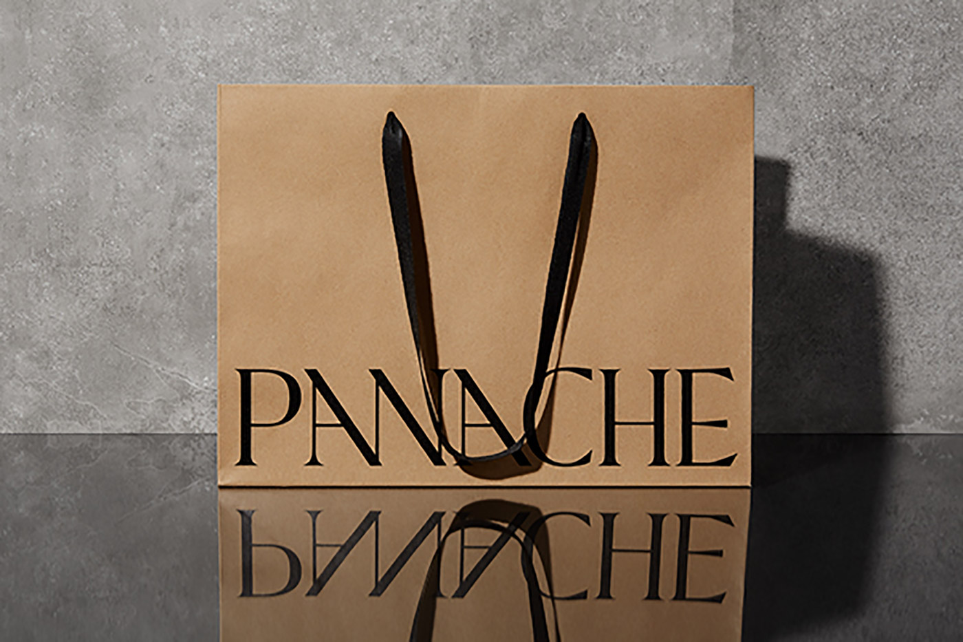
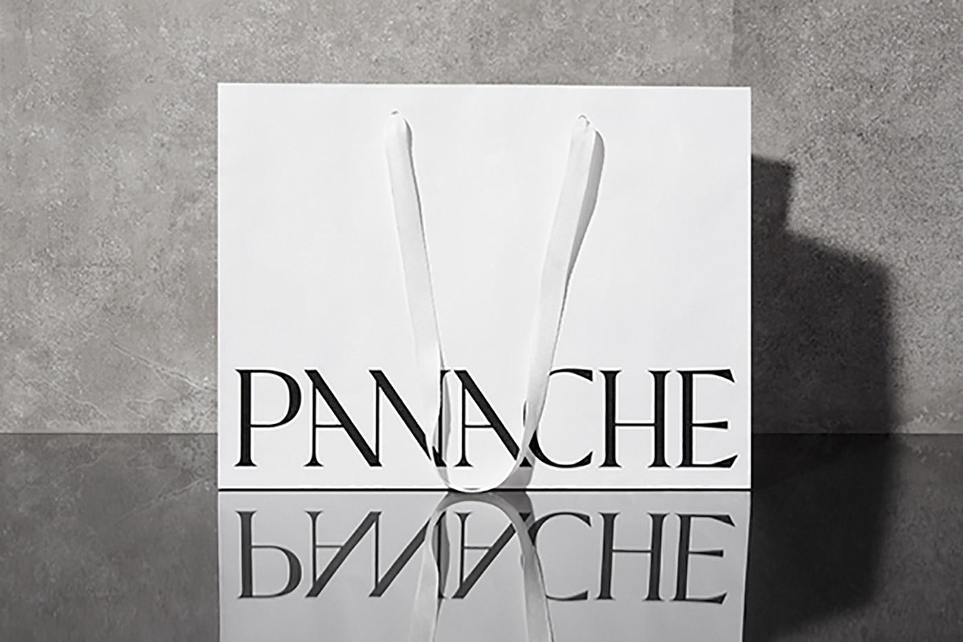
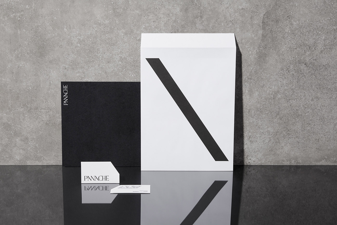
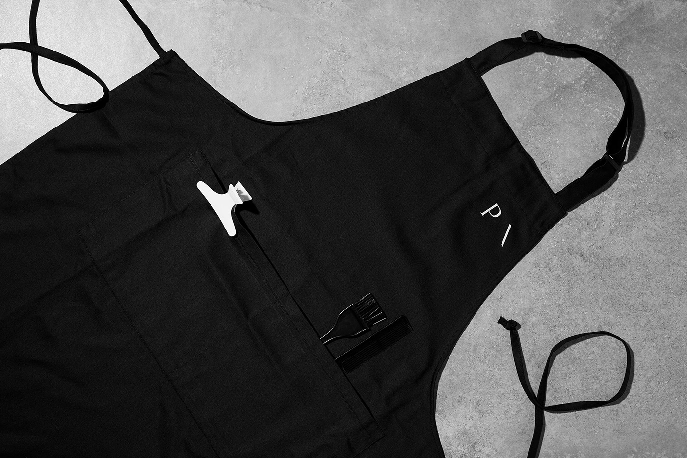
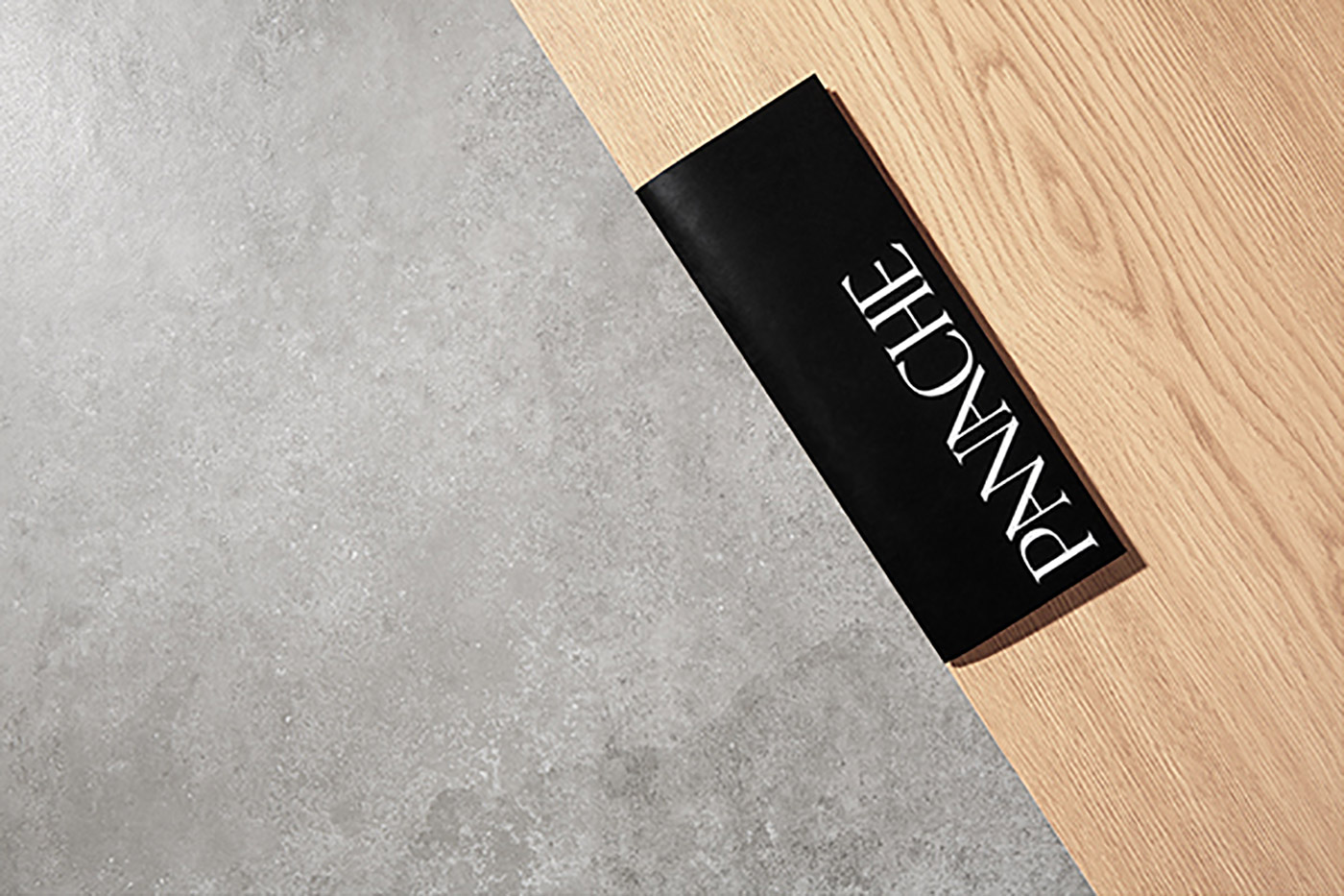
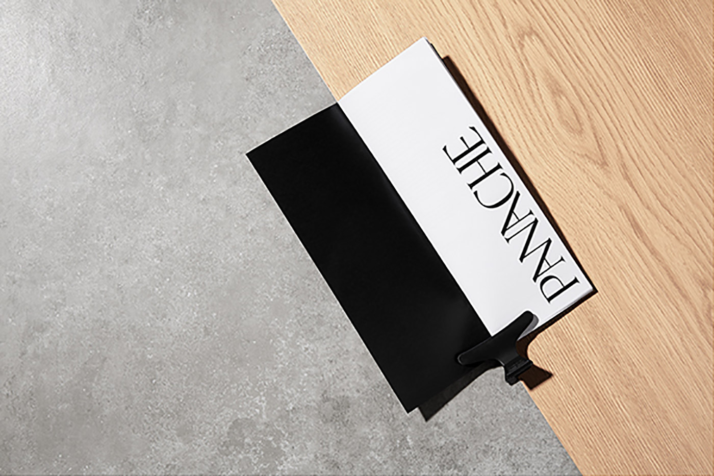
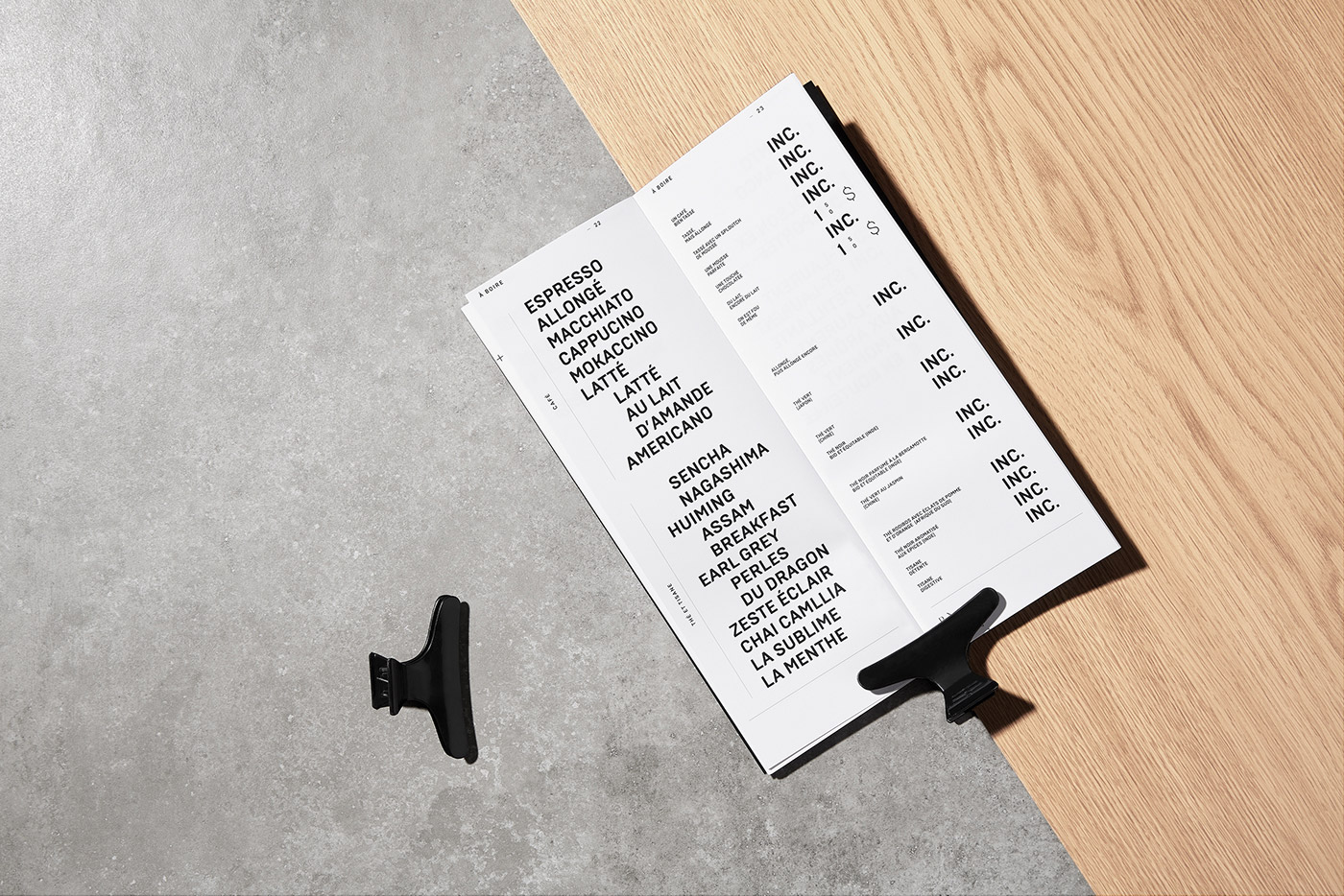
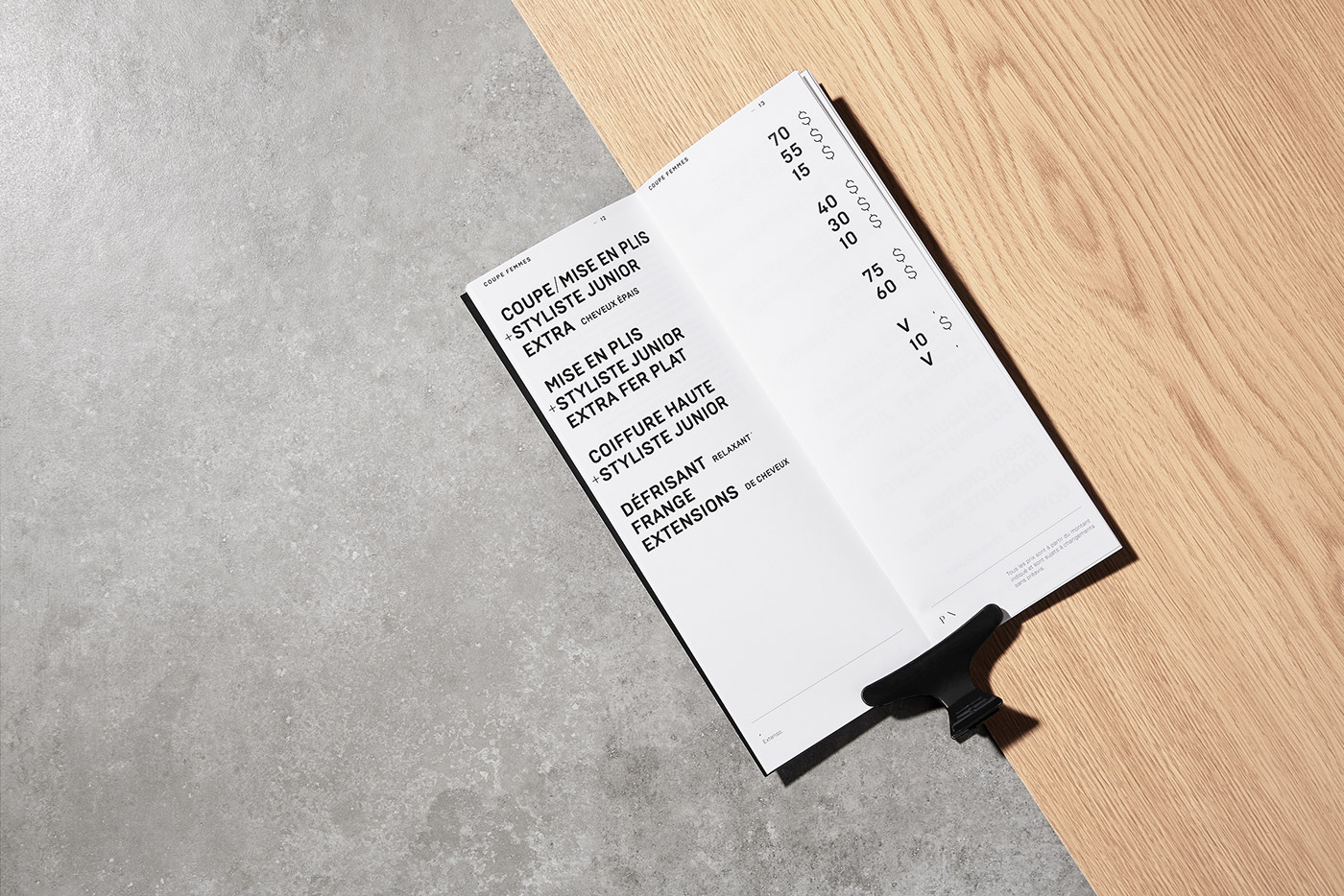
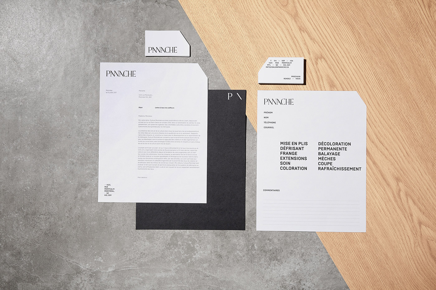
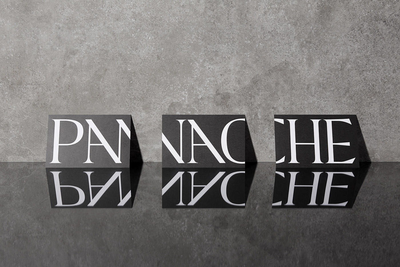
Panache is a high-end hairdressing salon based in Montreal, Canada, that has garnered celebrated status since opening its doors in 2011. In need of a 'new haircut', Panache confided in graphic design studio
to redo its
in order to better reflect its innovative spirit.
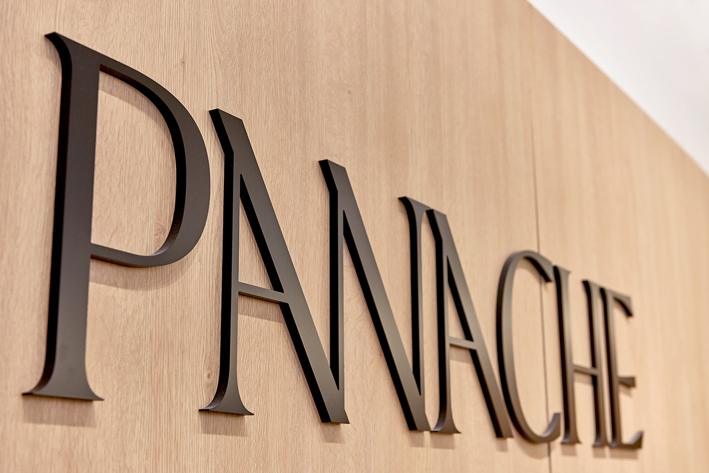
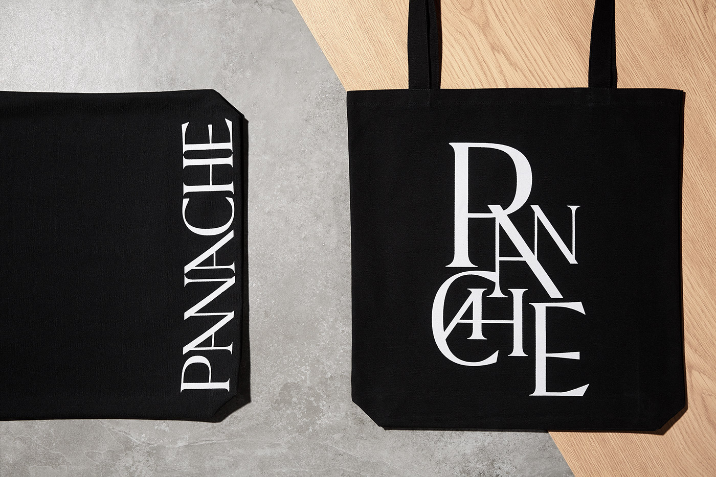
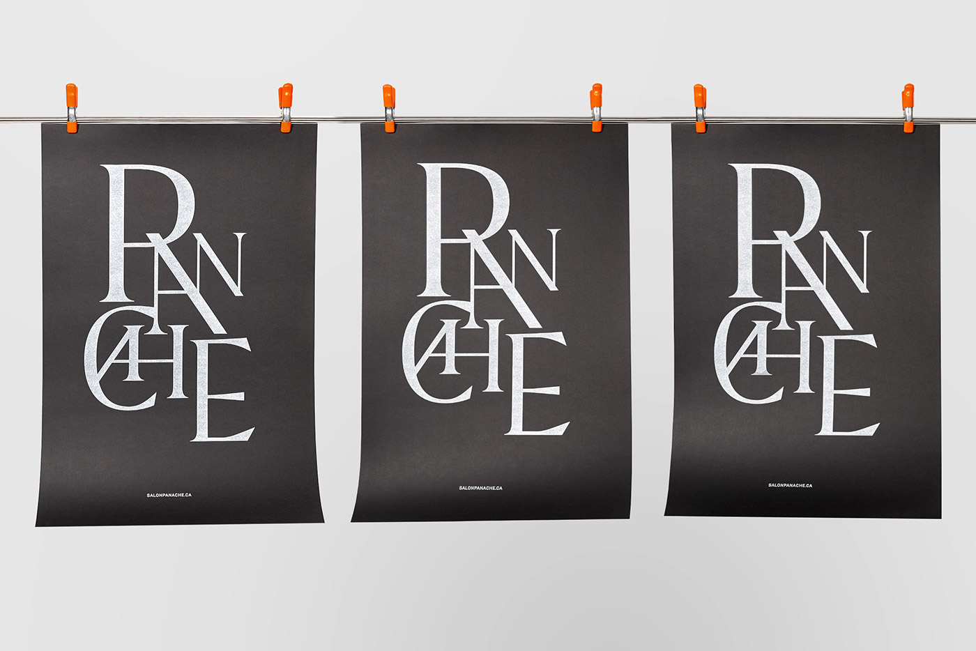
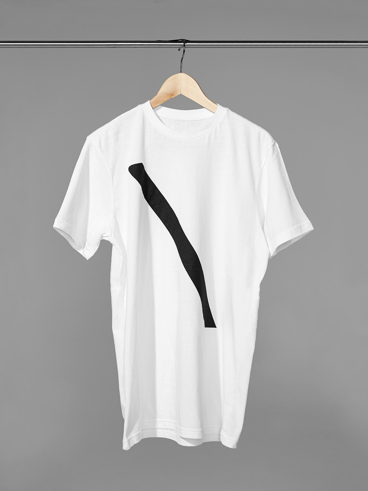
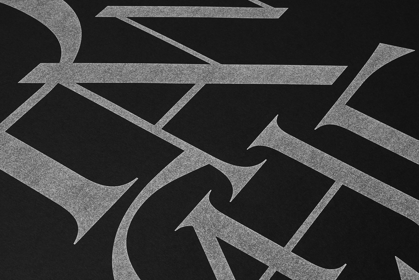
Inspired by the motion of scissors, the new identity's distinguishing feature is its diagonal lines, as featured in its typographic form and cut-out corporate stationery. Its iconic 'slash' serves as the salon's minimalist logo and is utilised throughout the space as a modern decorative element.