


Ian Styles
November 02, 2017
Mindsparkle Mag


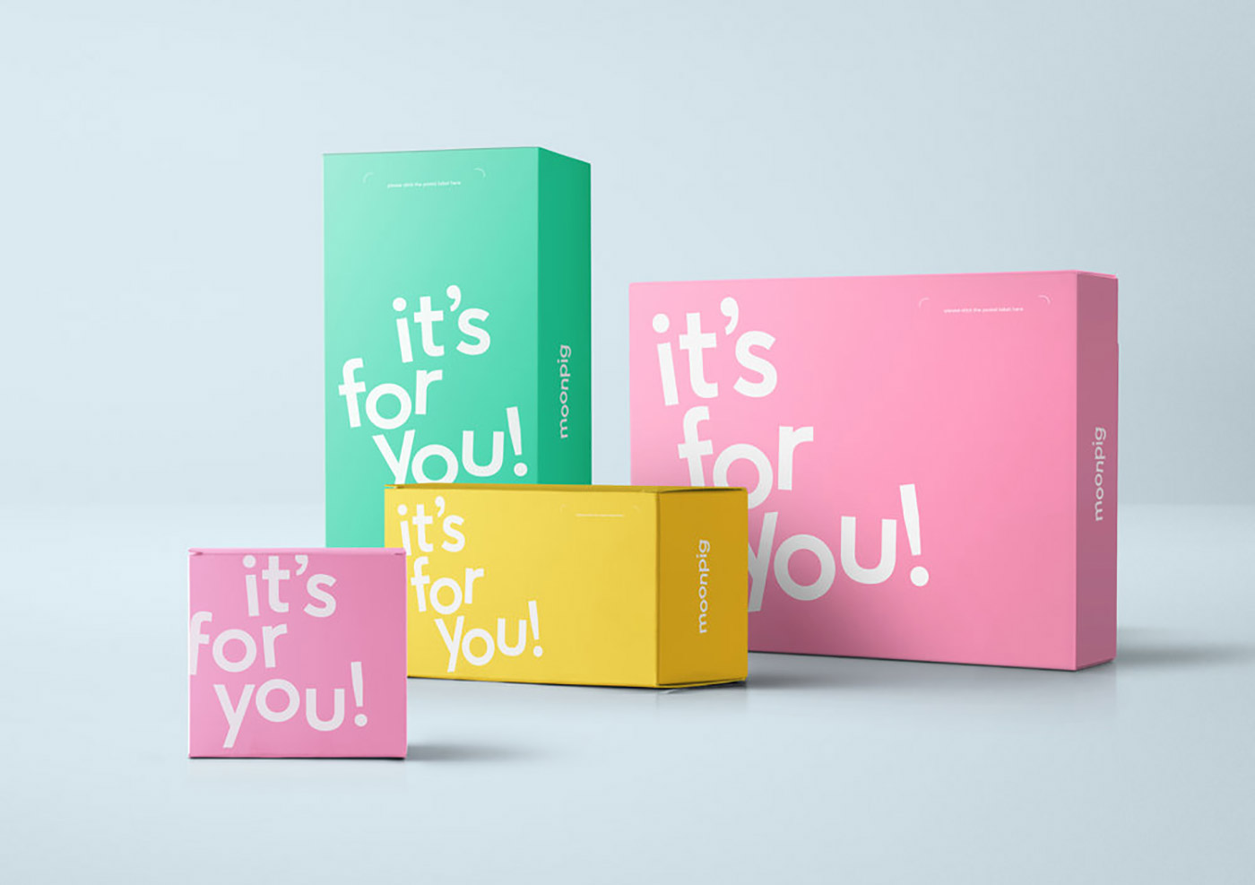
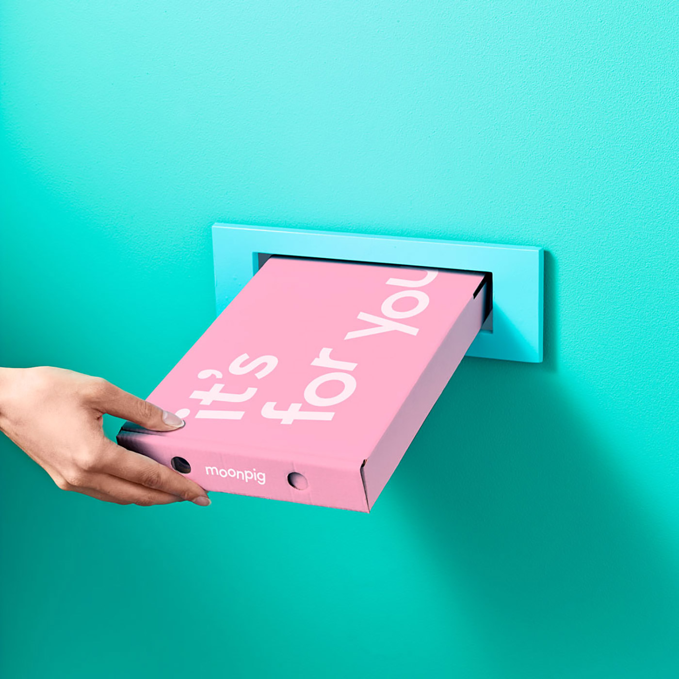
Ian Styles worked with the Creative Director and in-house creative team at Moonpig to design the dynamic new brand identity for the personalised greeting card business. This close collaboration allowed Ian Styles the crucial opportunity to understand the culture, customers, and vision for the business.
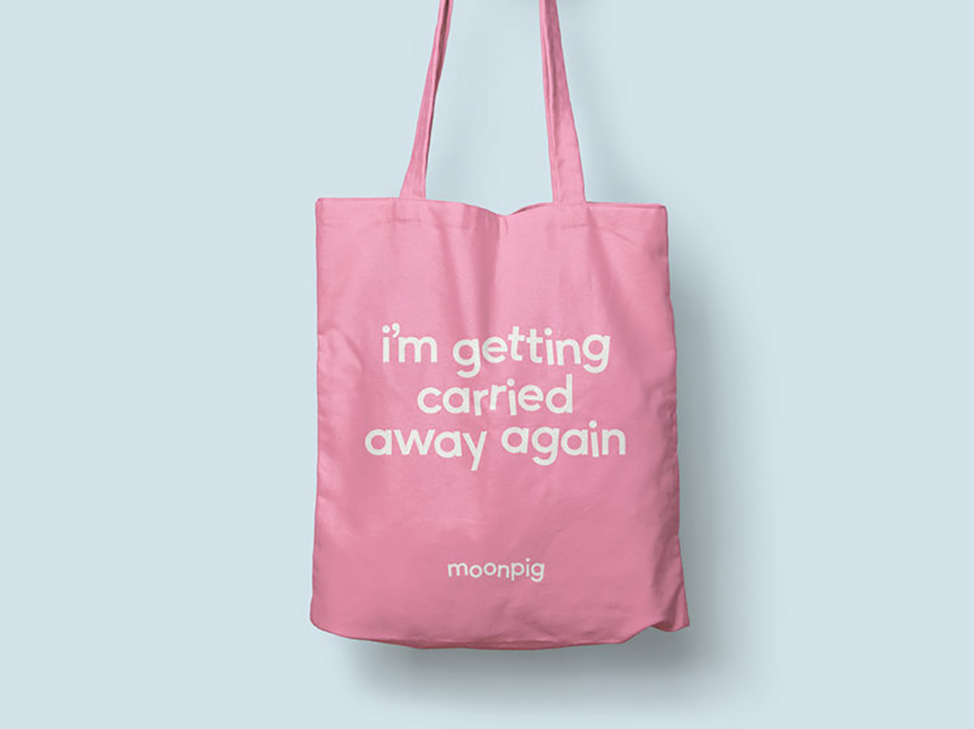
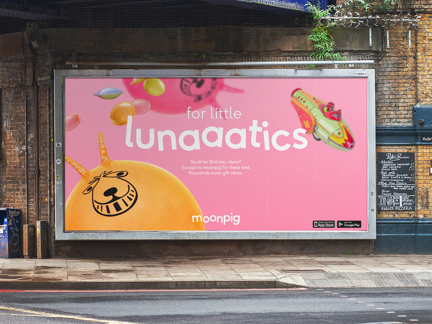
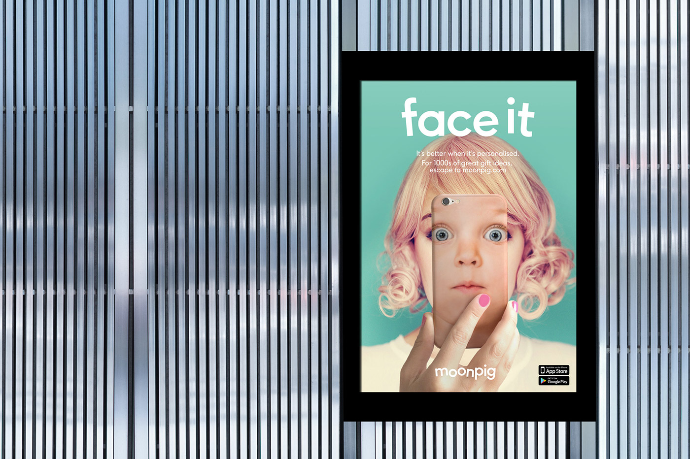
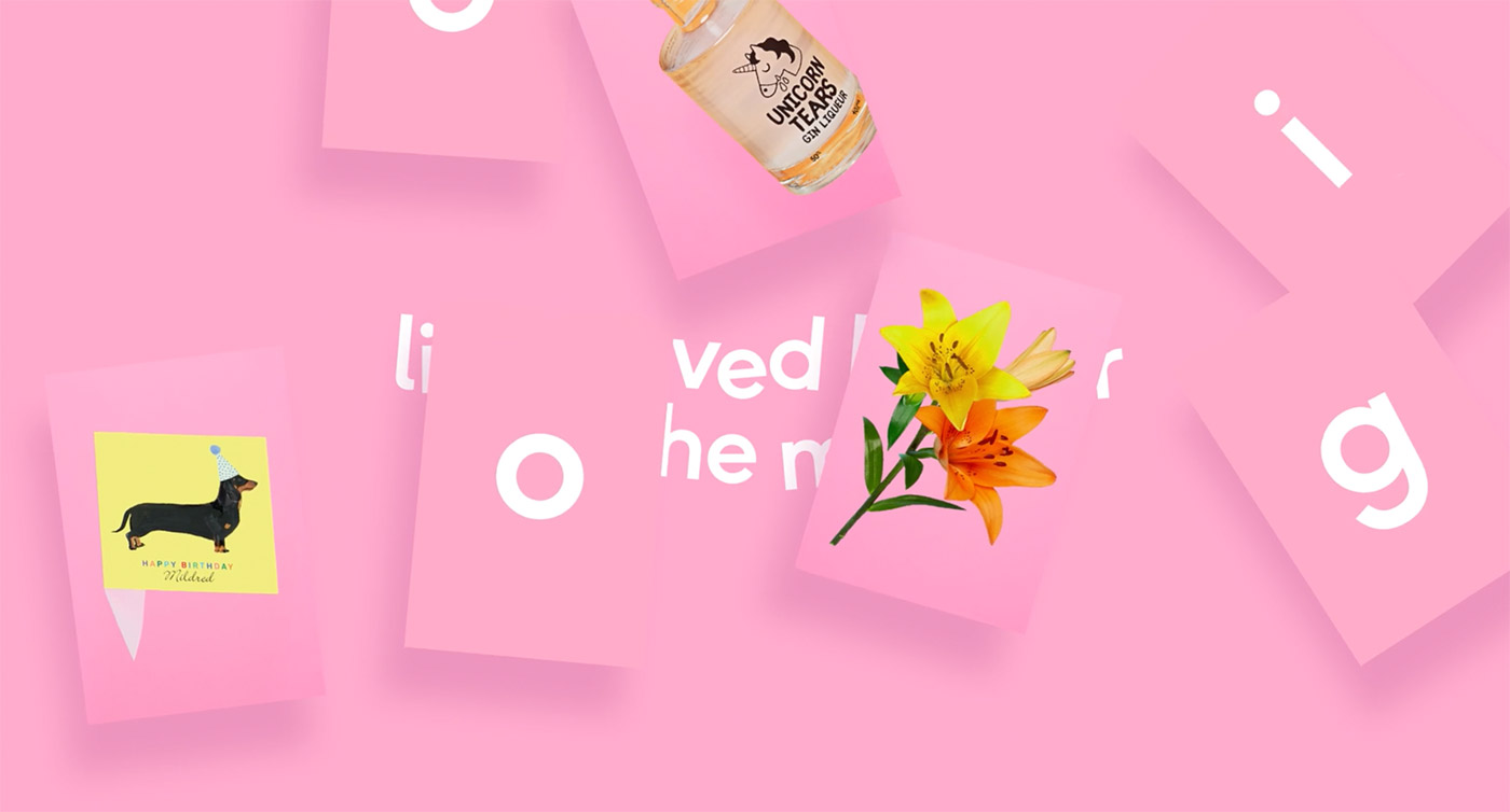
'Building on their new positioning, our idea was a simple one; create a whole new world for Moonpig, one where we imagine that we live life on the moon, where the normal rules don’t apply. We seek to capture people in our new world's gravity, pulling them towards us for a moment, offering an escape, where boring is banished, the obvious avoided and where life, is more fun and lighthearted.
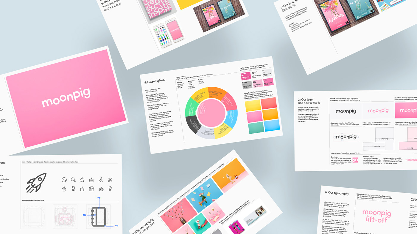
The logotype is playfully designed to compress down to form a subtle reference to a pig's snout in small spaces and extend out to allow play with horizontal formats and interact with the new TV jingle.
We worked extensively with British based type company F37 Foundry to create and develop a custom bespoke type family that would play a key role in Moonpig's new brand identity. Both companies worked together using the F37 Ginger type family as the foundations, creating a new Demi weight called Moonpig Lift-Off.
This weight features 3 styles of alternates with random programming, giving it a playful yet structured execution. It consists of 4 subclasses: a regular class for the normal design of the characters, one class for the ‘lift’ characters, another class for the ‘wobbly’ characters and one for the more complex group of characters — those that ‘shake’.
A method called ‘Quantum’ was used for the programming. This allowed for a higher degree of randomness, which is defined by the amount of characters affected within a certain group of characters and level of substitution.'
Credits: Ian Styles


