 Plus
Plus

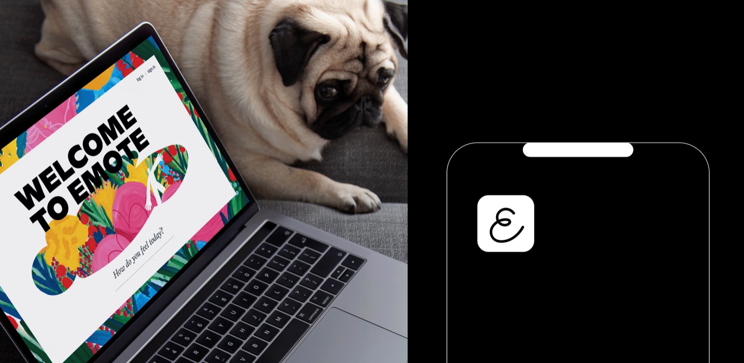
Emote is a barrier-breaking web application that helps companies monitor employees mental health. It detects when a person feels depressed or harassed so that they can be provided with support. The driving force behind this project was a need to create a safe space, where anyone can freely express their feelings without shame. It is a huge task and a great responsibility to make people feel comfortable about sharing their feelings and experiences - for many, sharing emotions is daunting.
The new brand identity was created by perfectly boring studio. In their own words: Our design is all about contrasts: fear of speaking the truth and the relief after that; fear of being ashamed, and then the joy of acceptance. You have to be sensitive enough to understand your own feelings, and courageous enough to speak up about how you feel. We wanted our concept to reflect the quote the greatest strength is in our weakness, as it takes tremendous strength to be vulnerable. This duality in our design contributes to an identity that gives people a sense of safety and understanding.
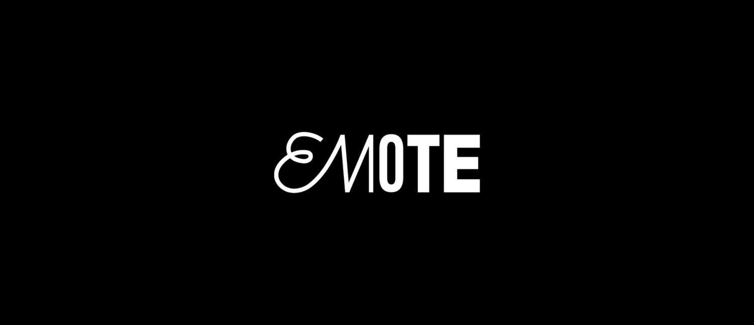
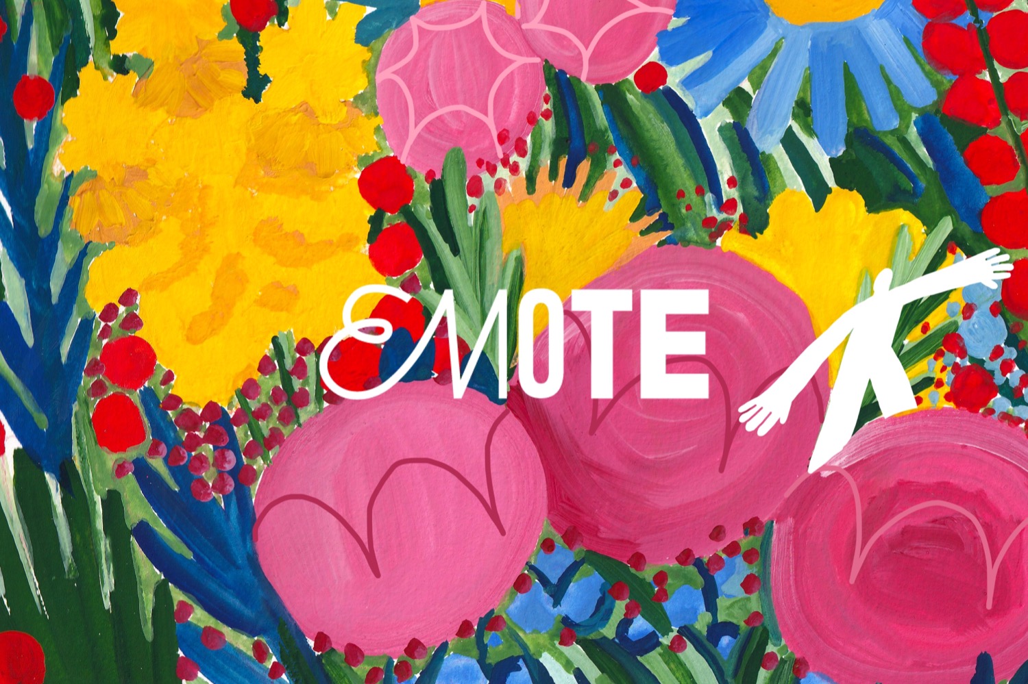
Emotes logo is all about dualism: its soft on the one side and very brutal on the other. The first part of the logo is about messiness and expression. But then we have the second part of the logo. It gives us solid confidence we can rely on. It is brave and tough. Where the first half is soft and naive, the latter half is concrete and bold. But as a whole, It gives feelings of support and reliability. A space to let go, and come back together again.
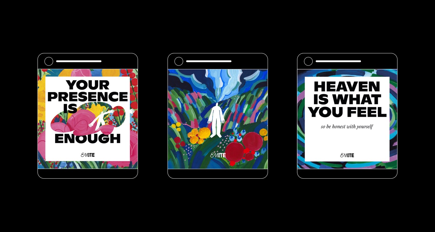
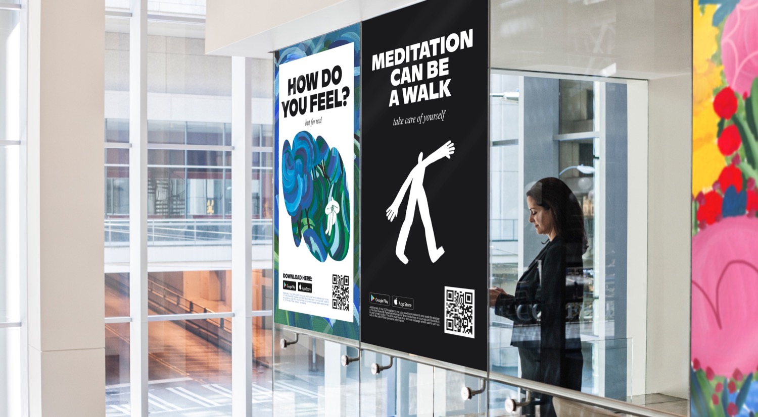
The theme of duality thrives even in the typography itself. For the main text and titles, we use Ginto Bold typeface. In the small captions under headings and the main body is Laica Italic. It helps to build a consistent style of the visual identity.
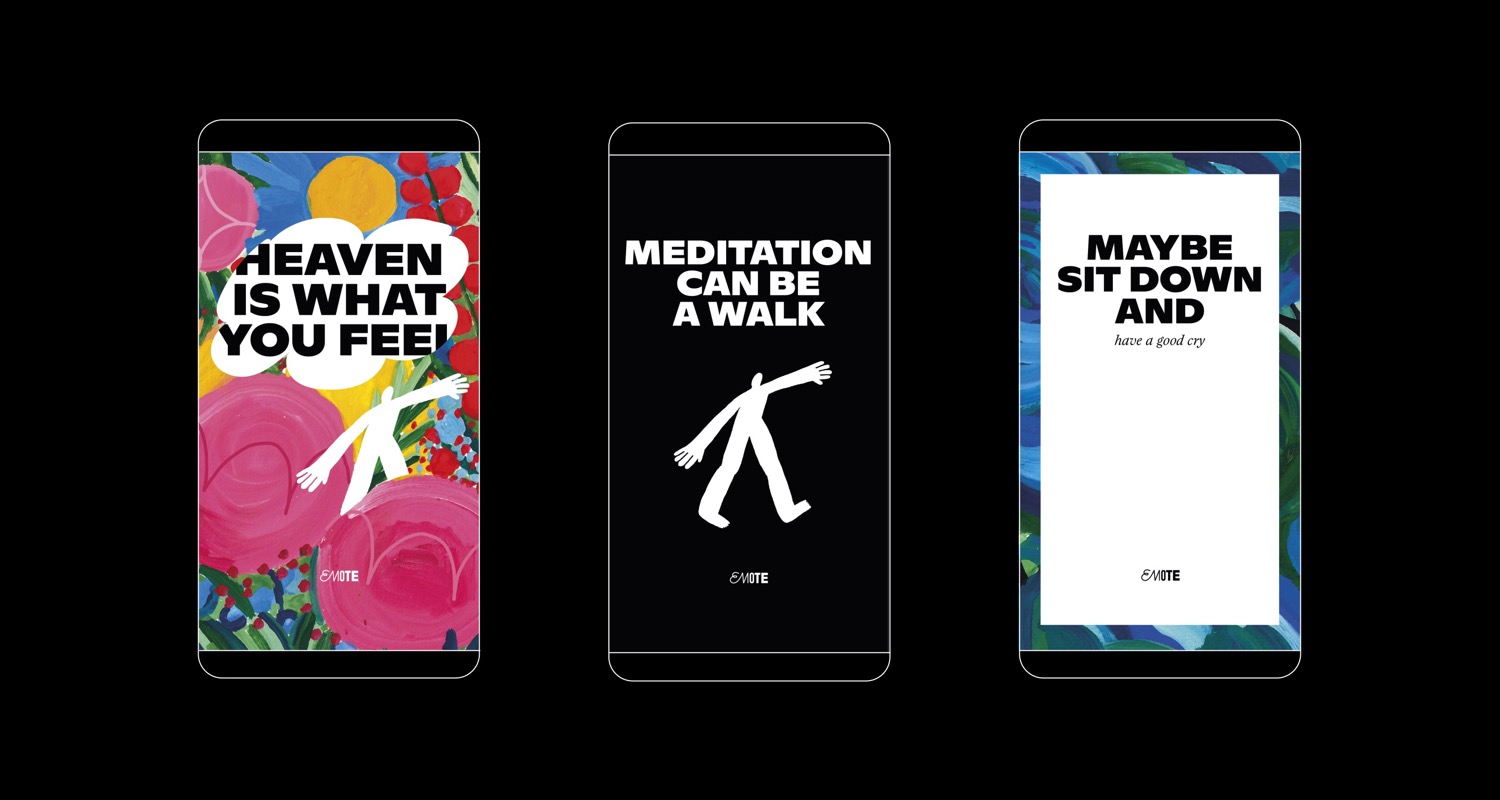
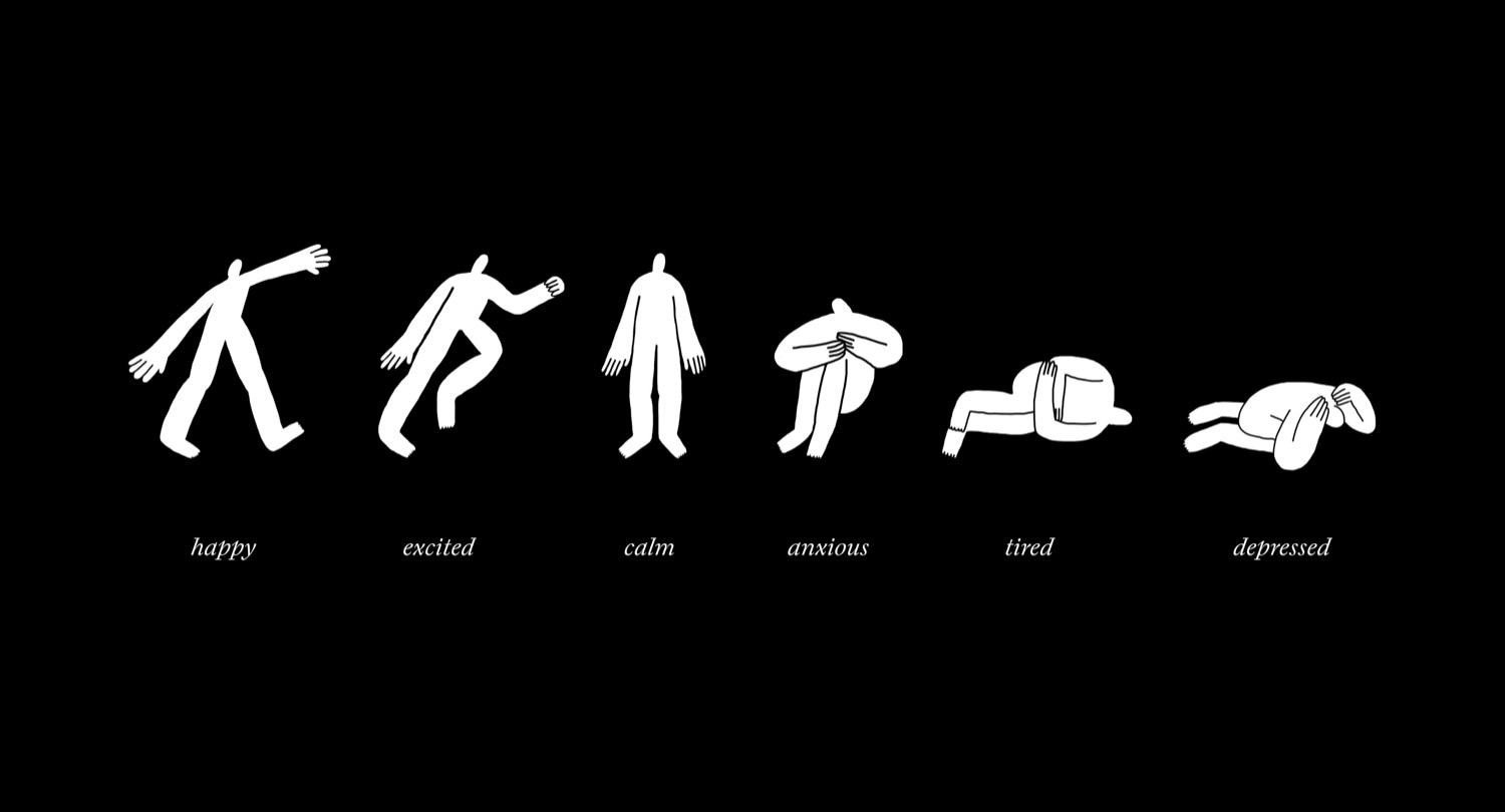
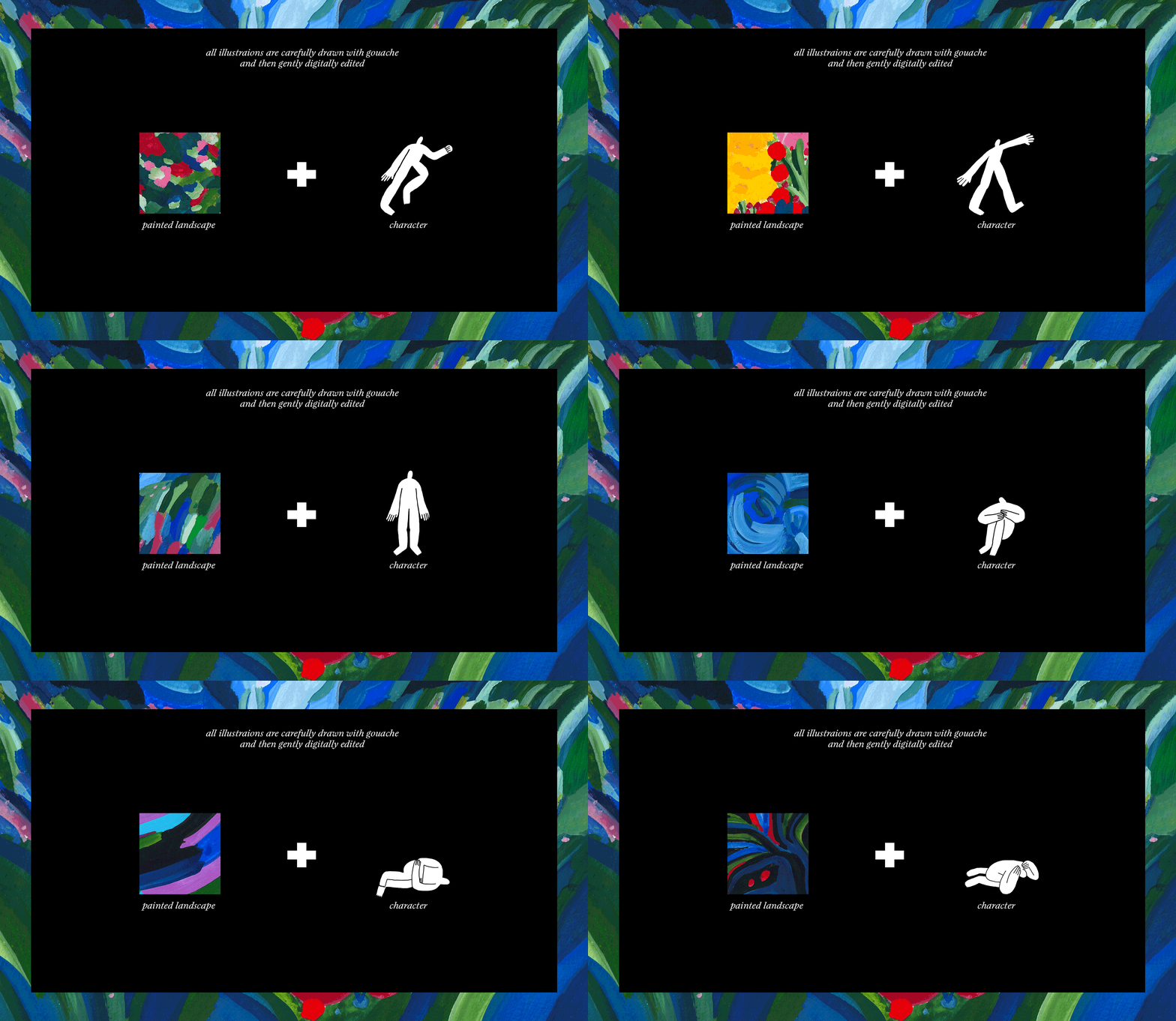
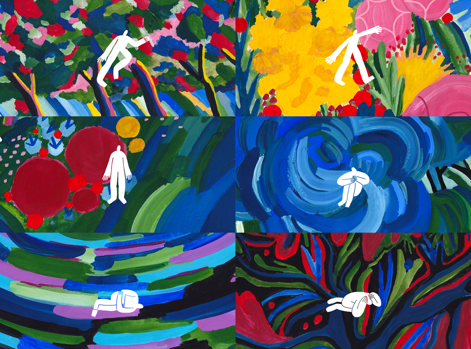
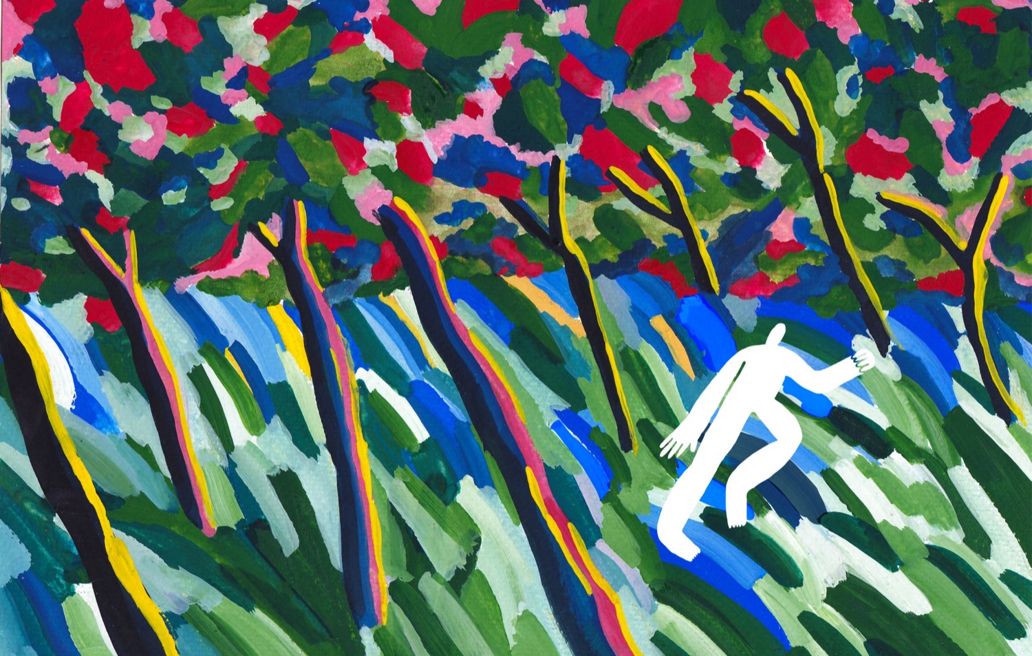
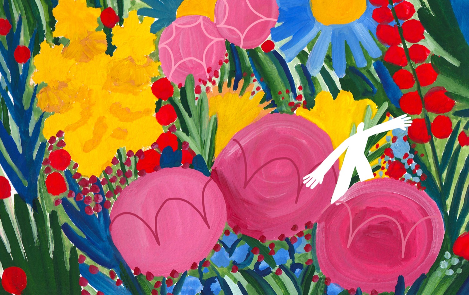
The illustrations are the part that really makes us giddy. They are delicately drawn with gouache paint and then, digitally, lightly tweaked. We formed the final look of the illustrations with a combination of colorful landscapes and the figure of a small, endearing human.
Why landscapes? Emotions are like nature, unpredictable and messy. The landscape grows and warps around the character, representing the feelings he has at the moment. We borrowed this evocative technique from expressionism. We wanted to make the internal world externalize itself in the environment that surrounds the character. It is simple, but it flows perfectly with our design concept and the goal we needed to achieve: relatability, a place to be heard, calmness, and freedom.
Overall, we truly appreciated being entrusted with creating something so important and unique. Working with craft materials and exploring inner fears was a great experience. We are super grateful to the client who supported us and was excited about the results too. While speaking about peoples emotions it is important to stay truthful and relatable. We escaped the classic approaches of sharp geometrical forms and stuck to flaws and imperfections. Because we are imperfect, emotion-filled, and human.
Credits: perfectly boring studio
