


Brand Brothers
August 31, 2021
Mindsparkle Mag


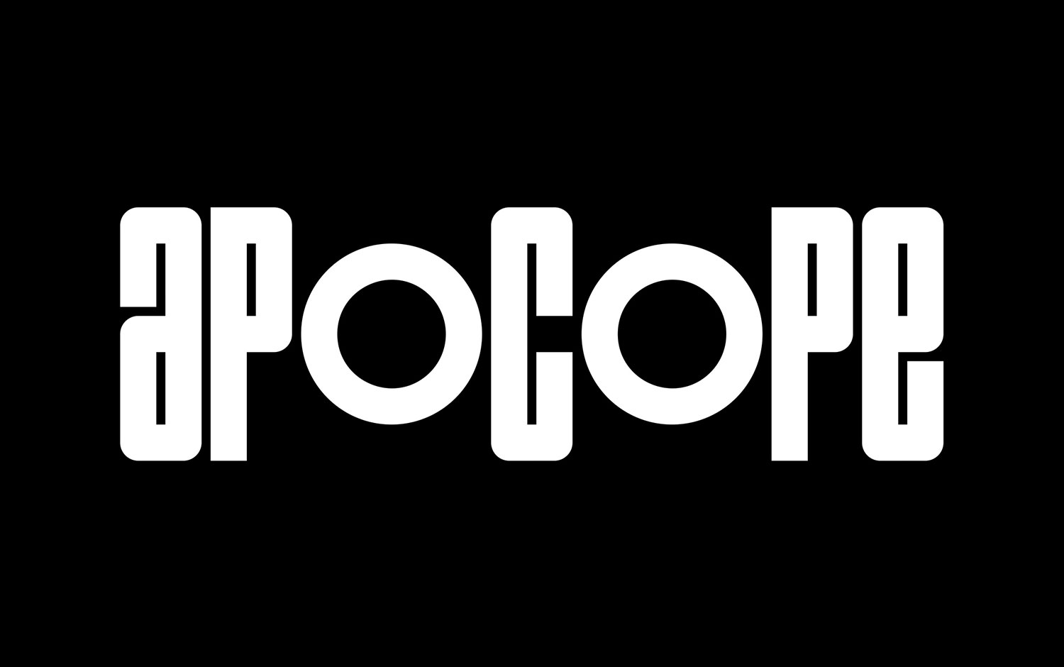
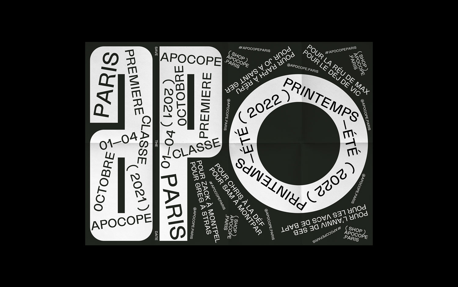
For the last years and even nowadays, time is the most precious currency we all have. And dedicating someone or something time means we care about or we have interest in that. Today, we're featuring a project that has to do with time. Apocope is a deep-rooted cultural and urban attitude highly used in France. And the name of the leather company we're showcasing is designed by Brand Brothers. All these links with the context we live in, constantly rushing and surrounded by a fast-paced environment.
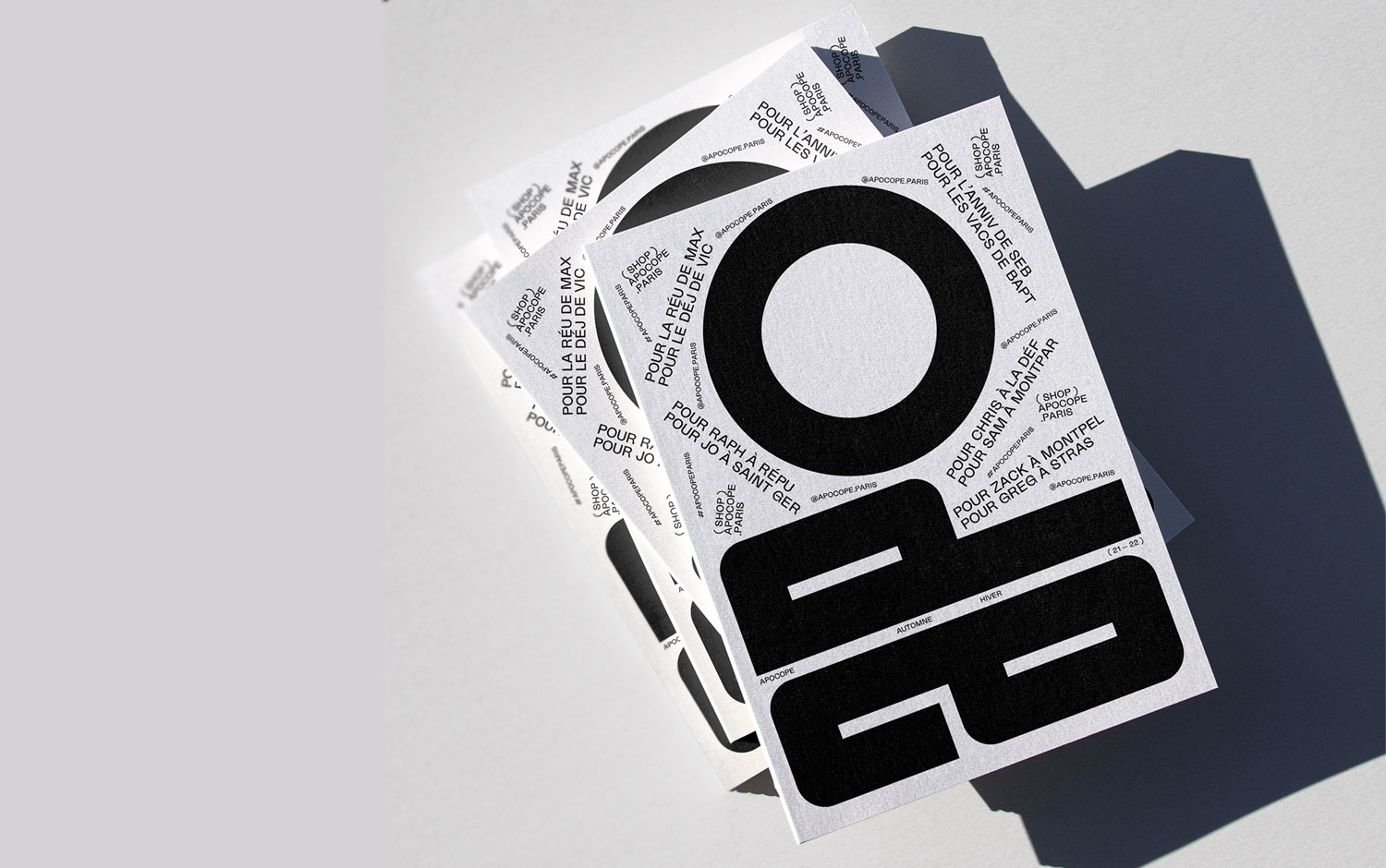
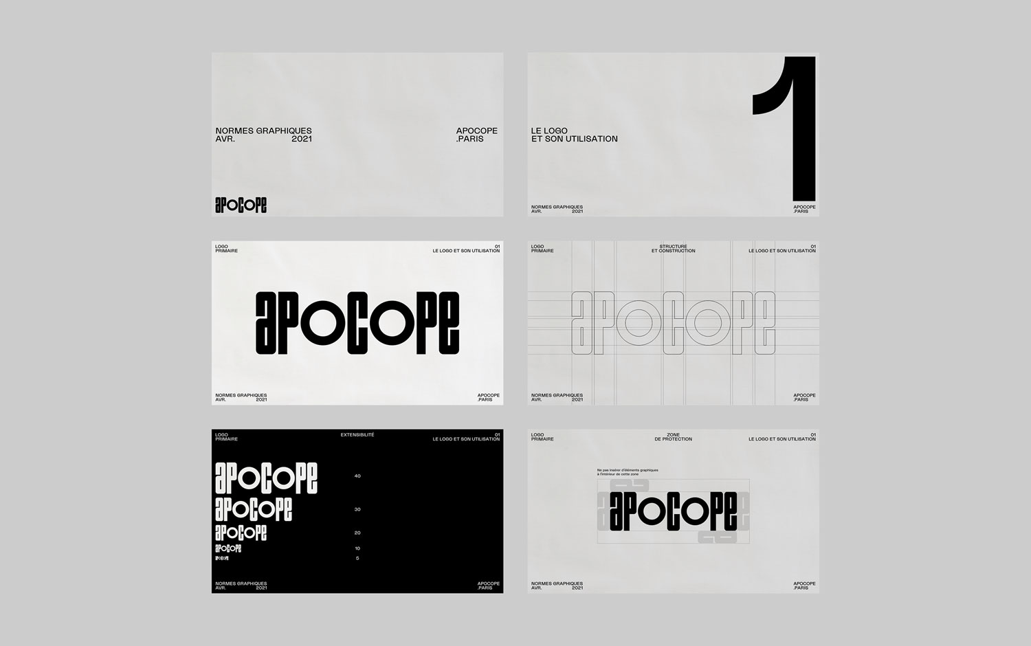
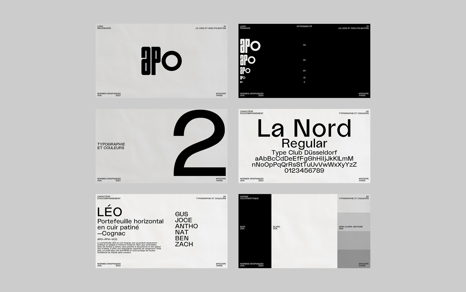
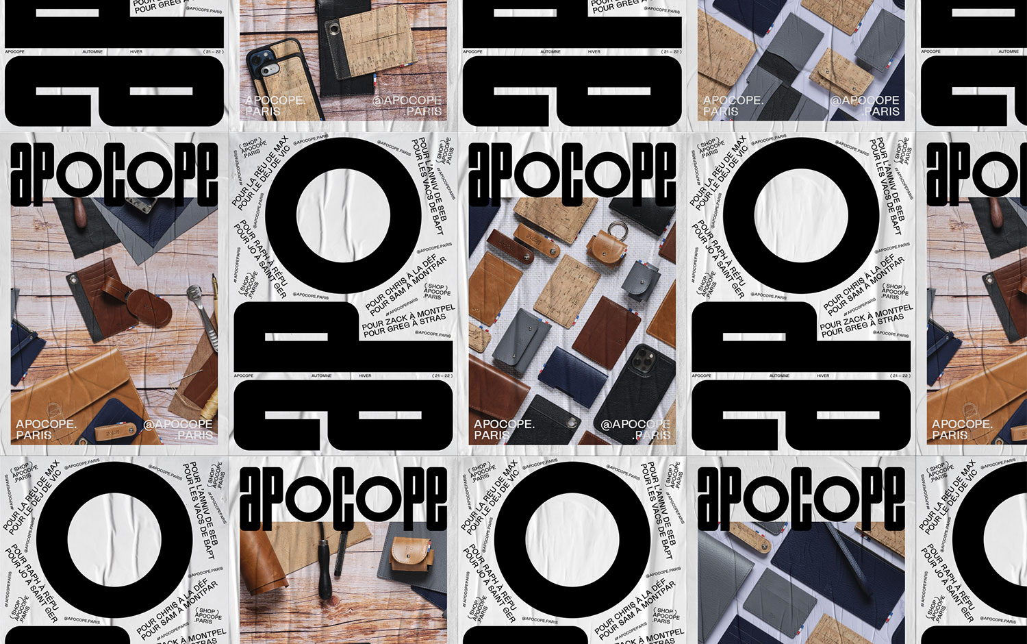
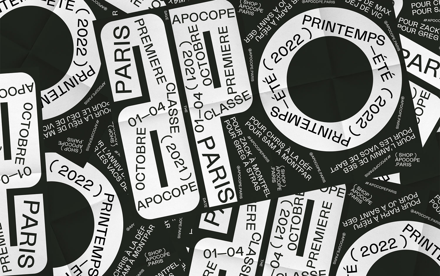
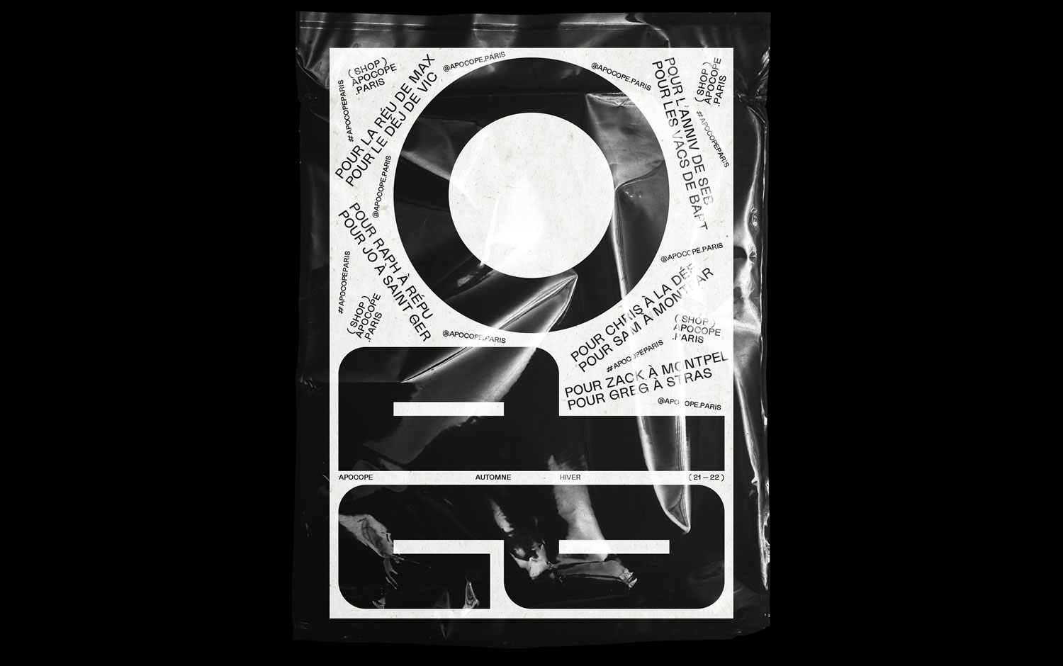
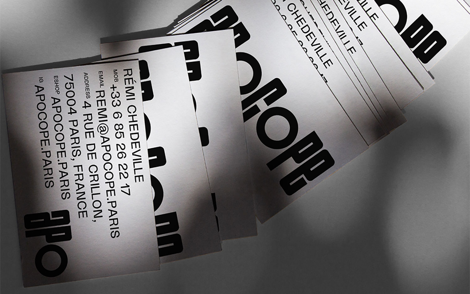
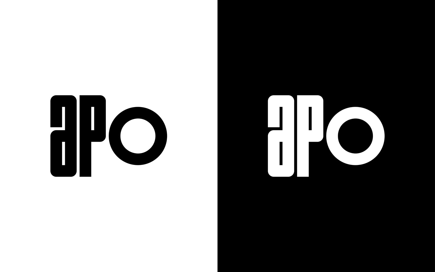
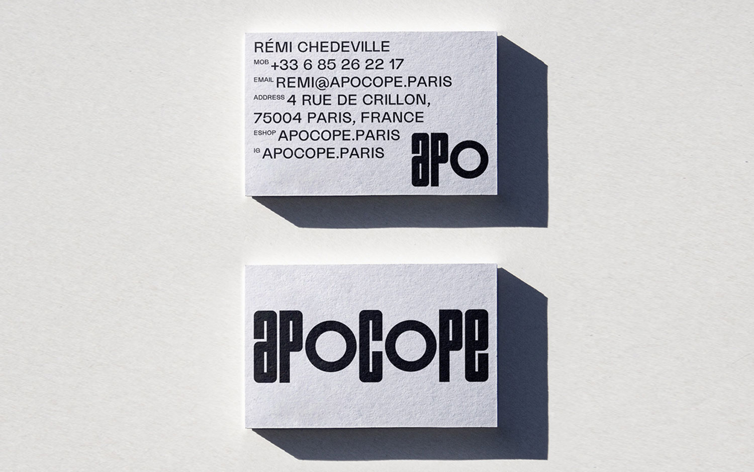
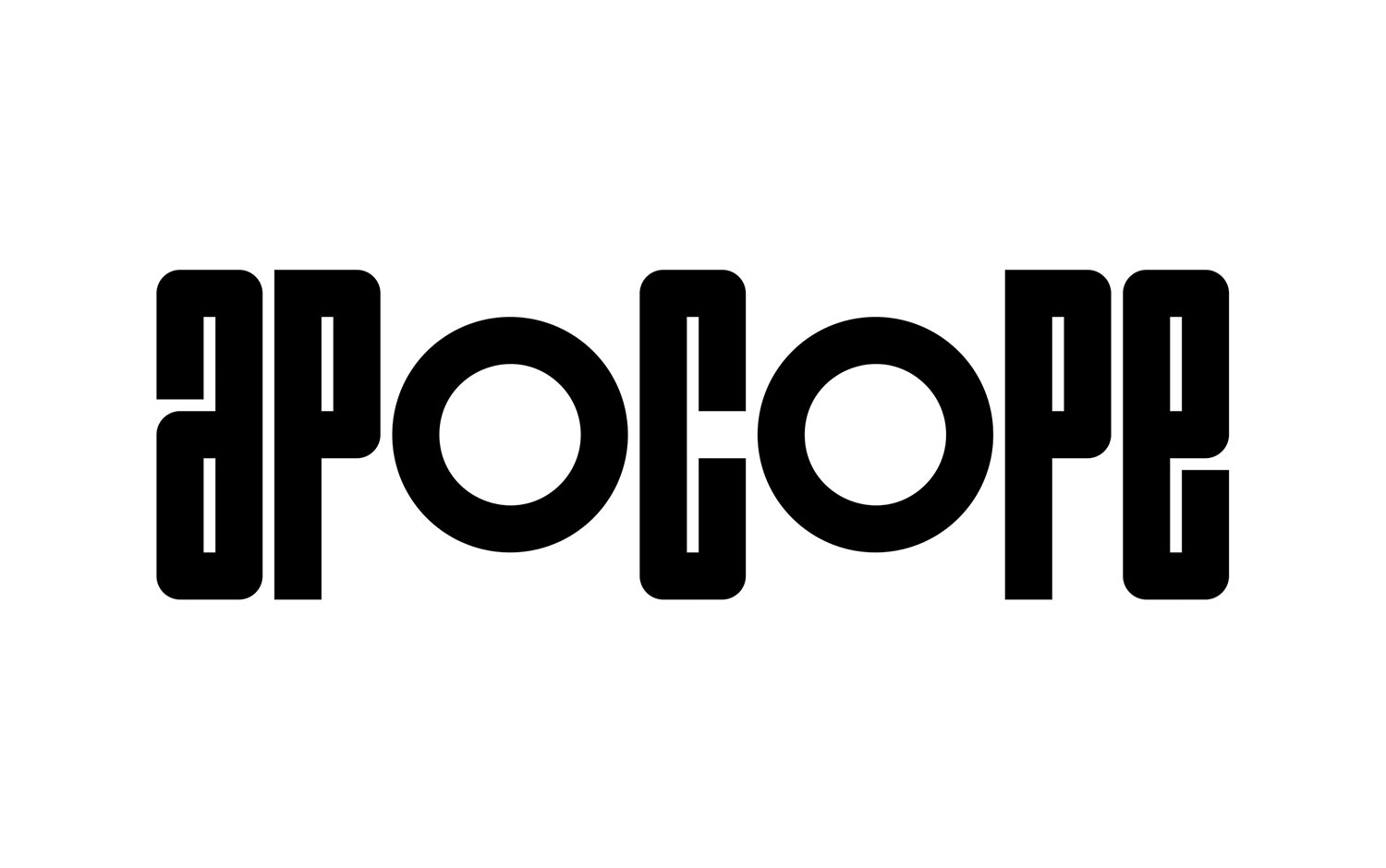
Launched in 2021, Apocope produces goods for men, focusing on materials and their provenance. It combines with a minimalist and precise design, imagined in the brand’s Parisian workshop. Also, this attitude reflects our active lives, always on the move, where we seek to shorten to save time. This practicality resonates with the primary function of the leather goods and their usefulness to the man who wears them. Brand Brothers' designers created the graphic identity; thus, based on an in-house typogram, strong and rhythmic, their work is articulated around typographic compositions, sometimes pure, sometimes maximalist. Plus, the typeface has a modern and unique style. The monogram, Apo, the apocope of Apocope, becomes a pivot around which the messages are composed and decomposed.
All in all, the identity created for the brand profoundly links with the dynamic, revolved world we live in and perfectly understands the approach and impact the brand wants to make within its clients.
Credits: Brand Brothers


