


Sangwon Lee
December 31, 2021
Mindsparkle Mag


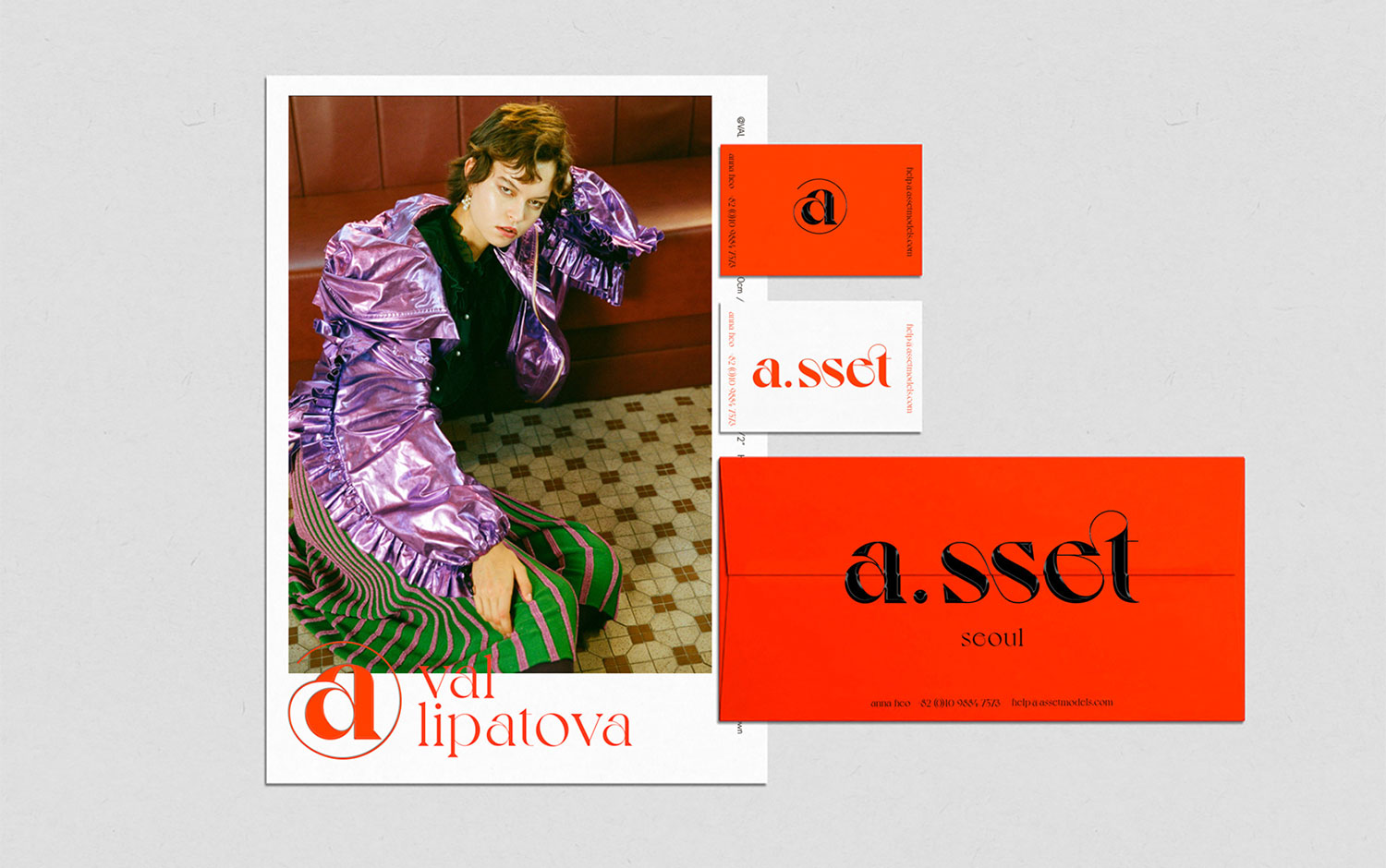
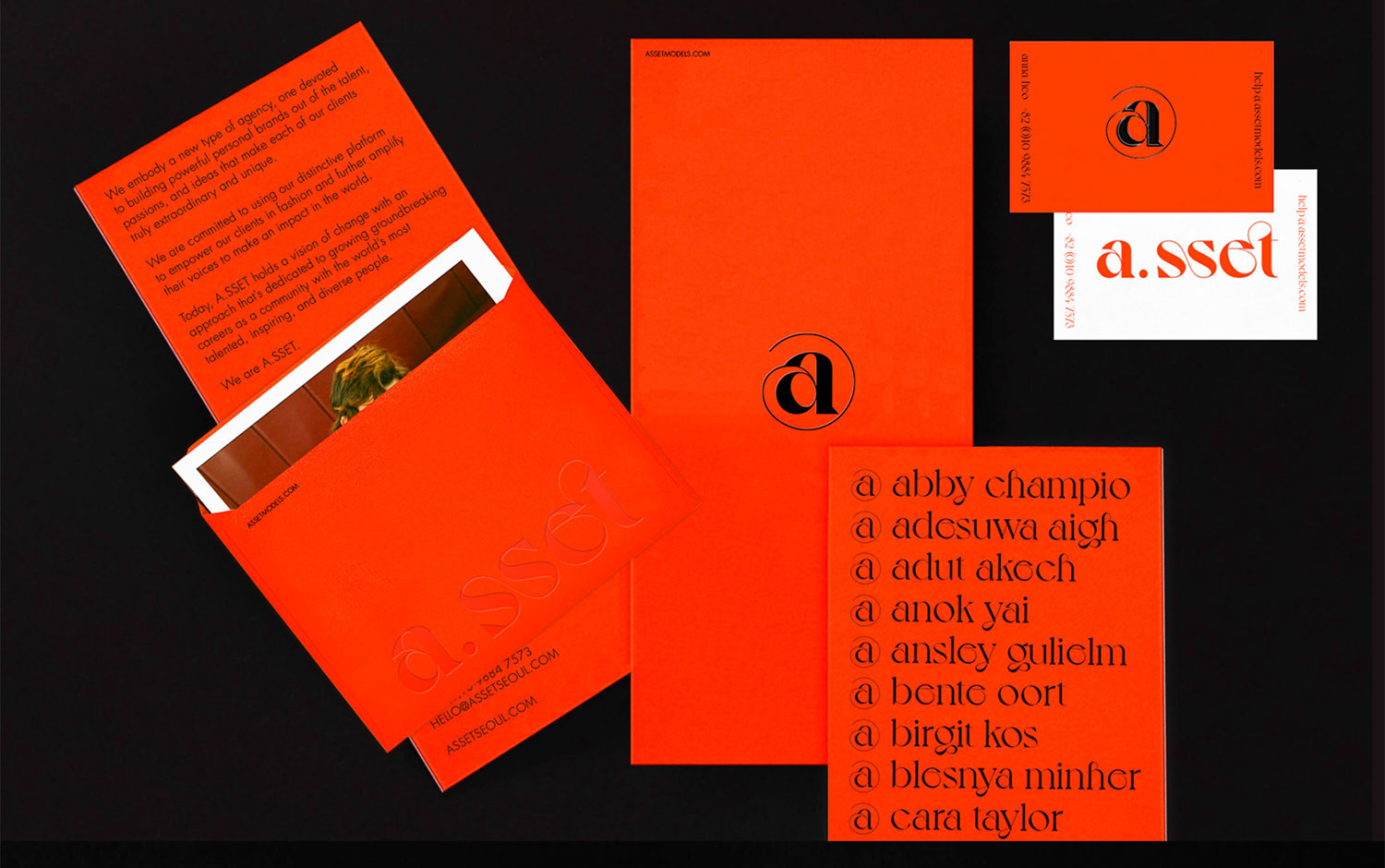
Last day of the year, and we're going super fancy with today's design post. We hope you have a wonderful evening planned and the perfect outfit for it. So, let's get started! Today we're showcasing A.sset, the model agency's branding experience and identity system designed by Sangwon Lee.
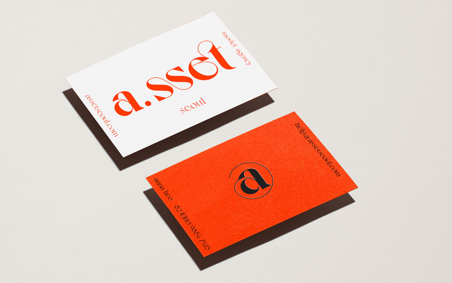
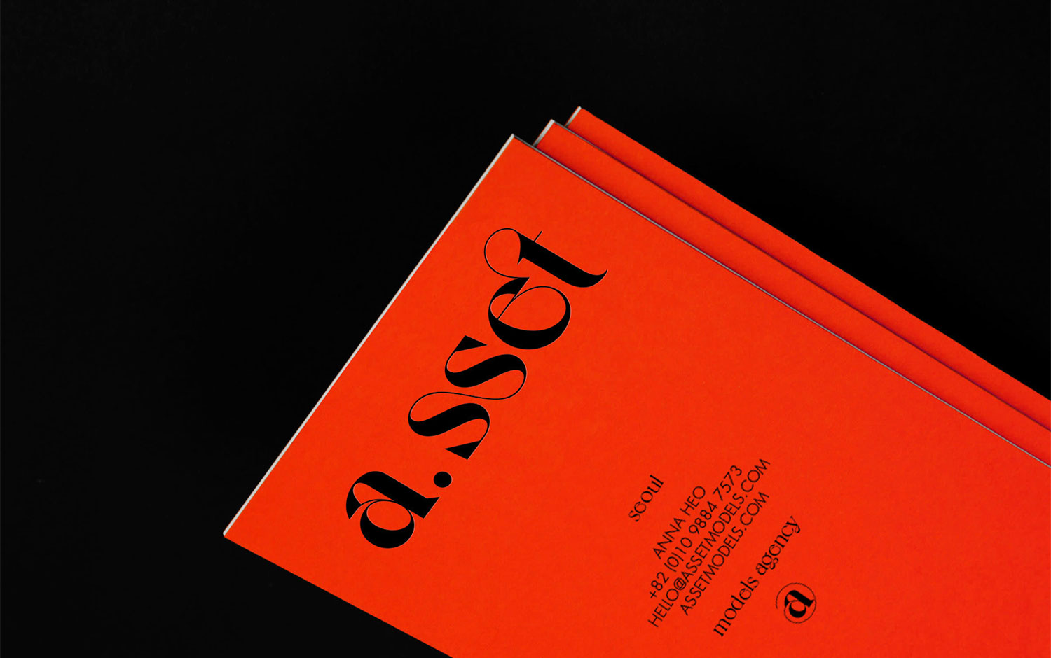
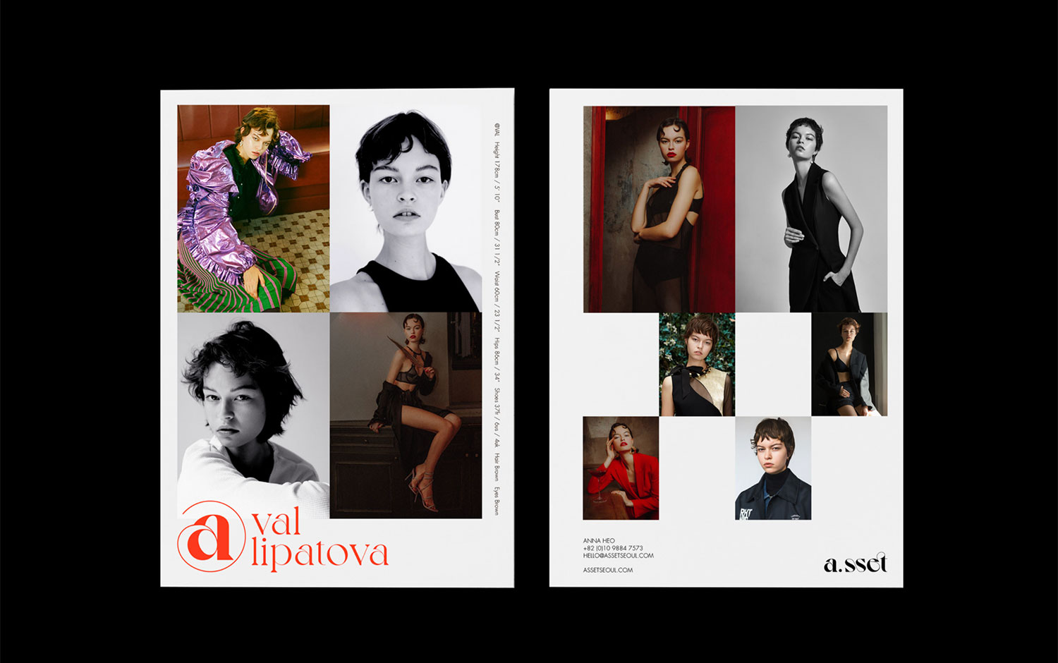
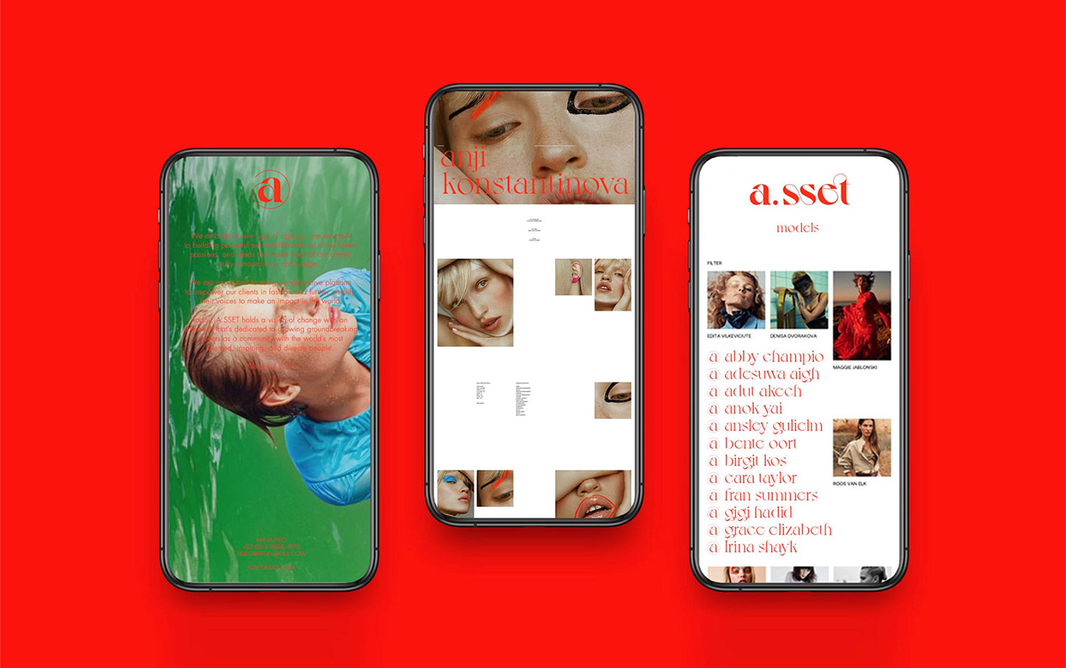
Strident red characterizes A.sset, this Seoul-based model agency founded by Anna Heo. She says: "human is a core value, it will be an asset for the a.sset". Her company provides a network service through a platform that links the client with the model and vice-versa. The creative team came up with the brand identity symbol after the @ sign. The meaning behind it reinforces the founder's first name's initial and the brand. Plus, the model names are in the form @modelname. We need to highlight the fantastic typographic choice made for this project as it features a fancy look and feel, yet it has a strong character.
After almost everything collapsed this year or is right now collapsing, we wanted to keep up with the intensity and showcase a vibrant and stunning identity, which we found in A.sset's branding. That's all for 2021; let's reconnect with new projects. And we wish you all the best for what's coming.


Credits: Sangwon Lee


