Plus
Plus

 Menu
Menu


TRA
January 19, 2017
Mindsparkle Mag


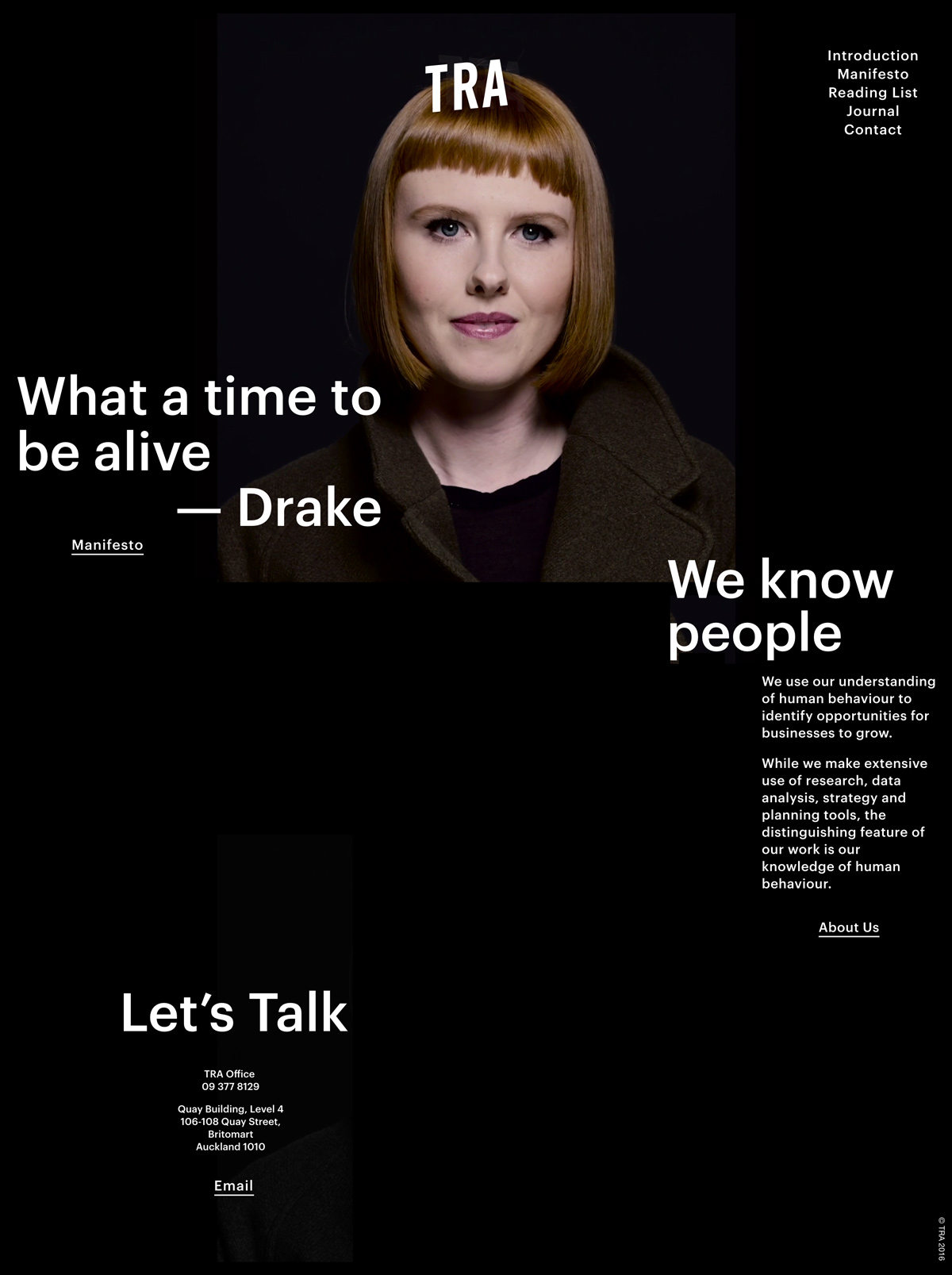
TRA, the Auckland behavioural-insights agency, sets a bold, confident tone on tra.co.nz with an almost entirely black canvas. A single striking portrait anchors the hero, overlaid with heavy white sans-serif type and the cheeky pull-quote “What a time to be alive — Drake.” The generous negative space and oversized headlines — “We know people,” “Let’s Talk” — give the site a swaggering editorial rhythm while keeping everything crisp and legible. It’s a smart, minimal exercise in typography and web design that lets personality do the talking.
Credits: TRA
More in Minimal Branding
Includes freebie bundle, unseen BTS insights and more.