Plus
Plus

 Menu
Menu


Twistudio
April 07, 2017
Mindsparkle Mag


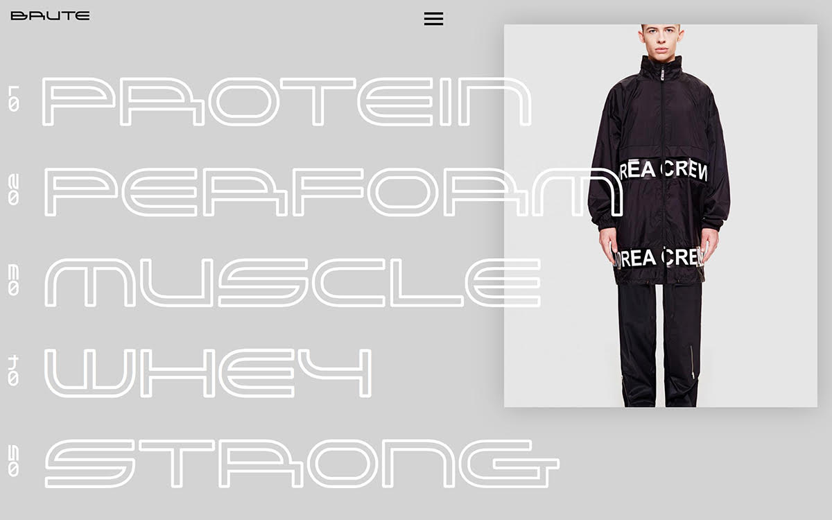
Twistudio gives this sportswear and supplement brand a lean, high-performance look that lives up to its name. Against a cool grey backdrop, a stack of oversized outlined display words — Protein, Perform, Muscle, Whey, Strong — marches down the left in a futuristic hollow typeface, each numbered from 01 to 05. To the right, a stark product photograph of a model in a black “Area Crew” tracksuit grounds the composition, while a tidy Brute wordmark and menu keep the interface sharp. The bold, monochrome treatment makes it a striking exercise in typography and web design.
Credits: Twistudio
More in Fashion Websites
Stay on top of this week's design. Insights, top picks & more.