Plus
Plus

 Menu
Menu


Studio So
February 16, 2017
Mindsparkle Mag


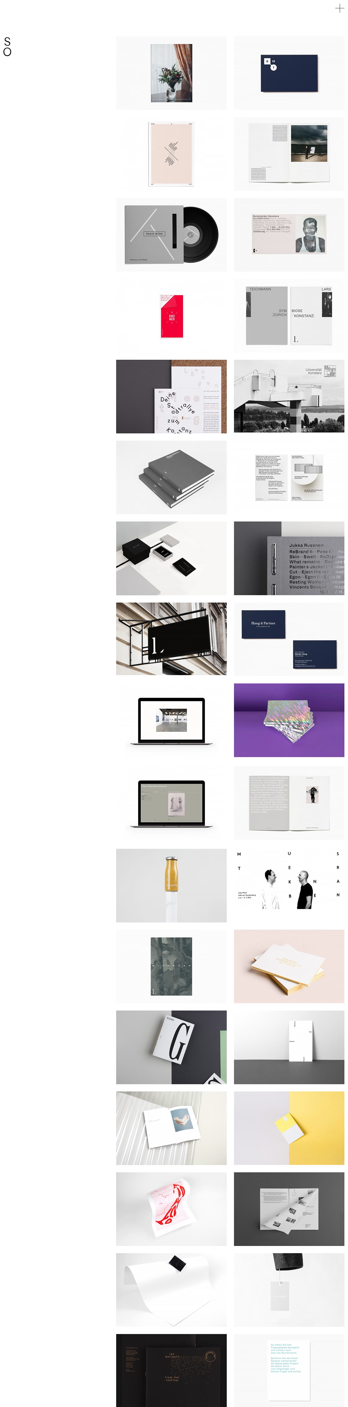
Studio So presents its own work through this crisp, gallery-like portfolio built around a calm two-column grid on studio.so. A minimal S O monogram sits in the corner while an extended scroll of branding, editorial and print projects unfolds in soft neutral tones and considered white space. The restrained layout keeps attention squarely on the craft of each case study, from stationery systems to publication spreads. It is a beautifully disciplined showcase that mirrors the studio's own attention to detail, blending assured branding with polished graphic design.
Stay on top of this week's design. Insights, top picks & more.