Plus
Plus

 Menu
Menu


Ken Mah
September 28, 2019
Mindsparkle Mag


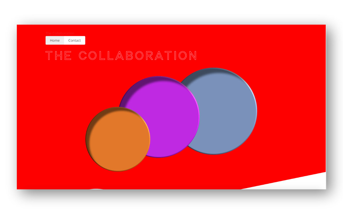
Ken Mah keeps The Collaboration landing page bold and beautifully simple, flooding the screen with a single vivid red. Three glossy, embossed circles in orange, magenta and slate-blue overlap at the centre like tactile buttons, giving the flat colour field a surprising sense of depth. A finely outlined "The Collaboration" wordmark and a minimal Home/Contact navigation let the composition breathe, while an angled white cut slices across the lower corner for a touch of dynamism. The result is confident and graphic, trusting colour and shape to carry the whole experience. A punchy little study in web design and colour.
Stay on top of this week's design. Insights, top picks & more.