Plus
Plus

 Menu
Menu


subsense
August 05, 2019
Mindsparkle Mag


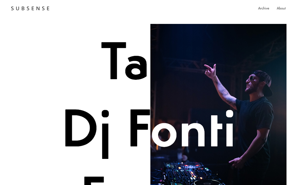
subsense presents its studio work through a spare, typographically driven layout that lets the content take centre stage, live at subsense.io. Against clean white space, oversized black display letters spell out project titles that overlap a moody photograph of a DJ mid-set, bathed in blue stage light. The minimal navigation — just Archive and About — signals a confident, archive-first approach where the imagery and type do the talking. It is understated and contemporary, the kind of restrained design that reads as effortless. A polished portfolio built on strong typography and striking web design.
Credits: subsense
More in Design Agency
Includes freebie bundle, unseen BTS insights and more.