




Black Friday 50% off Plus
Unlock InsightsBlack Friday 50% off Plus
Unlock Insights Menu


Studio Oker
October 01, 2019
Mindsparkle Mag


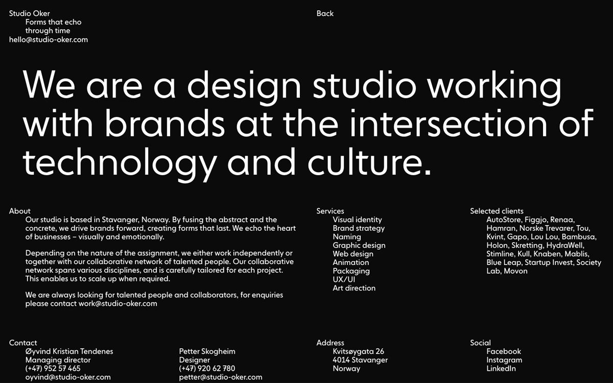
Studio Oker, based in Stavanger, Norway, states its purpose in enormous white type across a confident black page: "We are a design studio working with brands at the intersection of technology and culture." The layout is unapologetically typographic, letting a single bold sans-serif statement dominate before neat columns lay out services, selected clients and contact details. The restrained monochrome palette and precise grid feel serious and grown-up, echoing the studio's tagline "Forms that echo through time." Everything is calm, legible and deliberately understated, putting the words and the work first. It is disciplined typography and assured branding in equal measure.
Credits: Studio Oker
More in Design Agency
Stay on top of this week's design. Insights, top picks & more.
 Plus