Plus
Plus

 Menu
Menu


Stereo
August 01, 2019
Mindsparkle Mag


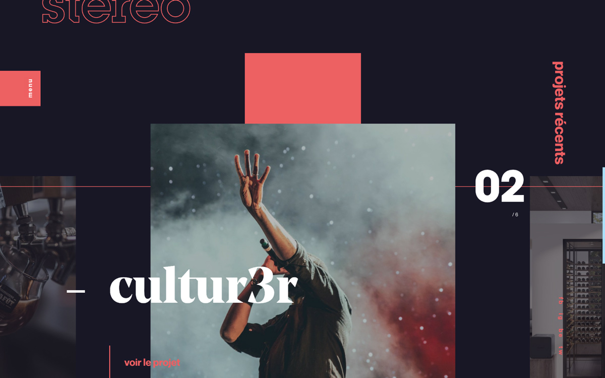
Stereo introduces its recent projects at stereo.ca with a dark, cinematic layout accented by a single punch of coral red. An outlined "stereo" wordmark sits quietly in the corner while a large framed concert photograph — a performer reaching into a haze of smoke and red light — anchors the composition, overlaid with an elegant serif project title, "cultur3r". Vertical French labels, a "02/6" counter and crisp geometric blocks give the page a rhythmic, editorial structure. It is moody, stylish and well paced, balancing bold imagery against restrained type. A confident portfolio whose art direction and web design know exactly how to set a mood.
Credits: Stereo
More in Design Agency
Includes freebie bundle, unseen BTS insights and more.