Plus
Plus

 Menu
Menu


Surya Prasetya
November 13, 2019
Mindsparkle Mag


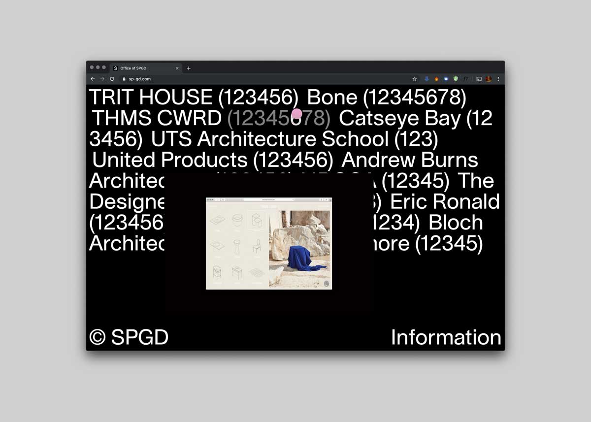
Surya Prasetya takes a boldly typographic approach to the Office of SPGD portfolio. Against a stark black background, a long white client list — Trit House, Bone, Catseye Bay, UTS Architecture School, Andrew Burns Architects and more — sprawls across the screen in heavy sans-serif, each entry paired with playful placeholder digits. A single small browser-window preview floats at the centre, hinting at the work beneath the index, while ‘© SPGD’ and ‘Information’ bookend the layout. It is confident, experimental typography and assured art direction in equal measure. See it at SPGD.
Credits: Surya Prasetya
More in Design Agency
Stay on top of this week's design. Insights, top picks & more.