Plus

 Menu


Qode Interactive
January 26, 2020
Mindsparkle Mag


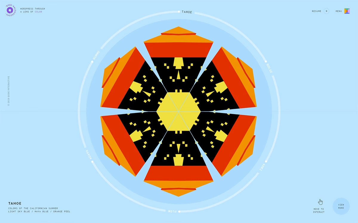
Qode Interactive created Qode Kaleidoscope, a playful experiment that looks at WordPress "through a lens of colour". At the centre of a light sky-blue page sits a large hexagonal kaleidoscope in orange, red, black and yellow, surrounded by a circular track of names such as Tahoe, Aoki, Flow and Agava. Each stop is a palette with its own story: Tahoe, for example, captures the colours of the Californian summer in light sky blue, maya blue and orange peel. A small "Move to interact" hint invites visitors to play, while spaced-out uppercase labels keep the interface light. It is a joyful piece of interactive design and a lovely tribute to the colour palette.
Credits: Qode Interactive
More in Design Agency
Stay on top of this week's design. Insights, top picks & more.