Plus
Plus

 Menu
Menu


OhDada
August 16, 2021
Mindsparkle Mag


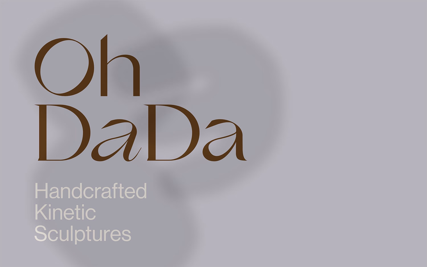
With OhDada, restraint becomes the whole mood. The landing page floats a soft, blurred organic shadow across a muted lavender-grey field, while the words “Oh DaDa” are set large in a warm brown, high-contrast serif whose alternating letterforms feel both classical and a little mischievous. Beneath it, the quiet line “Handcrafted Kinetic Sculptures” explains the craft in an understated sans, letting the typography and negative space carry the emotion. The pastel palette and gentle, almost weightless composition give Oh Dada a poised, gallery-like calm. It is a lovely study in how balance and beautiful typography can define a brand’s web design.
Credits: OhDada
More in Sustainable Branding
Stay on top of this week's design. Insights, top picks & more.