Plus
Plus

 Menu
Menu


Wyre
May 16, 2022
Mindsparkle Mag


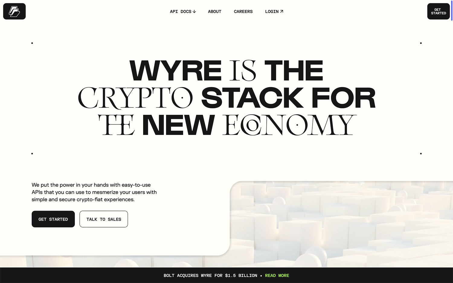
Wyre makes a bold statement with this landing page positioning the company as “the crypto stack for the new economy.” The hero leans on expressive, experimental lettering that blends heavy sans-serif and high-contrast serif characters, with playful target motifs tucked inside the O’s for an unmistakably contemporary feel. Set on a warm off-white ground with tidy corner marks, the composition feels editorial and self-assured, softened by a subtle 3D field of white blocks drifting in from the corner. Clean pill buttons and a compact top navigation keep the developer-facing message approachable. It is a confident exercise in display typography and type design.
Stay on top of this week's design. Insights, top picks & more.