Plus
Plus

 Menu
Menu


Sara Riedel, Ryan Wilson & Andrew Bromwell
October 04, 2021
Mindsparkle Mag


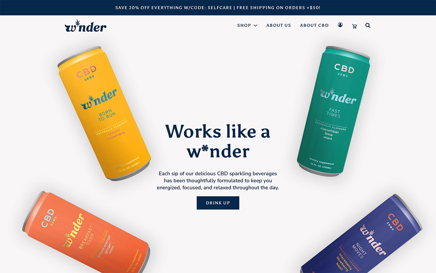
The trio of Sara Riedel, Ryan Wilson & Andrew Bromwell gives CBD beverage brand W*nder a bright, playful storefront. Four vividly coloured cans — sunny yellow “Born to Run,” green “Fast Times,” coral “Breakfast Club” and deep purple “Night Moves” — pinwheel around a centred navy serif headline that reads “Works like a w*nder.” The clean off-white background and friendly navy type let the product photography and its cheerful packaging carry the palette. A simple promo bar and a punchy “Drink Up” button keep the ecommerce flow light and approachable. It is fresh, upbeat web design that makes the range feel every bit as refreshing as the drinks themselves.
More in E-Commerce
Stay on top of this week's design. Insights, top picks & more.