Plus
Plus

 Menu
Menu


Size
December 23, 2018
Mindsparkle Mag


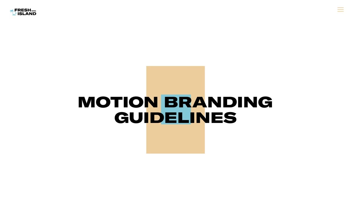
Size presents its motion branding guidelines for Fresh Island Festival with a title screen as bold and rhythmic as the system it introduces. Heavy black condensed capitals reading “Motion Branding Guidelines” sit over a warm sand-coloured panel and a small sky-blue accent block, with the festival’s palm-tree logo tucked neatly in the corner. It is a confident, stripped-back opening that hints at a lively, movement-driven identity beneath. The strong typography and sun-and-sea palette set exactly the right tone for a summer music event. A promising glimpse of considered motion design and brand thinking.
Credits: Size
More in Food & Beverage Branding
Stay on top of this week's design. Insights, top picks & more.