Plus
Plus

 Menu
Menu


MING Labs
October 31, 2016
Mindsparkle Mag


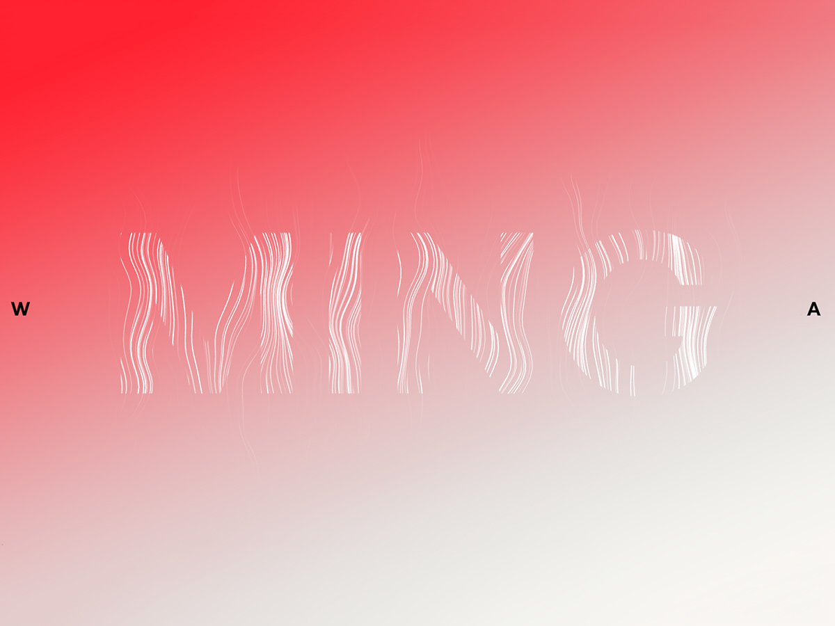
MING Labs opens with a striking, type-led hero: the studio’s name rendered in flowing, hair-like white strands that seem to drift across a soft red-to-white gradient. Lone letters anchor the edges of the screen, and the near-empty composition puts all the emphasis on motion and form. The effect is quiet but technically assured, hinting at the digital product studio’s craft. It is a confident, minimal piece of web design where a single animated wordmark and its typography carry the whole page.
Credits: MING Labs
More in Real Estate Branding
Includes freebie bundle, unseen BTS insights and more.