Plus
Plus

 Menu
Menu


schoener
May 09, 2017
Mindsparkle Mag


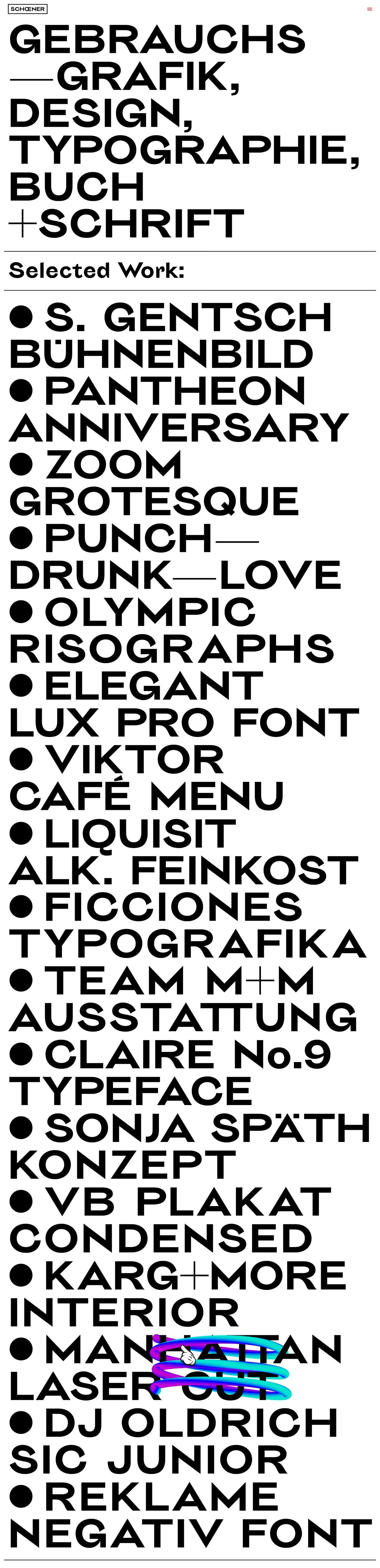
German studio schoener lets language do all the heavy lifting on wir sind schoener, a portfolio built almost entirely from oversized black grotesque type set on a clean white field. The homepage reads like an index, stacking a bulleted run of selected work — from stage design and typeface projects to Risograph prints and café menus — in confident, tightly leaded capitals. There is no imagery competing for attention here; the lettering itself, punctuated by bold dots and em dashes, becomes the visual identity. It is a disciplined celebration of typography and craft that trusts the alphabet to carry the whole experience. A single playful scribble of colour breaks the monochrome, a small wink in an otherwise rigorous piece of web design.
Credits: schoener
More in Design Agency
Includes freebie bundle, unseen BTS insights and more.