Plus
Plus

 Menu
Menu


Special — Offer
June 03, 2017
Mindsparkle Mag


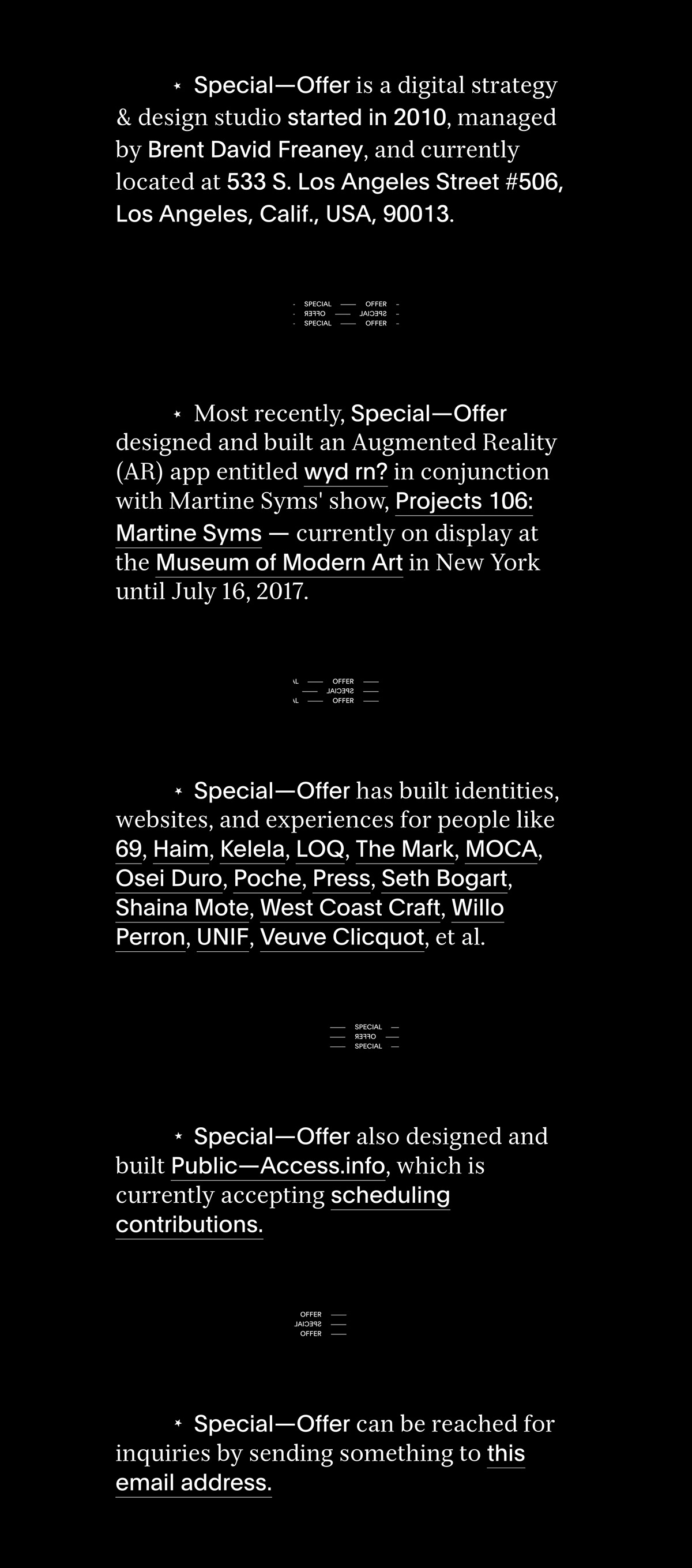
Special — Offer designed this striking single-page site as a quiet manifesto for their own Los Angeles design and strategy studio. Set against deep black, the layout leans almost entirely on beautifully mixed typography — a refined serif paired with a crisp sans — arranged in short, centred blocks that read like a printed statement. Small rotating “Special — Offer” wordmarks punctuate the scroll, adding rhythm and a touch of playfulness to an otherwise austere composition. It is confident, editorial web design that lets language and negative space carry the whole experience. A lovely example of a studio introducing itself with restraint and personality.
Credits: Special — Offer
More in Design Agency
Stay on top of this week's design. Insights, top picks & more.