Plus

 Menu


Kilo Kilo
August 09, 2018
Mindsparkle Mag


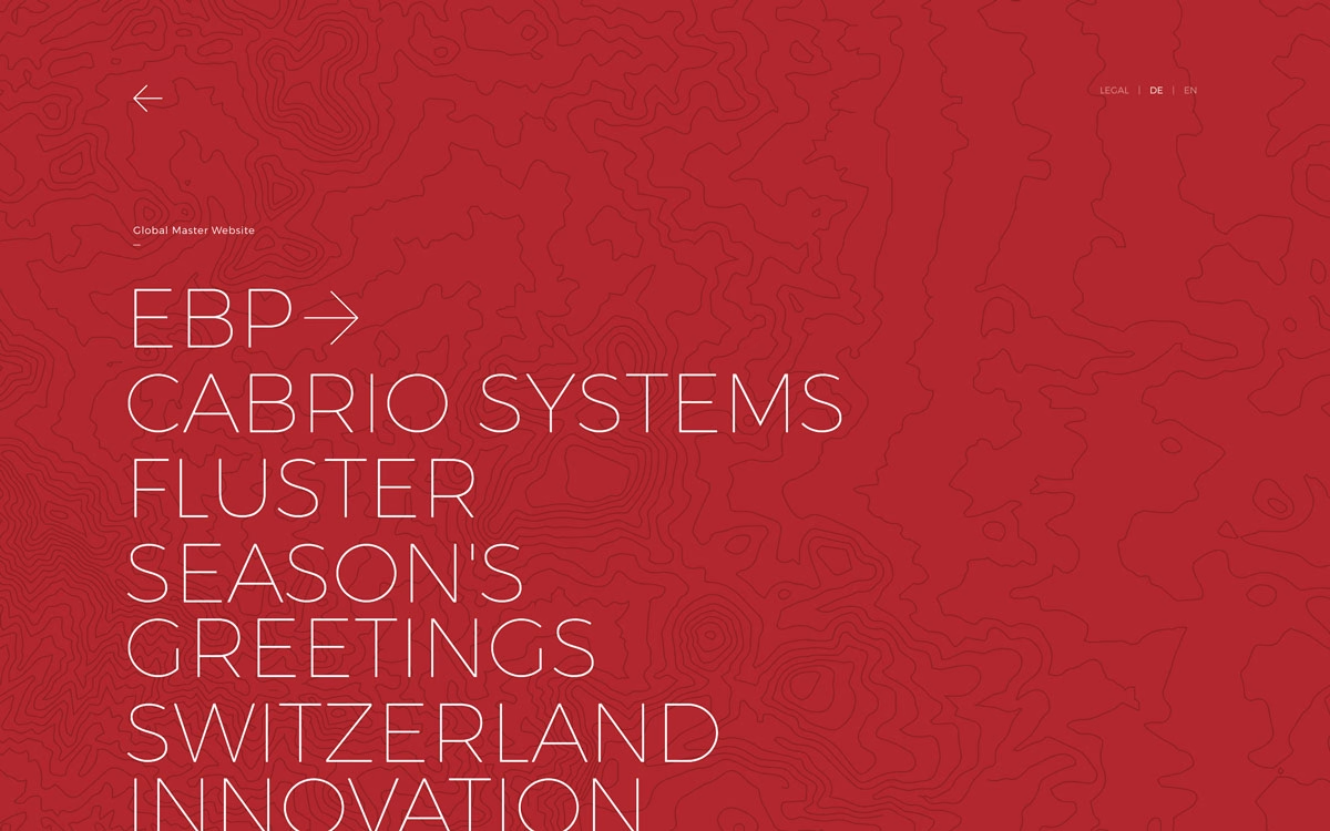
This is the studio portfolio of Kilo Kilo, and it wears its confidence beautifully. A deep crimson field is etched with faint topographic contour lines, over which oversized, hairline-thin outline lettering spells out project names like a slow, elegant marquee. The restraint of a single bold colour paired with that delicate, wide-set typeface feels both graphic and quietly luxurious. It is a striking lesson in how much presence typography alone can carry in web design. Take the full tour at kilokilo.ch.
Credits: Kilo Kilo
More in Design Agency
Includes freebie bundle, unseen BTS insights and more.