Plus

 Menu


Kidon Bae
May 30, 2019
Mindsparkle Mag


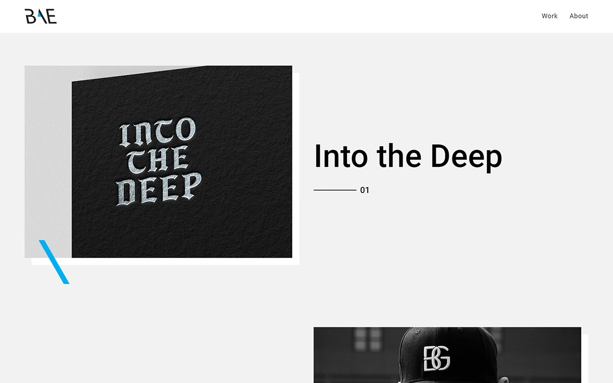
Kidon Bae’s portfolio opens with a clean, gallery-style layout that puts the work first against a soft grey backdrop. The featured piece, “Into the Deep”, shows warped blackletter lettering embossed on a textured black surface, its old-world character sharpened by a single electric-blue diagonal slash. A slim “BAE” monogram anchors the header, and numbered captions lend the scroll an orderly, editorial cadence. Plenty of breathing room around each project keeps attention on the craft of the type and identity work itself. It is understated, well-mannered web design whose expressive typography trusts the strength of the portfolio to speak for itself.
Credits: Kidon Bae
More in Design Agency
Stay on top of this week's design. Insights, top picks & more.