Plus

 Menu


Claudia Costantini
September 17, 2016
Mindsparkle Mag


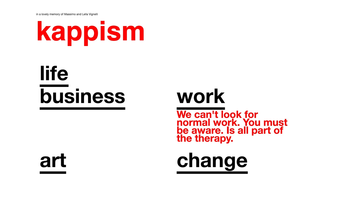
Claudia Costantini built Kappism as a stripped-back typographic tribute, dedicated “in a lovely memory of Massimo and Lella Vignelli”. The design is pure Swiss modernism: a crisp white field, a bold red “kappism” wordmark and a scatter of heavy black keywords — life, business, work, art, change — each underlined like a manifesto heading. A single red statement about work and therapy provides the emotional punch, proving how much personality can come from type alone. It is a confident, playful study in typography and web design that wears its Vignelli influence with pride. See it at claudia-costantini.com/kappism.
Credits: Claudia Costantini
More in Web Design
Includes freebie bundle, unseen BTS insights and more.