Plus

 Menu


Jean-Lou Renoux
April 22, 2019
Mindsparkle Mag


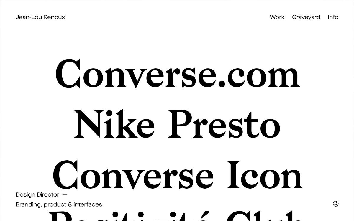
Design director Jean-Lou Renoux keeps his portfolio gloriously simple: a bright white page and an enormous serif list of projects. Names like Converse.com, Nike Presto and Positivité Club stack up in weighty, high-contrast type that fills the screen and doubles as the navigation itself. A slim top menu (Work, Graveyard, Info), a modest footer line — "Design Director, Branding, product & interfaces" — and a tiny smiley are the only adornments. It's a confident, type-led statement that lets scale and typography carry the whole editorial mood. See it at jeanlou.co.
Credits: Jean-Lou Renoux
More in Design Agency
Includes freebie bundle, unseen BTS insights and more.