Plus
Plus

 Menu
Menu


DIA
January 04, 2020
Mindsparkle Mag


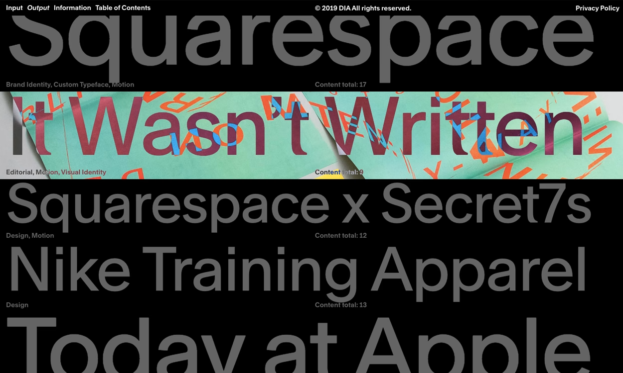
Design studio DIA turns its own index into a statement, letting oversized typography carry the entire experience on dia.tv. Projects for Squarespace, Nike and others are listed as bold headlines, each annotated with disciplines — brand identity, custom typeface, motion, editorial — and a running "content total" count that doubles as navigation. A flash of textured green imagery breaks through beneath the words "It Wasn't Written," hinting at the visual richness one click away. Set on deep black with a stripped-back top menu, it is assured, editorial and unmistakably type-led. A striking demonstration of how far confident typography alone can carry a portfolio.
Credits: DIA
More in Design Agency
Stay on top of this week's design. Insights, top picks & more.