Plus
Plus

 Menu
Menu


Daly
April 07, 2019
Mindsparkle Mag


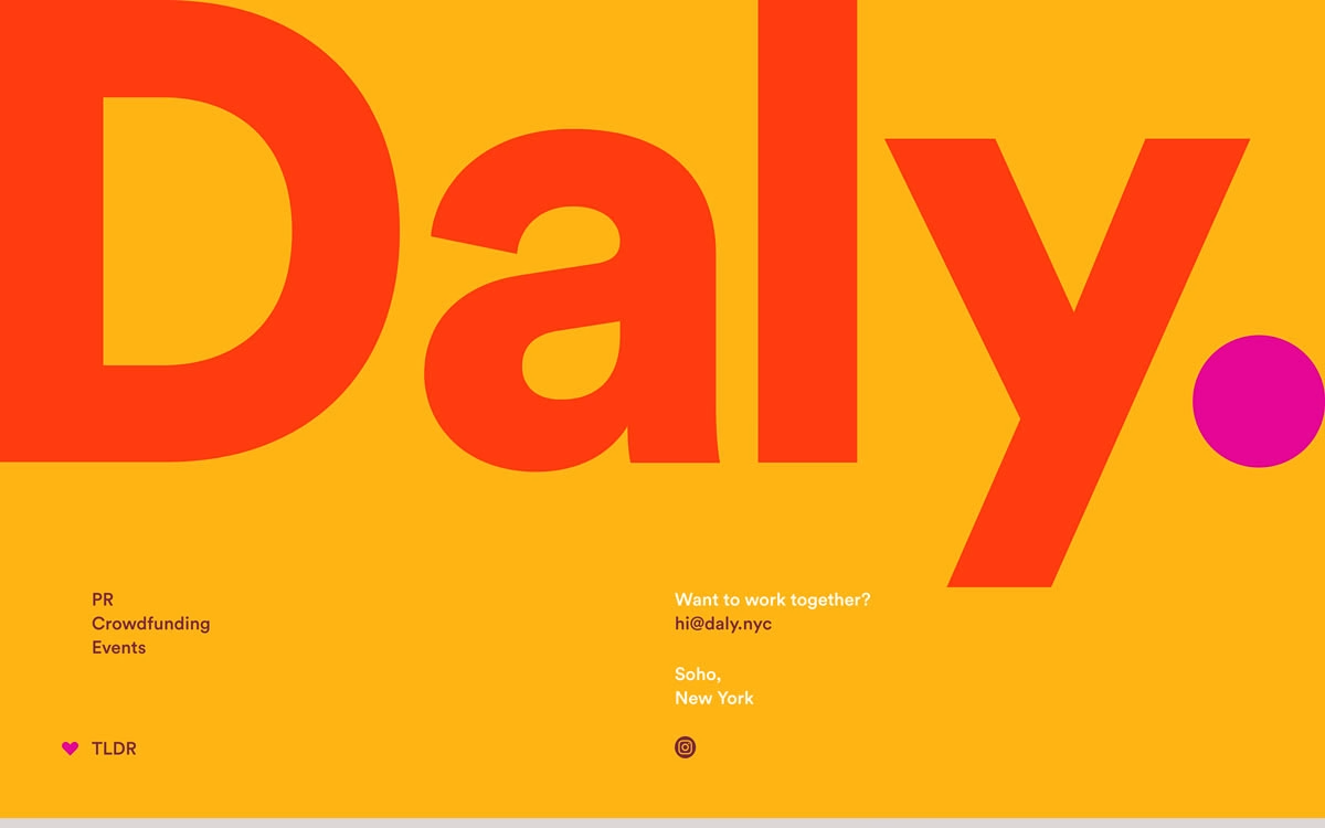
Daly keeps things gloriously bold and to the point on this single-screen site for the Soho, New York comms agency. A colossal coral-red “Daly.” wordmark fills a field of warm marigold yellow, its full stop echoed by a single magenta dot that adds a playful jolt of colour. Tidy supporting lines — PR, Crowdfunding, Events on one side, a friendly “Want to work together?” on the other — keep the whole thing purposeful and refreshingly uncluttered. It is a masterclass in doing more with less, leaning on scale and a punchy colour palette rather than decoration. Confident typography like this needs nothing else; take a look at daly.nyc.
Credits: Daly
More in Design Agency
Includes freebie bundle, unseen BTS insights and more.