Plus
Plus

 Menu
Menu


Compass Creative Studio
April 09, 2019
Mindsparkle Mag


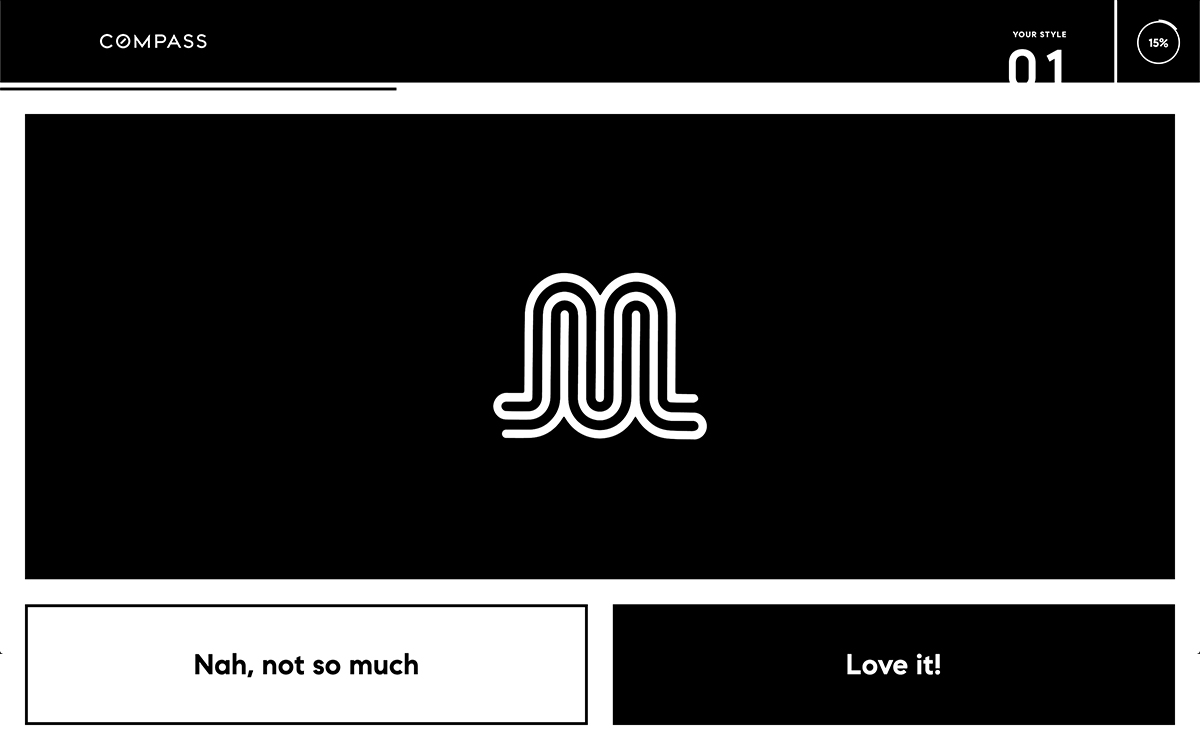
Compass Creative Studio turns the usually private business of choosing a logo into a game with the Compass Logo Workbook. The interface is stripped to a striking black-and-white system: a slim COMPASS wordmark, a “Your Style 01 — 15%” progress marker, and a single hero card holding one looping monoline mark at a time. Below it, two blunt buttons — “Nah, not so much” and “Love it!” — invite a quick gut reaction, building a swipe-style quiz that learns your taste. It is a smart, confident piece of interaction that makes logo design feel approachable and fun. The high-contrast layout and generous negative space keep every mark centre stage, a tidy example of interactive design in service of branding.
Credits: Compass Creative Studio
More in Design Agency
Includes freebie bundle, unseen BTS insights and more.