Plus
Plus

 Menu
Menu


Negative
January 02, 2020
Mindsparkle Mag


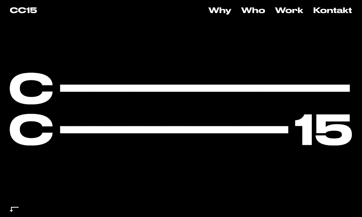
Studio Negative strips things right back for CC15, and the confidence shows. Against pure black, two heavy white "C" letterforms stretch into long horizontal rules that reach across the screen to meet a bold "15", turning the logo itself into the entire composition. A tight German-language menu — Why, Who, Work, Kontakt — sits quietly up top, leaving the typography all the room it needs. The stark monochrome palette and precise, almost architectural spacing give the page a cool, Swiss-inflected rigour. It is disciplined, high-contrast web design that proves how much presence restraint can command.
Credits: Negative
More in Design Agency
Stay on top of this week's design. Insights, top picks & more.