Plus
Plus

 Menu
Menu


Cards Against Humanity
November 22, 2021
Mindsparkle Mag


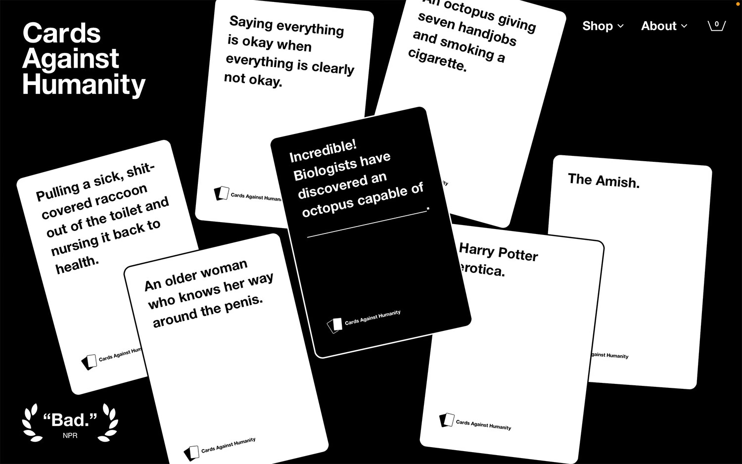
The website for Cards Against Humanity is every bit as blunt and irreverent as the party game it sells, and gleefully so. Set on a stark black background, a fan of the brand's signature black-and-white cards tumbles across the screen at jaunty angles, each one delivering the game's trademark deadpan humour. A big, no-nonsense bold wordmark sits top-left beside a minimal shop menu, while a tongue-in-cheek one-word 'Bad.' pull-quote from NPR adds to the joke. The strict monochrome palette and heavy typography give it a confident, brutalist edge. It is cheeky, unmistakably on-brand web design that knows exactly what it is.
Credits: Cards Against Humanity
More in E-Commerce
Includes freebie bundle, unseen BTS insights and more.