Plus

 Menu


A Color Bright
February 18, 2020
Mindsparkle Mag


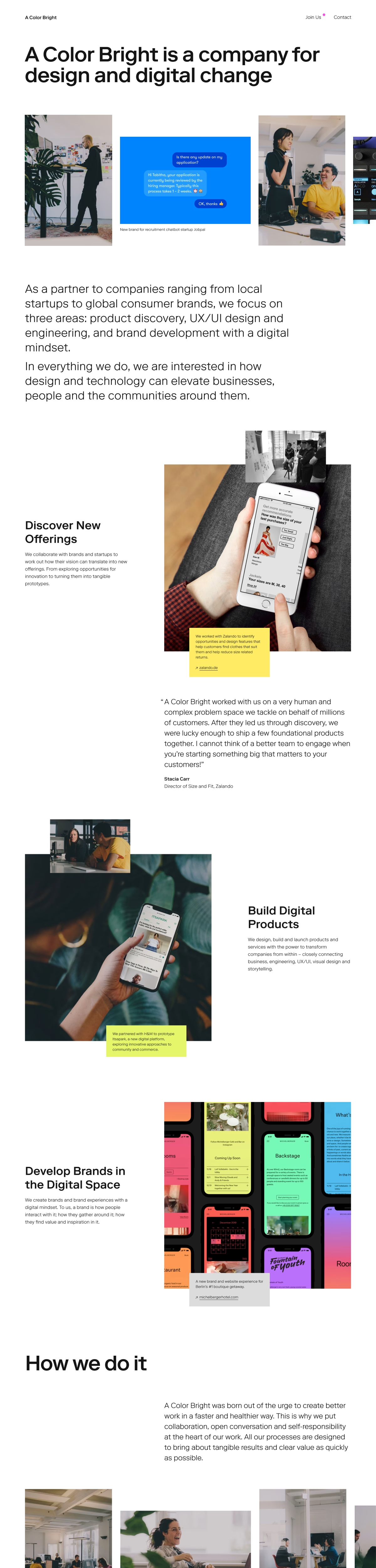
A Color Bright turned its own studio site into a quietly confident piece of editorial web design, where crisp black headlines sit on generous white space and offset photography drifts through an asymmetric grid. Phone mockups are pinned into the layout at angles, each one tagged with a small note in highlighter yellow or acid lime that explains the collaboration behind it. A client quote is given room to breathe in large, unhurried type, so the page reads as a scroll through the studio’s thinking rather than a sales pitch. The restraint is deliberate: colour appears only where it marks a piece of work, and everything else stays calm, legible and generously spaced. It is a clear-headed showcase of ux design presented with real editorial care, and you can see it in full at acolorbright.com.
Credits: A Color Bright
More in Design Agency
Stay on top of this week's design. Insights, top picks & more.