 Plus
Plus

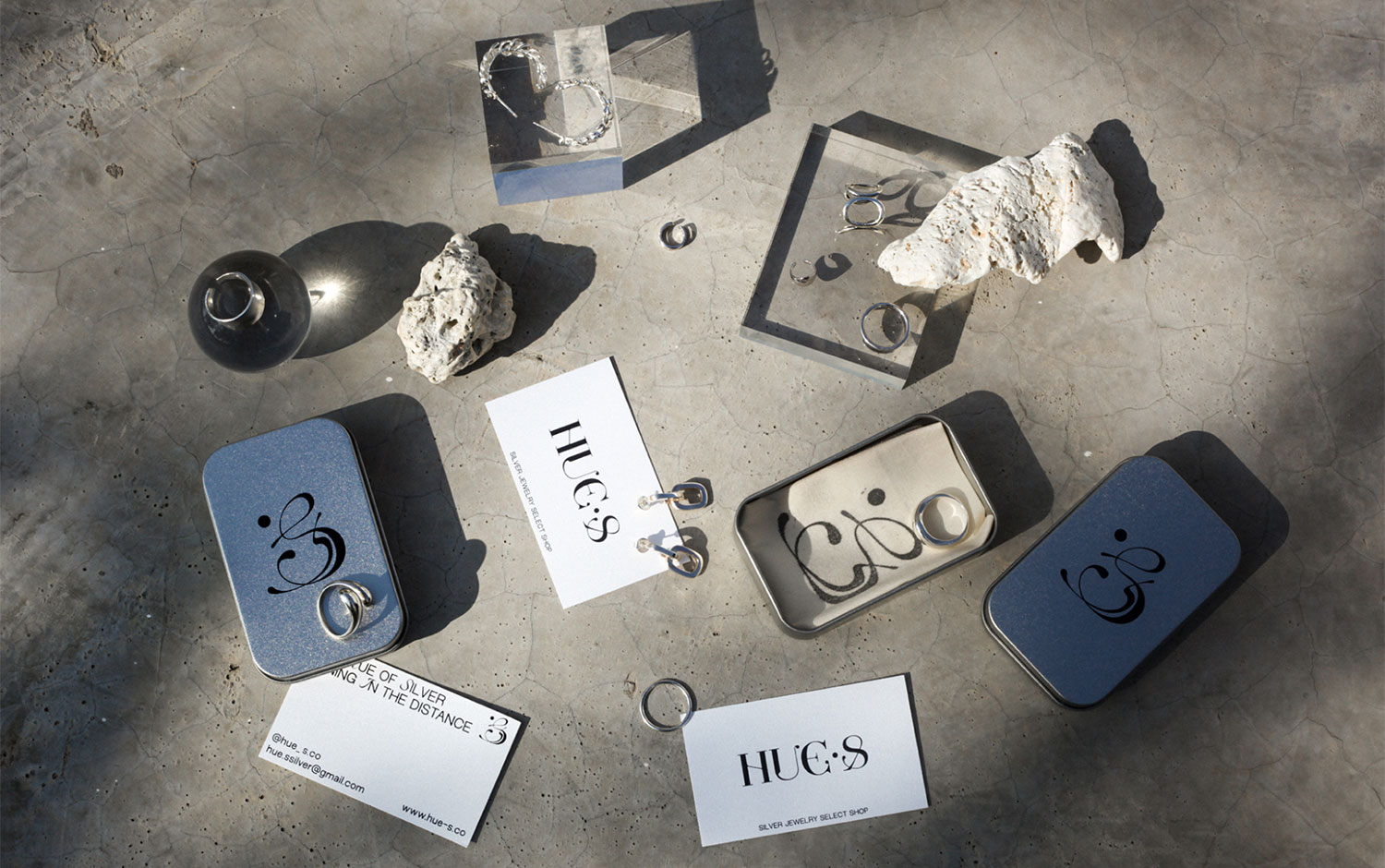
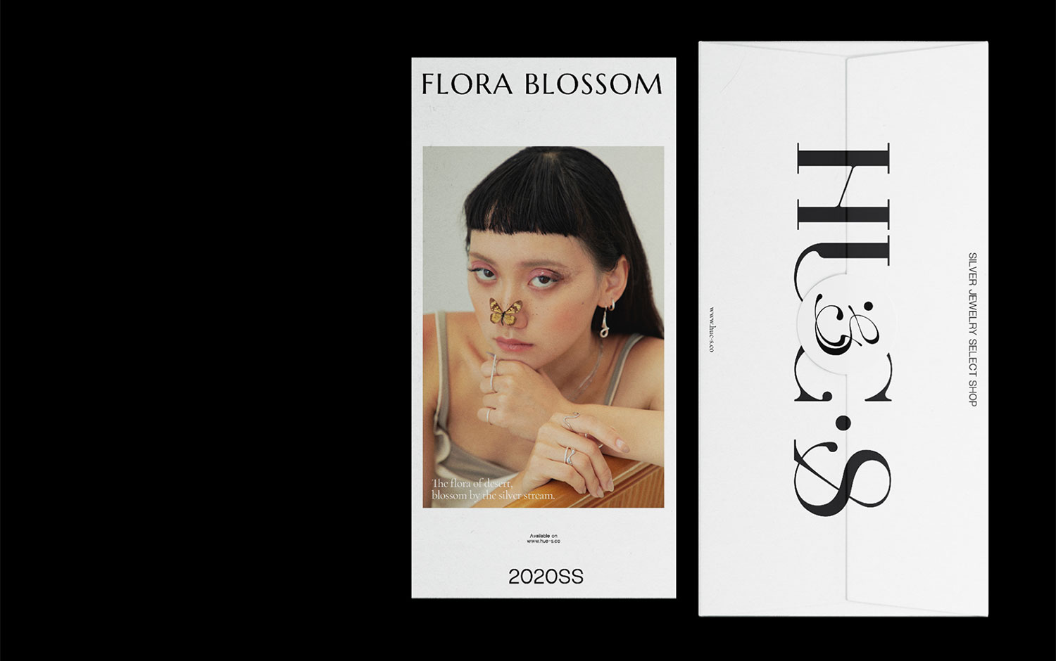
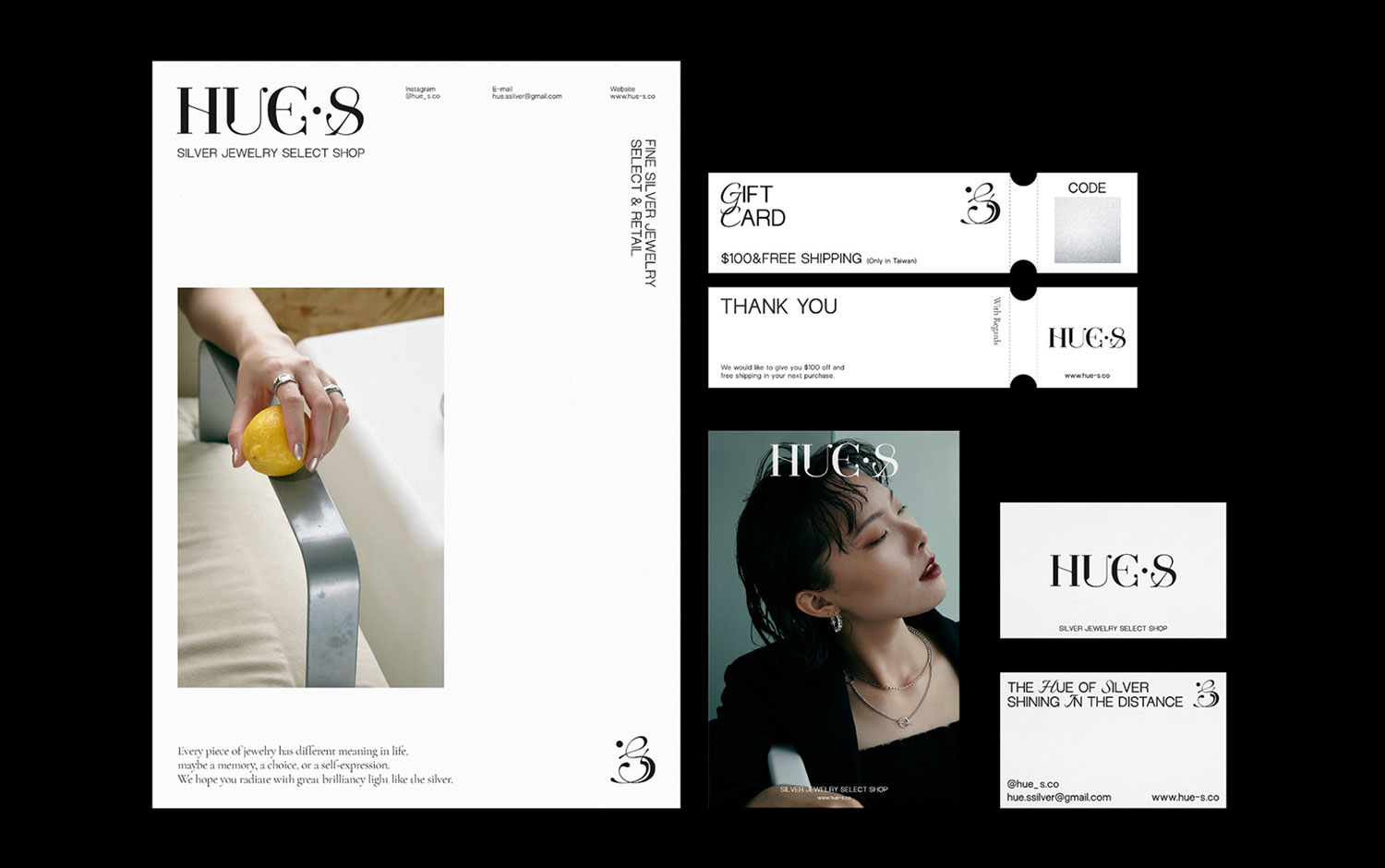
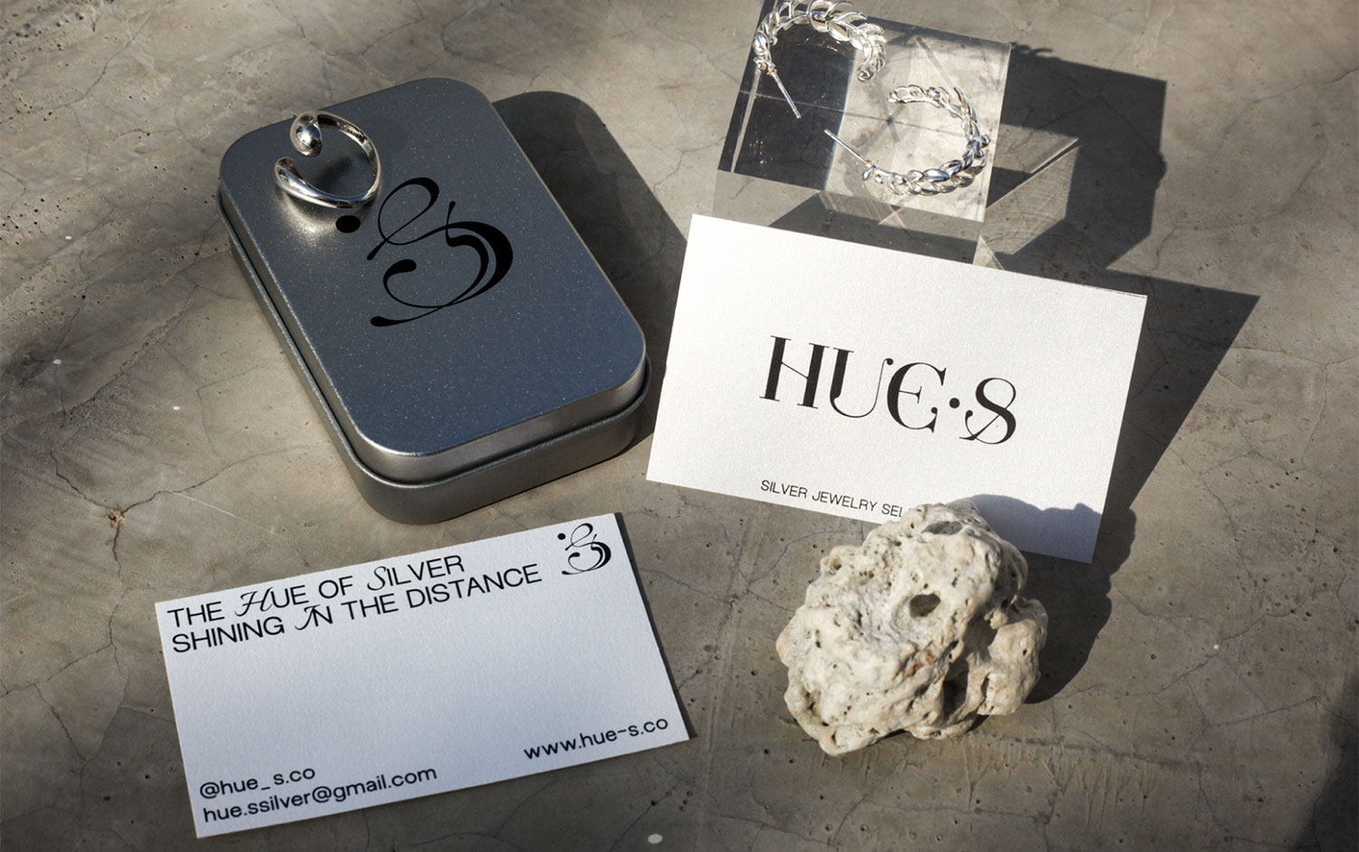
Back in 2021, we've featured some beautiful jewelry packaging and branding designs. In continuance with that line, we've come across HUE.S' project again! We've remembered its eye-catchy, serif font from our Top 10: Jewelry Packaging. It's a cool feature for January's design inspiration. The design studio involved with HUE.S is/u00a0aether3 Creative./u00a0
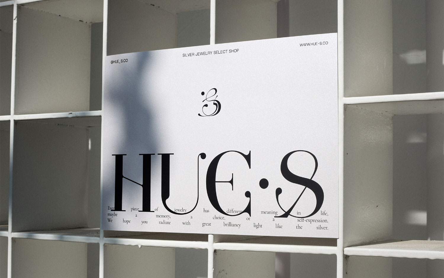
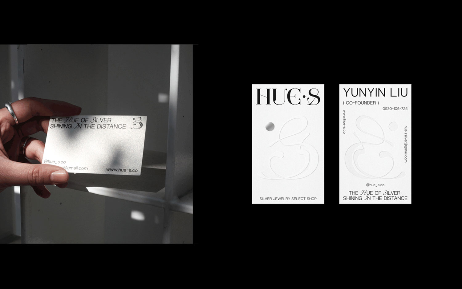
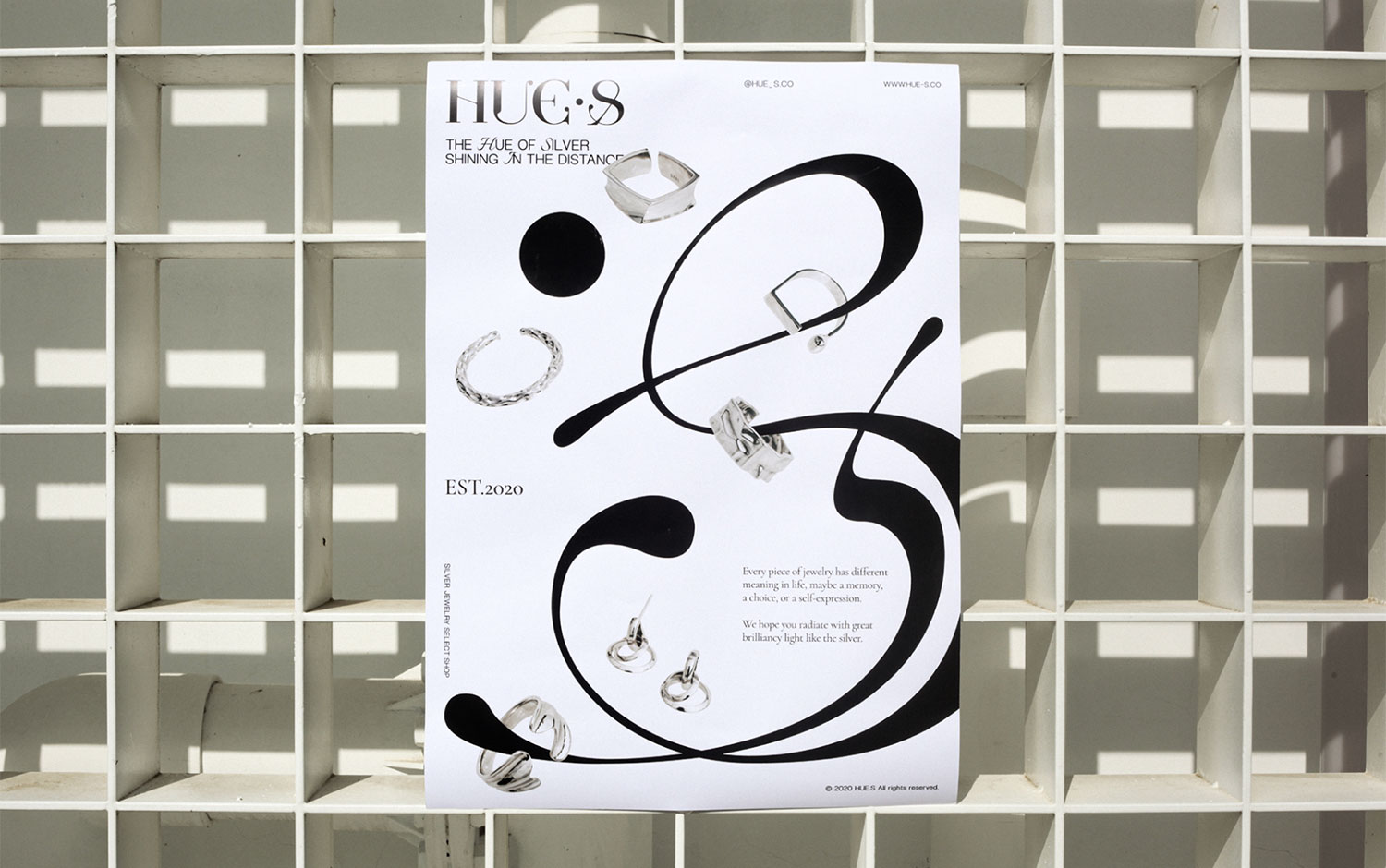
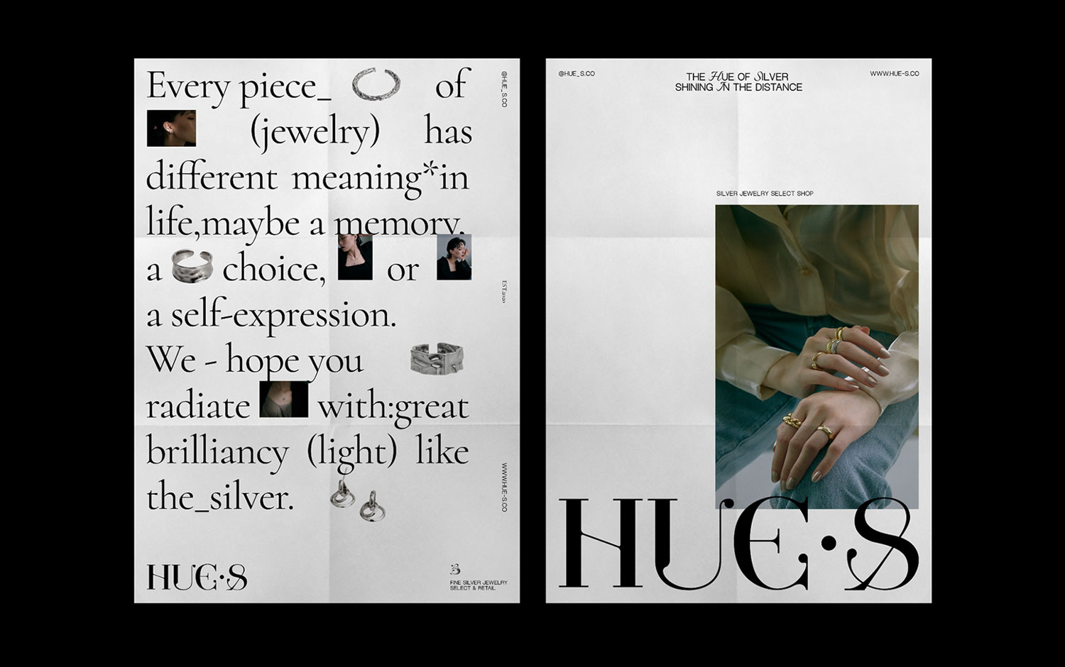
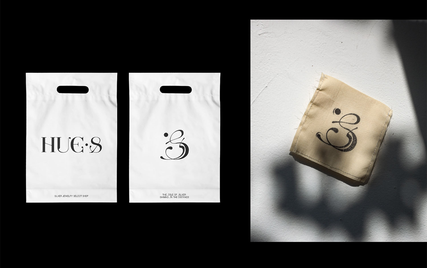
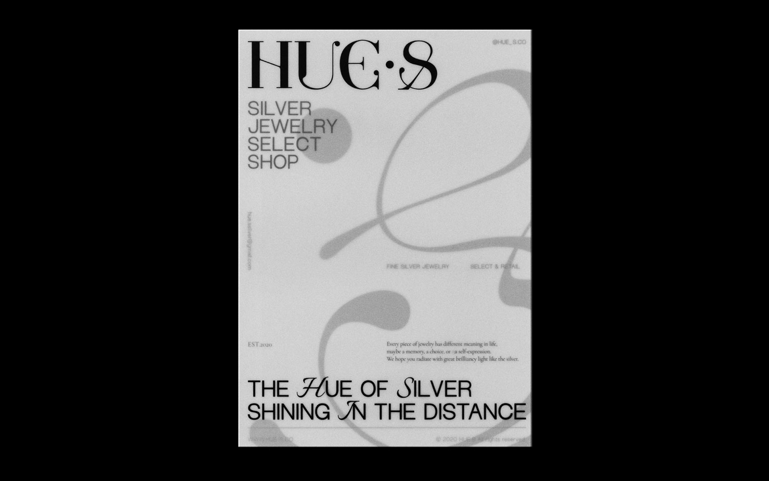
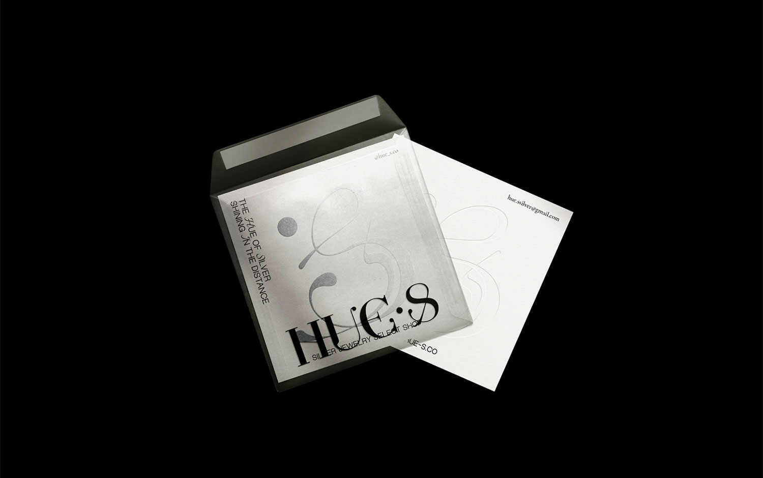
Jewelry is unique, and each piece tells a different story regardless of its design. The meaning we give to our timeless possessions varies; it might be a memory, a choice, or a representation of our essence. Located in Taiwan, the brand creates beautiful silver pieces carefully curated. Everything they do, they do it online! Both in English and Latin, silver means shinning and brilliance. HUE.S integrates the meaning of Hue and Silver; this comes to life with an ampersand and its typographic logo. Plus, the creative team designed a clean and contemporary concept that perfectly adapts to the brand's values./u00a0
All in all, HUE.S hopes customers radiate with great brilliancy light like the silver. We're in love with the creative team's choice to go bold on a serif type and put it in the spotlight, even though the ampersand sign doesn't literally appear on HUE.S naming. However, it accurately represents the brand's connection between shining and brilliance./u00a0
Creator: aether3 Creative
