


Kevin Davies & Leo Cao
September 12, 2021
Mindsparkle Mag


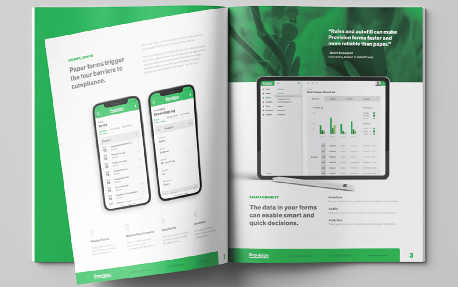
Today we're featuring Provision Analytics branding design by Kevin Davies. The company is a B2B software for food safety record keeping, founded in 2018. They were looking for a refreshing image to help them win trust among a market of late adopters. When this project began, 90% of the food industry still used paper and spreadsheets for food safety. Kevin unified the brand and UI in a crossover design system, reducing the learning curve for prospects between Provision’s promotion and its product trial.
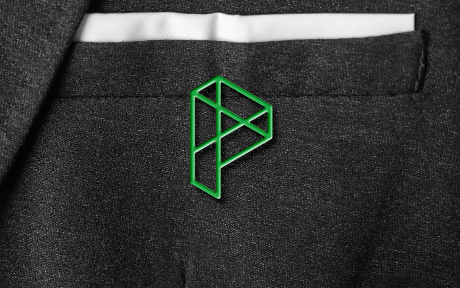
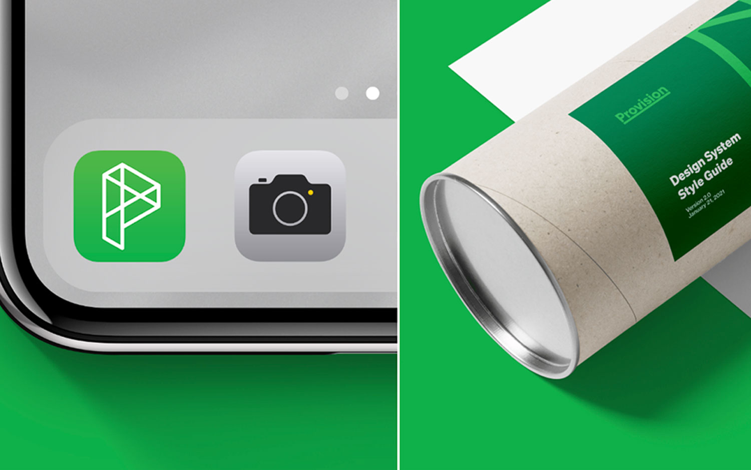
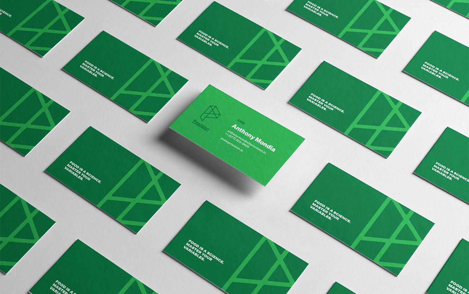
Provision’s new logo is based on geometric graph theory diagrams, evoking the product's notable traceability feature. The logo scales up into an abstract pattern, which appears throughout the identity. It maintains the prior logo’s 30-degree angles and rounded edges to create continuity. The brand identity introduces a type and color system used throughout the product. The project began with UX information architecture, remapping the navigation, page hierarchy, and workflow patterns. So, the UI changed into an atomic system. The left-hand page stack uses the z-index as a visual breadcrumb. Designers selectively used the resource of contrast; it’s low in tables thanks to white dividing lines and high on active fields that use a thick line in the signature green. Harmony in element sizing creates a sense of order and symmetry; the height of rows and domains matches the width of icon buttons and collapsed navigation. The crossover design system doubled the usability score among Provision users, increasing the Net Promoter Score by 100 points. Provision's signed revenue tripled within seven months.


Credits: Kevin Davies & Leo Cao


