


form & function
November 24, 2021
Mindsparkle Mag


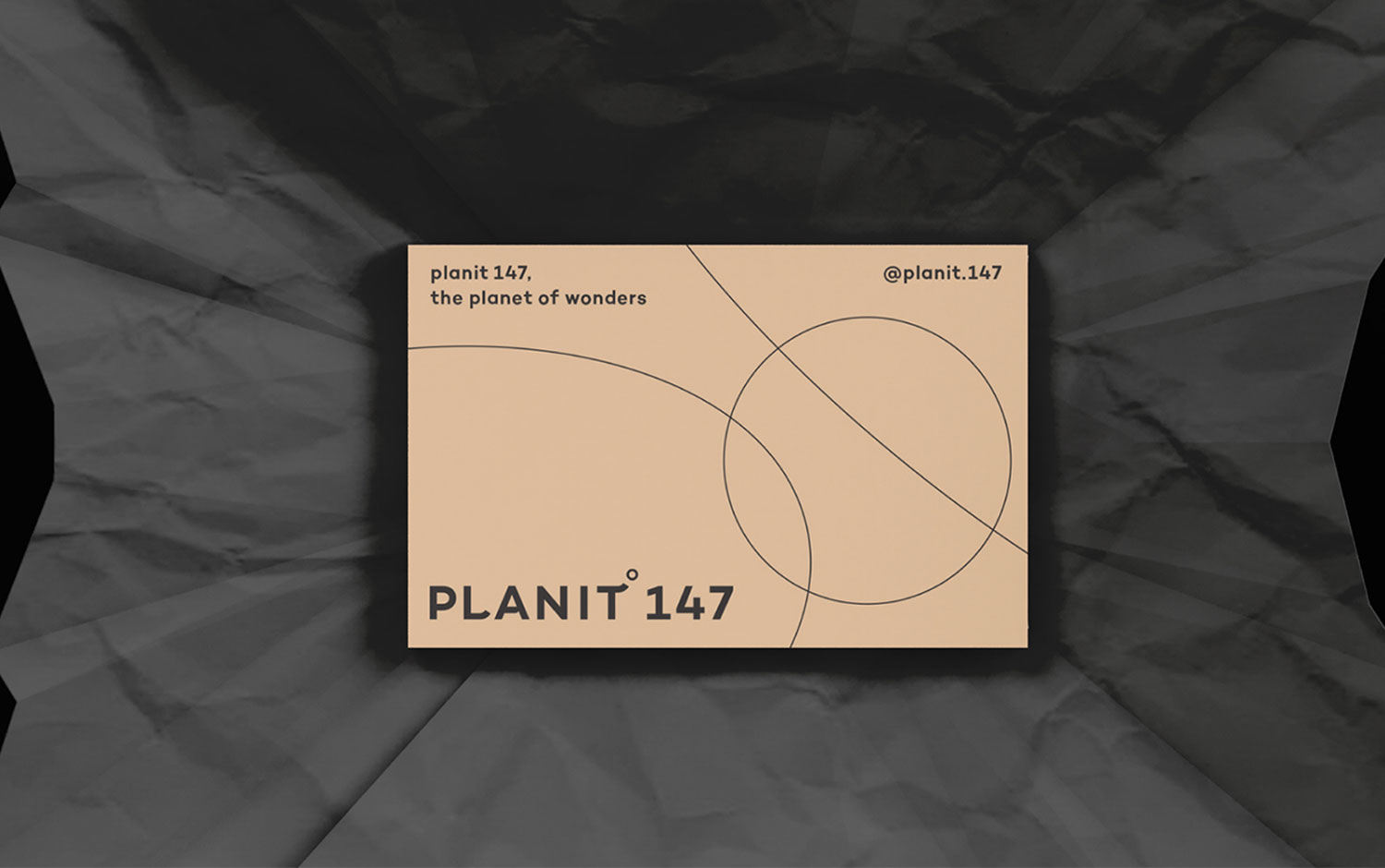
Today, we're presenting a project, particularly a skincare one, out of this world. Planit 147's values revolve around the beauty of the process, cosmetic planets, which here we alert a word game, and pureness. The brand asked Form & Function, a Seoul-based design studio, to think, design, and prototype its visual identity. Also, their cute motto says they relate a form and its function for the people's smile :)
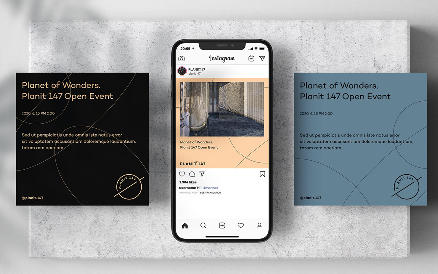
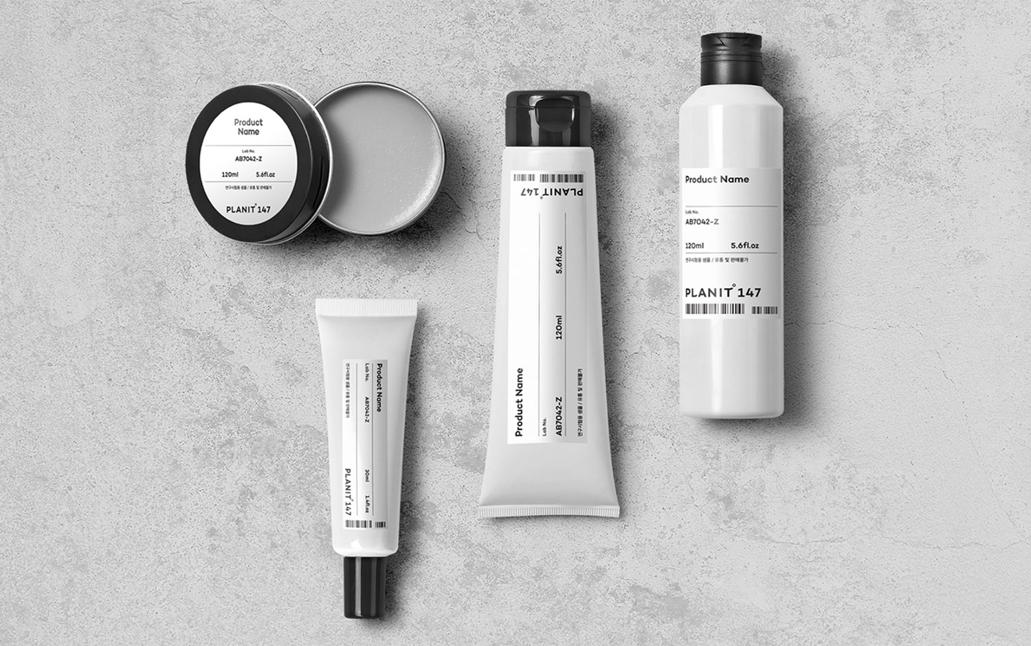
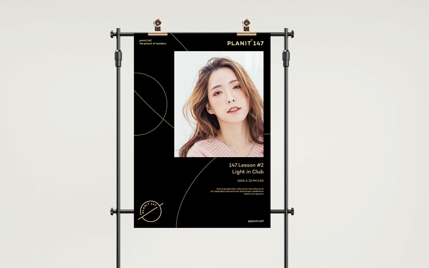
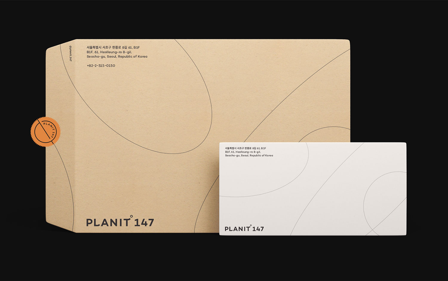
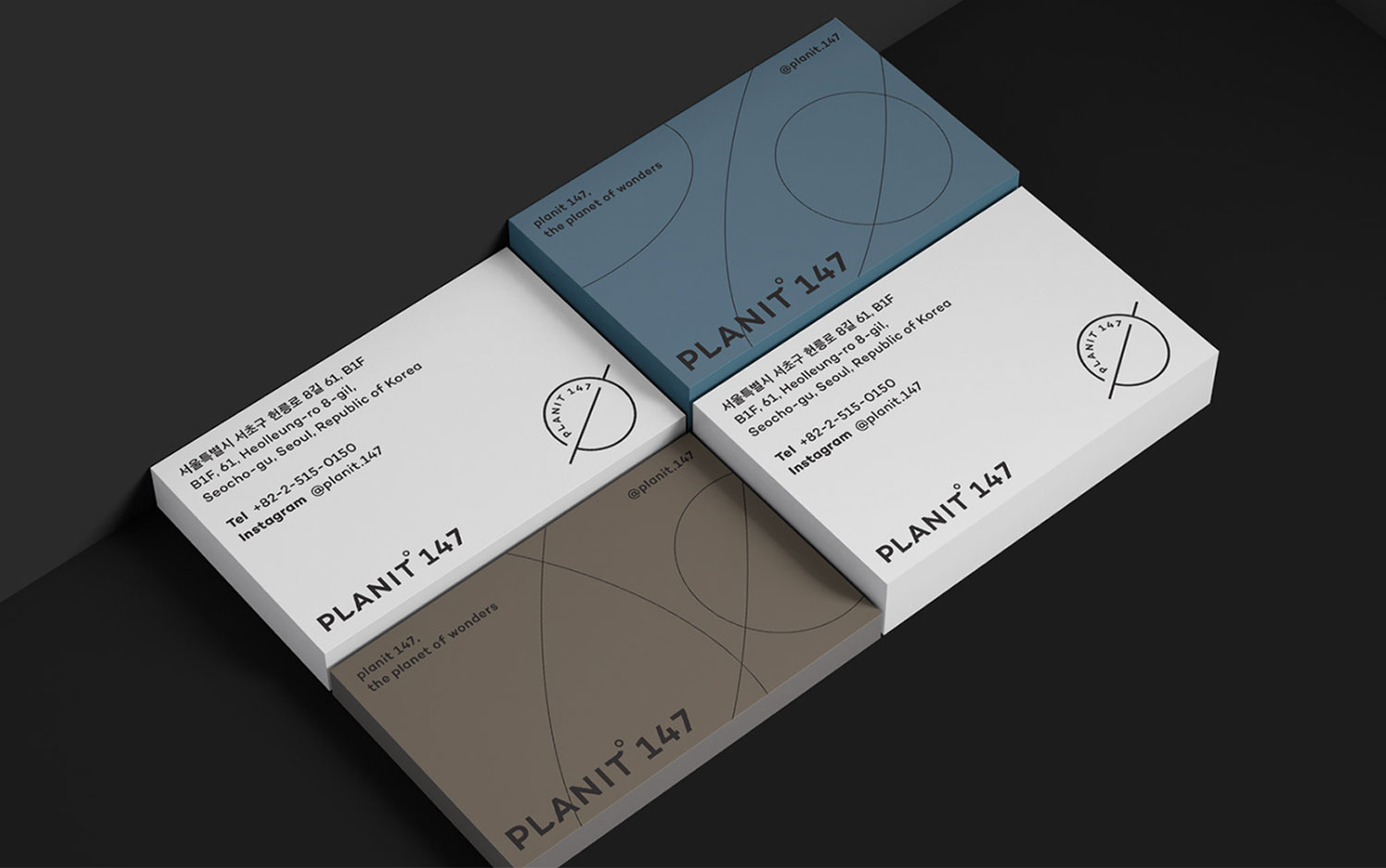
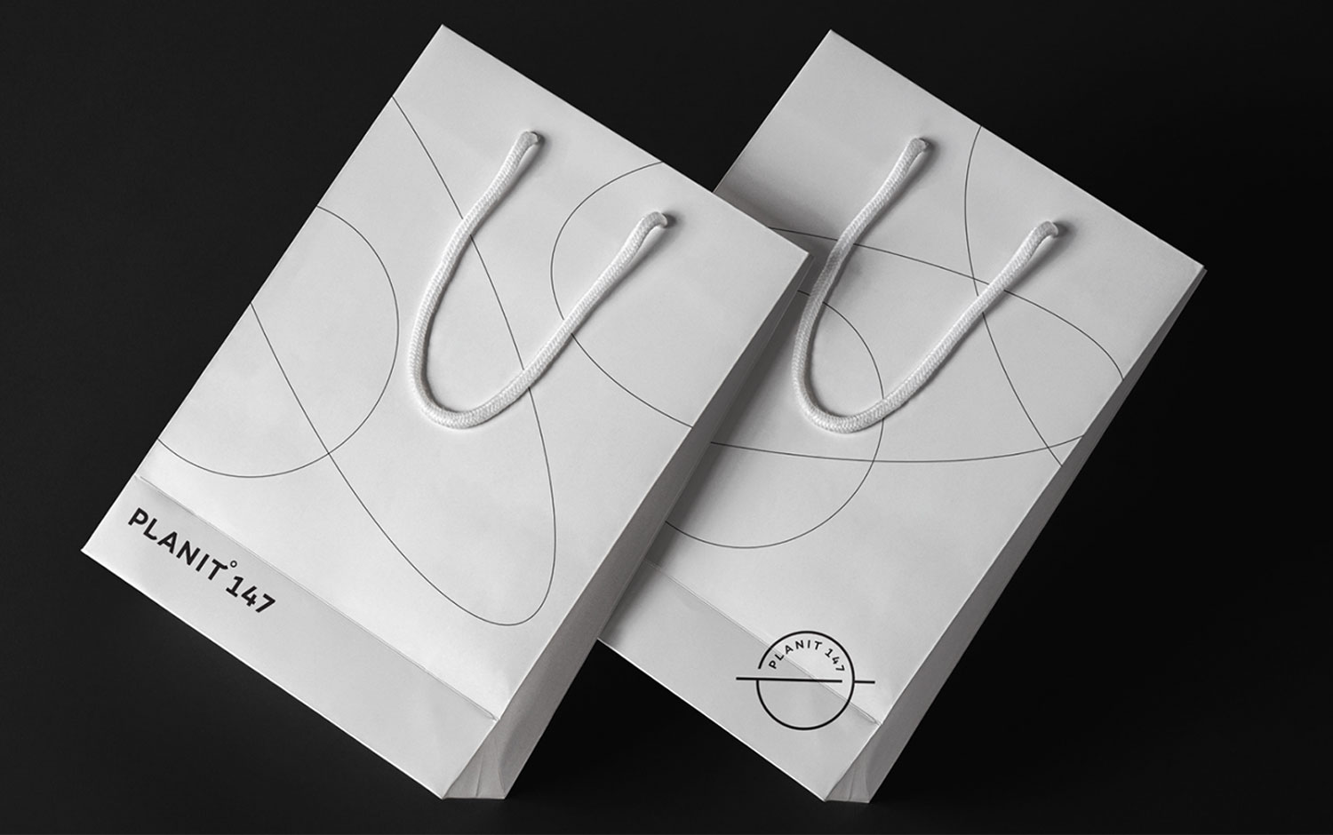
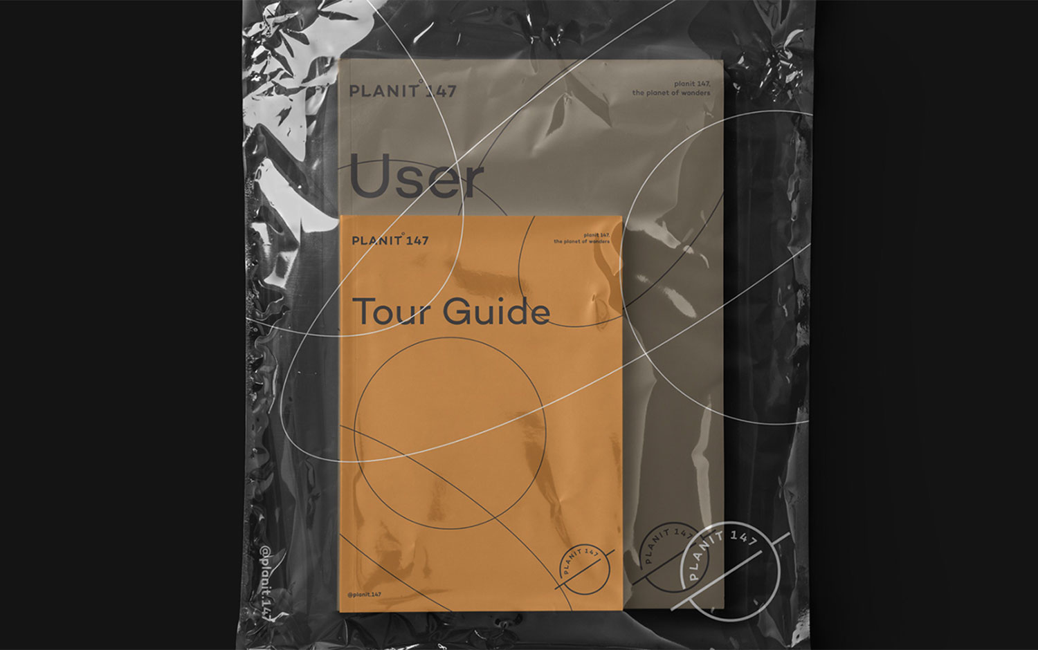
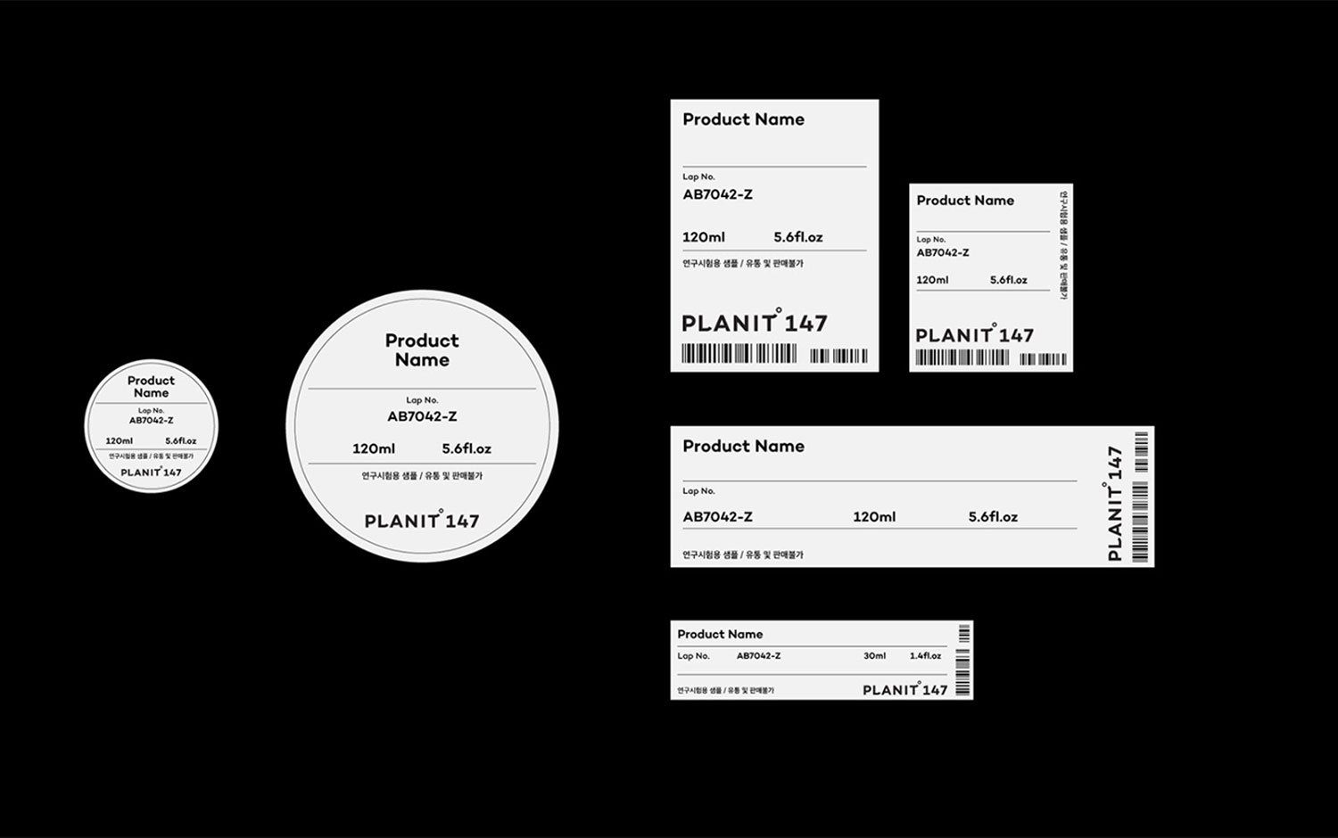
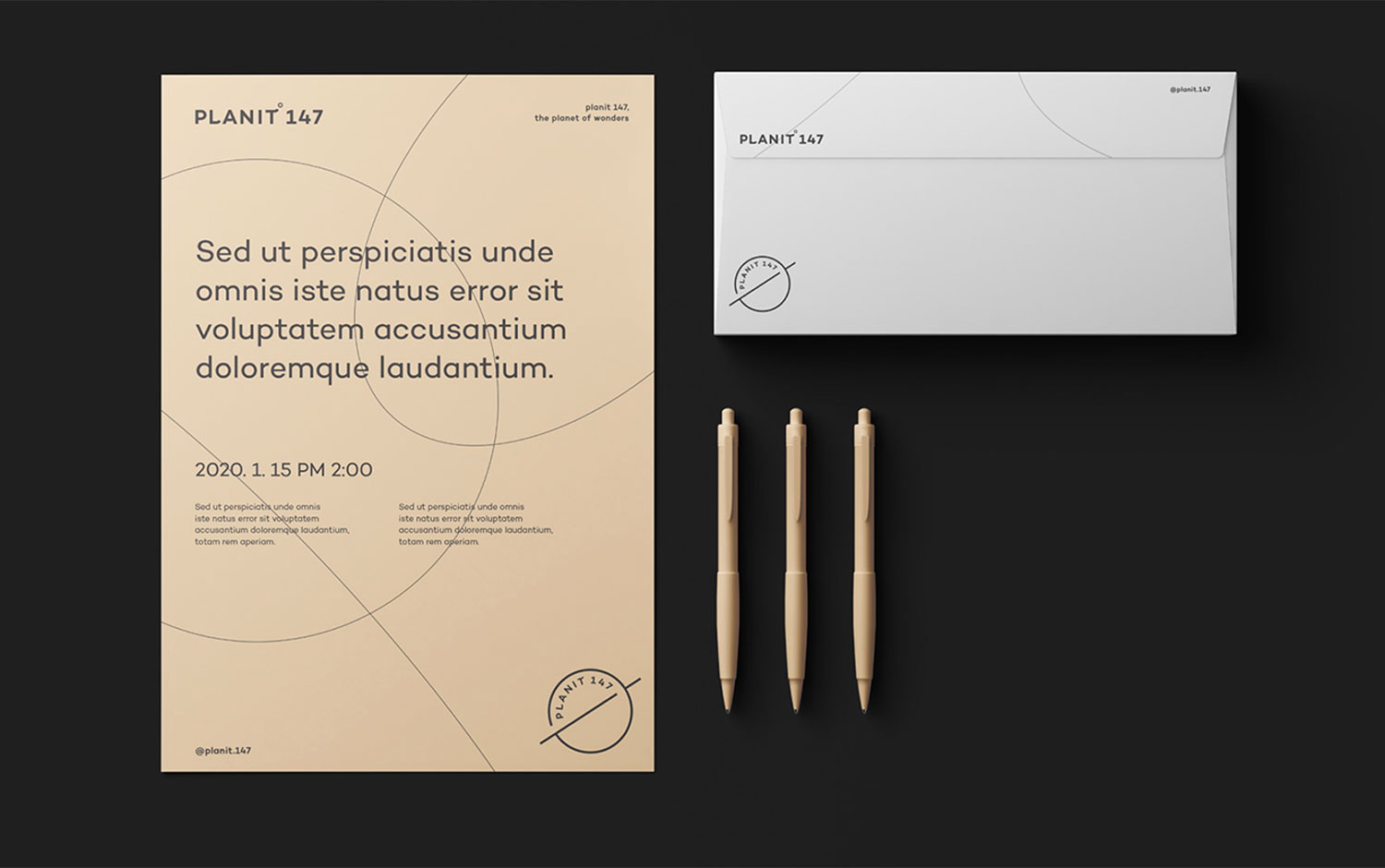
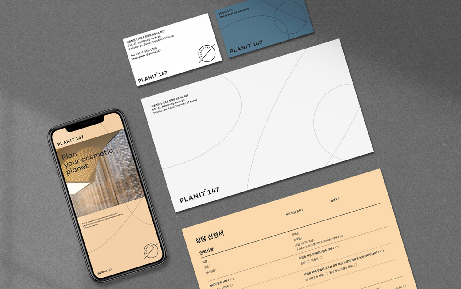
Designers came up with a soft and pale color palette, which gives a mystic and wondering feel. Also, they combined it with extra thin strokes, with elliptical and circular shapes in dynamic compositions. Like apps today, this design project has a light and dark mode, with which we're in love. For the logo design, Form & Function's designers created customized typography. And they intervened the circle, adding a Saturn-like appearance which Planit 147 project not only consisted of the impeccable stationery design but for the product's packaging. Their labels also have a minimalistic aesthetic featuring black and off-white colors.
All in all, we're amazed by Planit 147's visual identity. Moreover, its branding is super powerful and takes the protagonist side in comparison to the product's exterior, which seems to be a ticket for outer space ;) Would you travel to the moon if possible?
Credits: form & function


