


Brand Brothers
July 14, 2021
Mindsparkle Mag


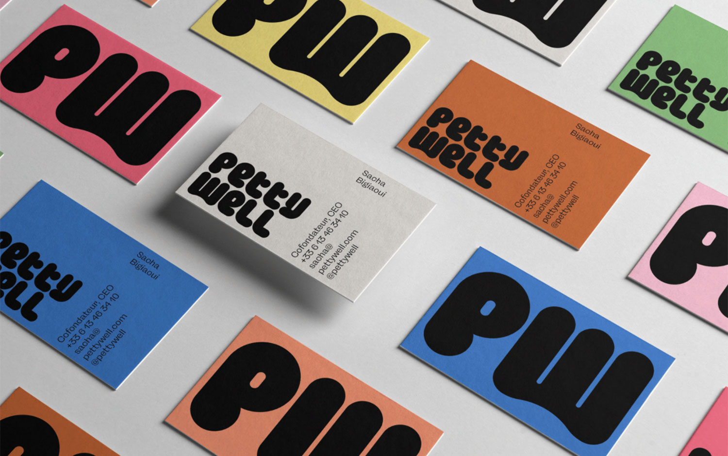
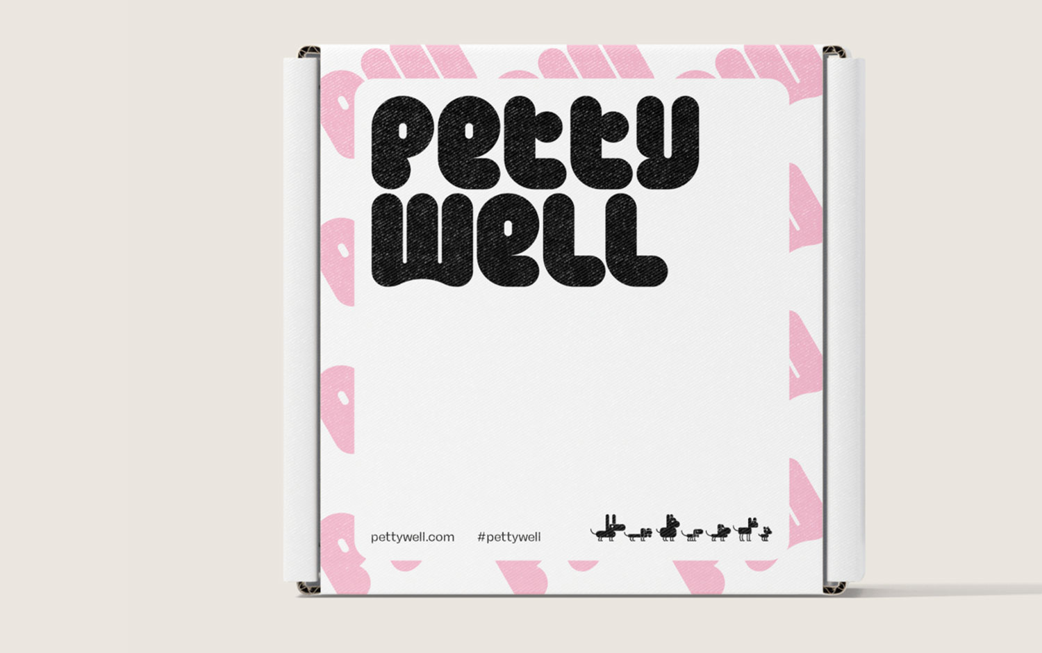
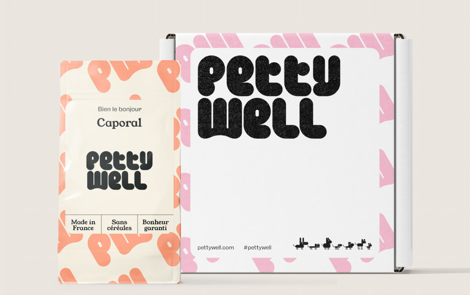
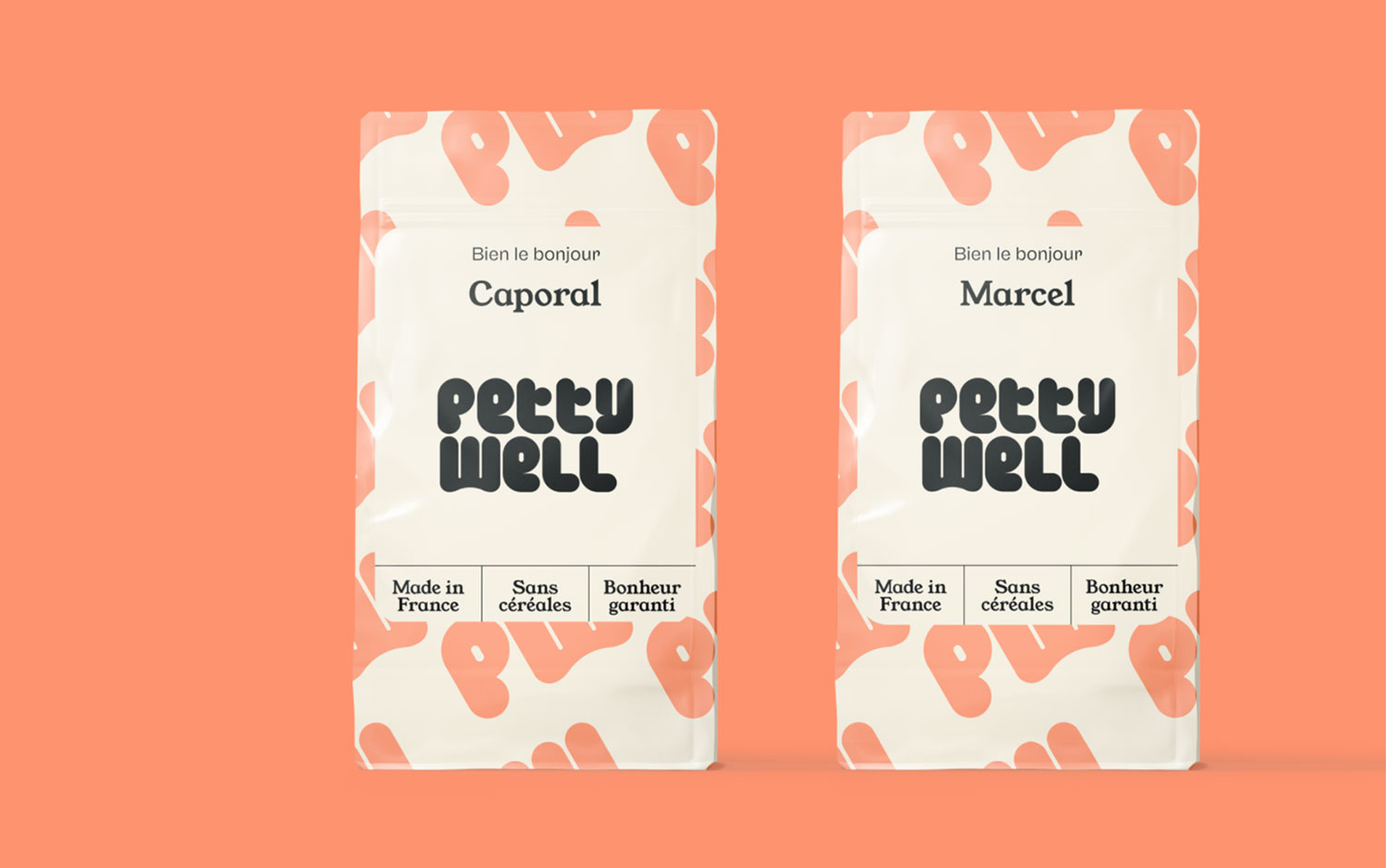
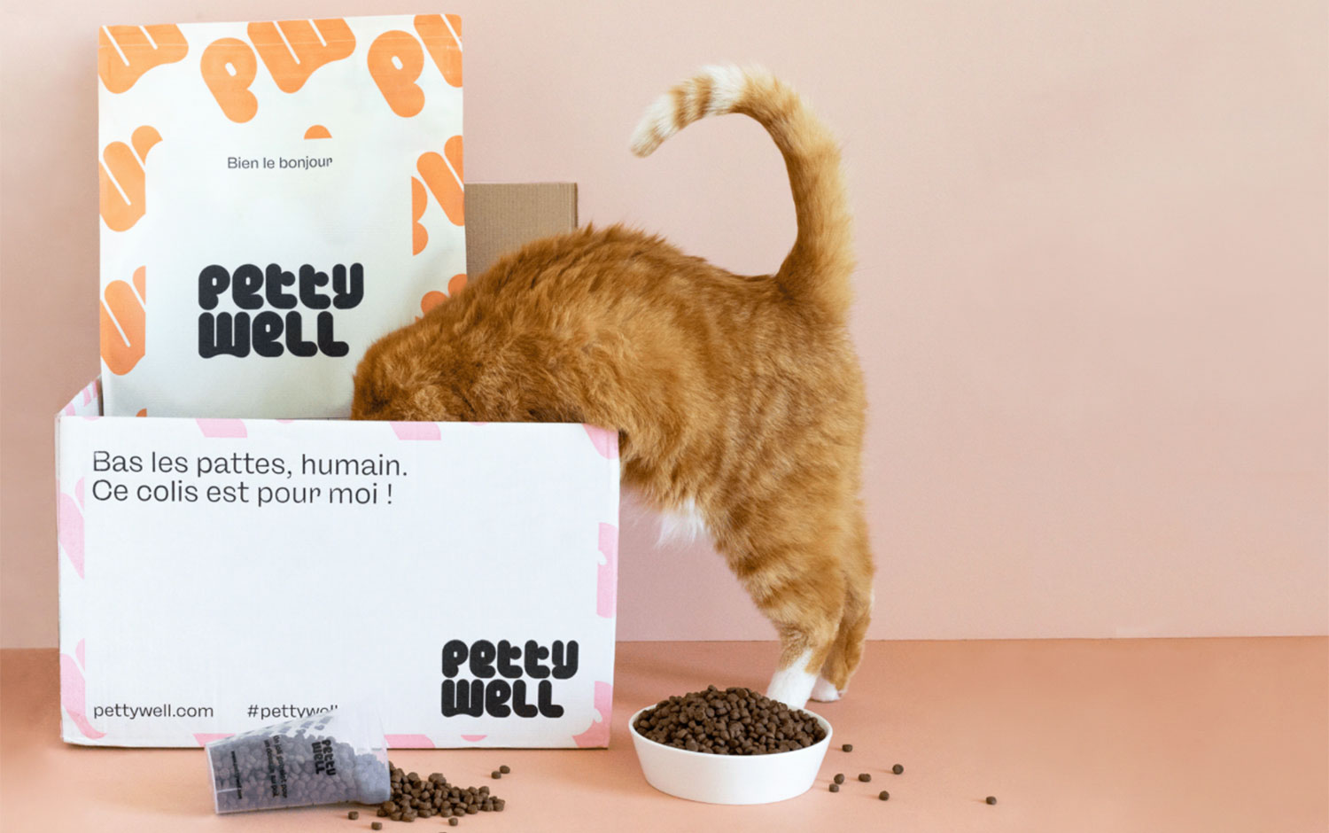
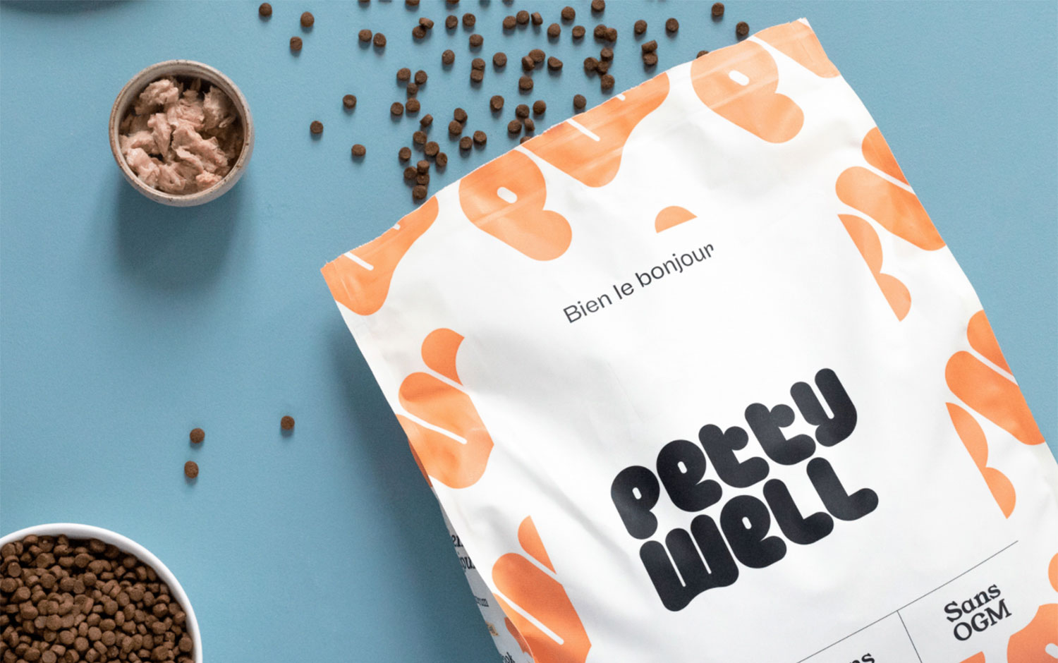
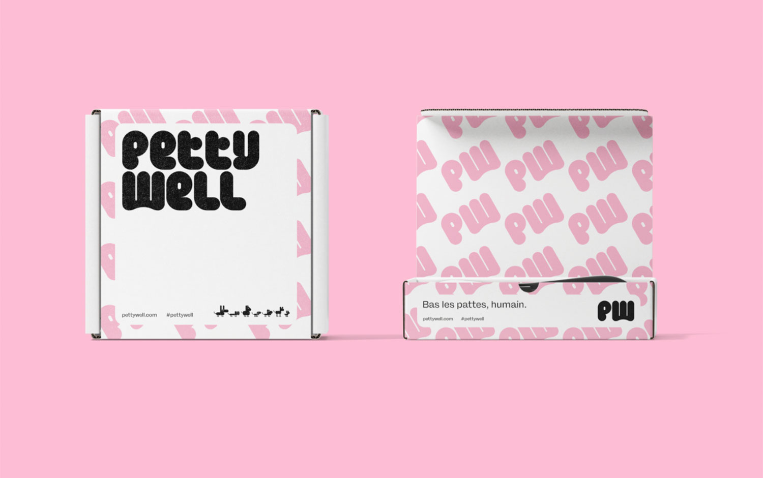
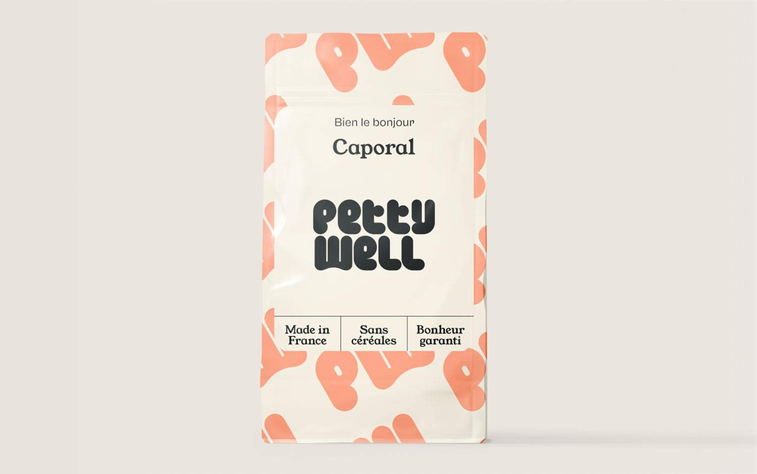
Today, we are showcasing a design post dedicated to our small, or not so little, be loving ones: our pets. They are always by our side and make our days happier. Petty Well is one of the major French brands of healthy food for dogs and cats. After a few years of launch and a real success, a community of more than 4000 customers has formed around Petty Well, and they chose Brand Brothers to redefine its visual identity.
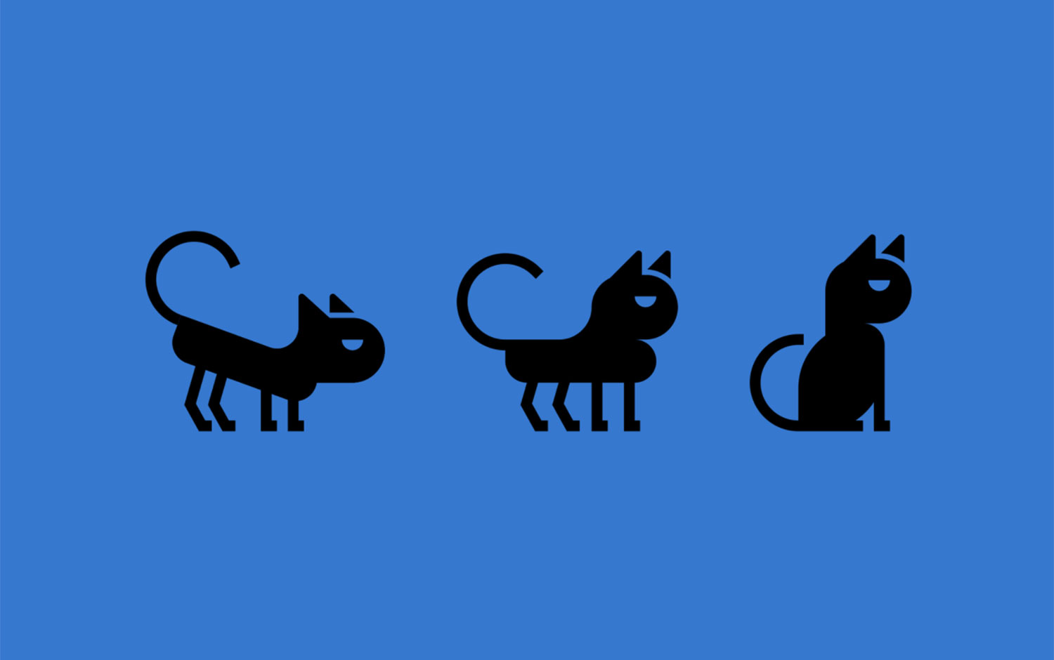
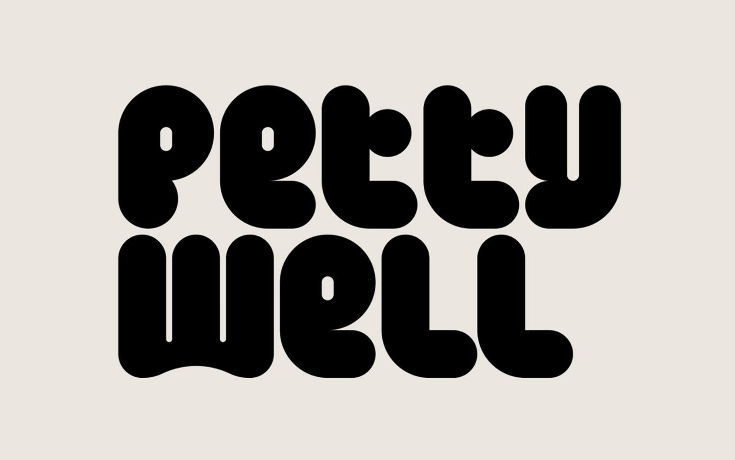
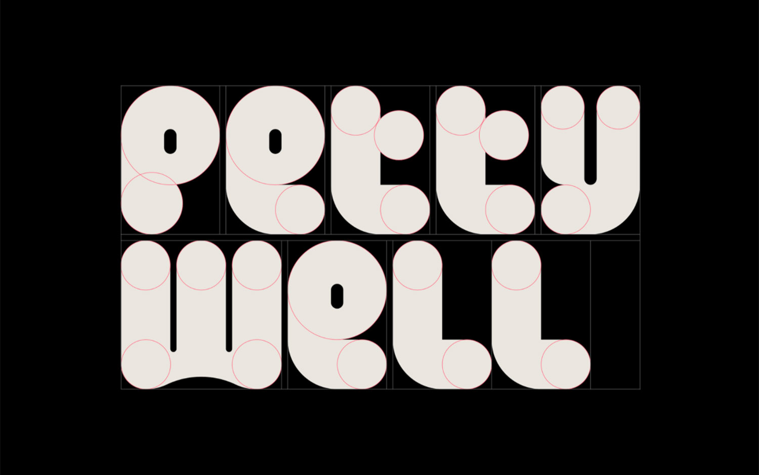
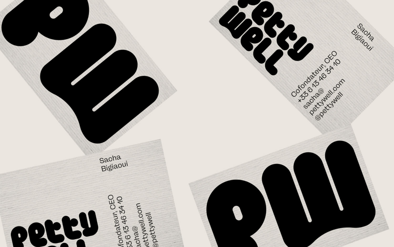
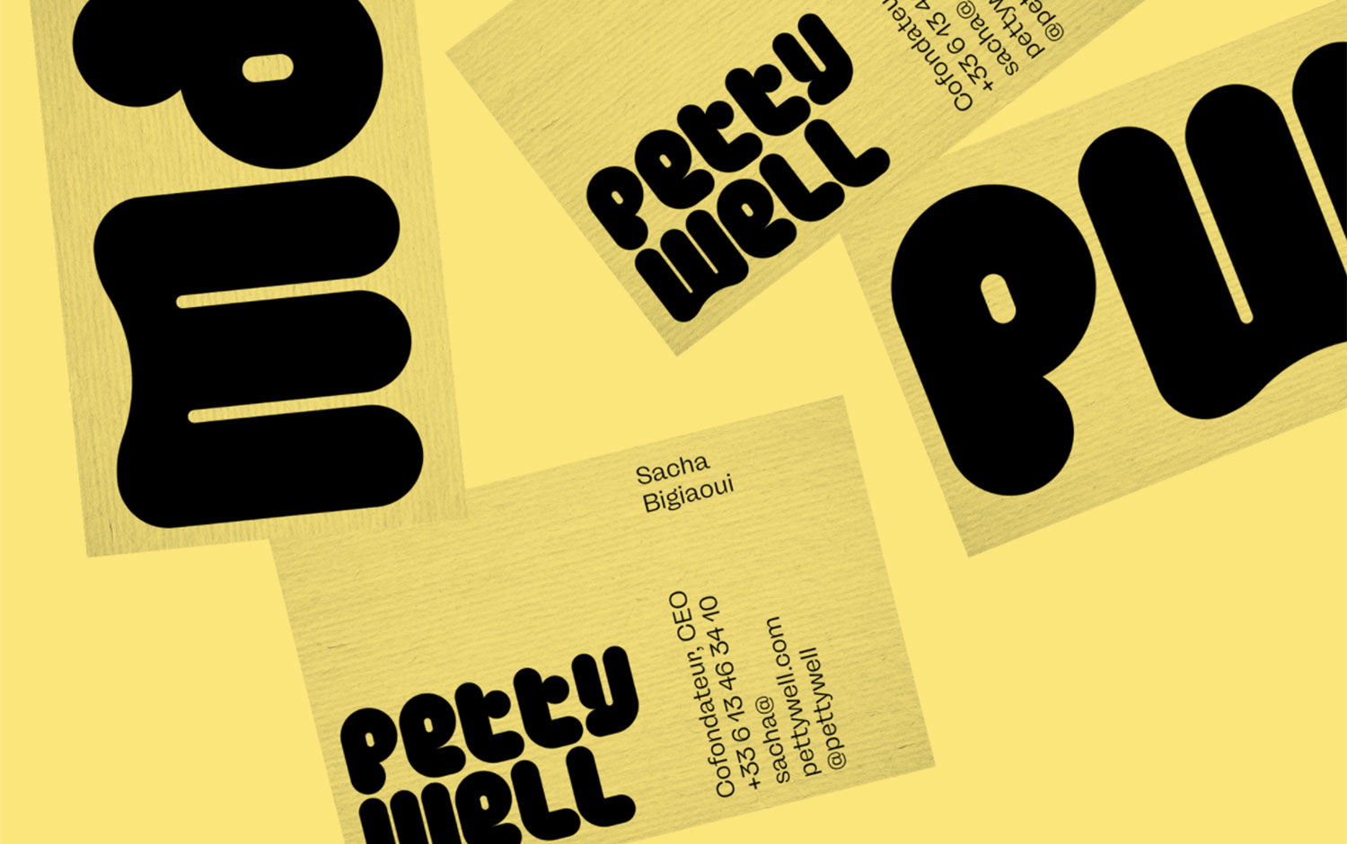
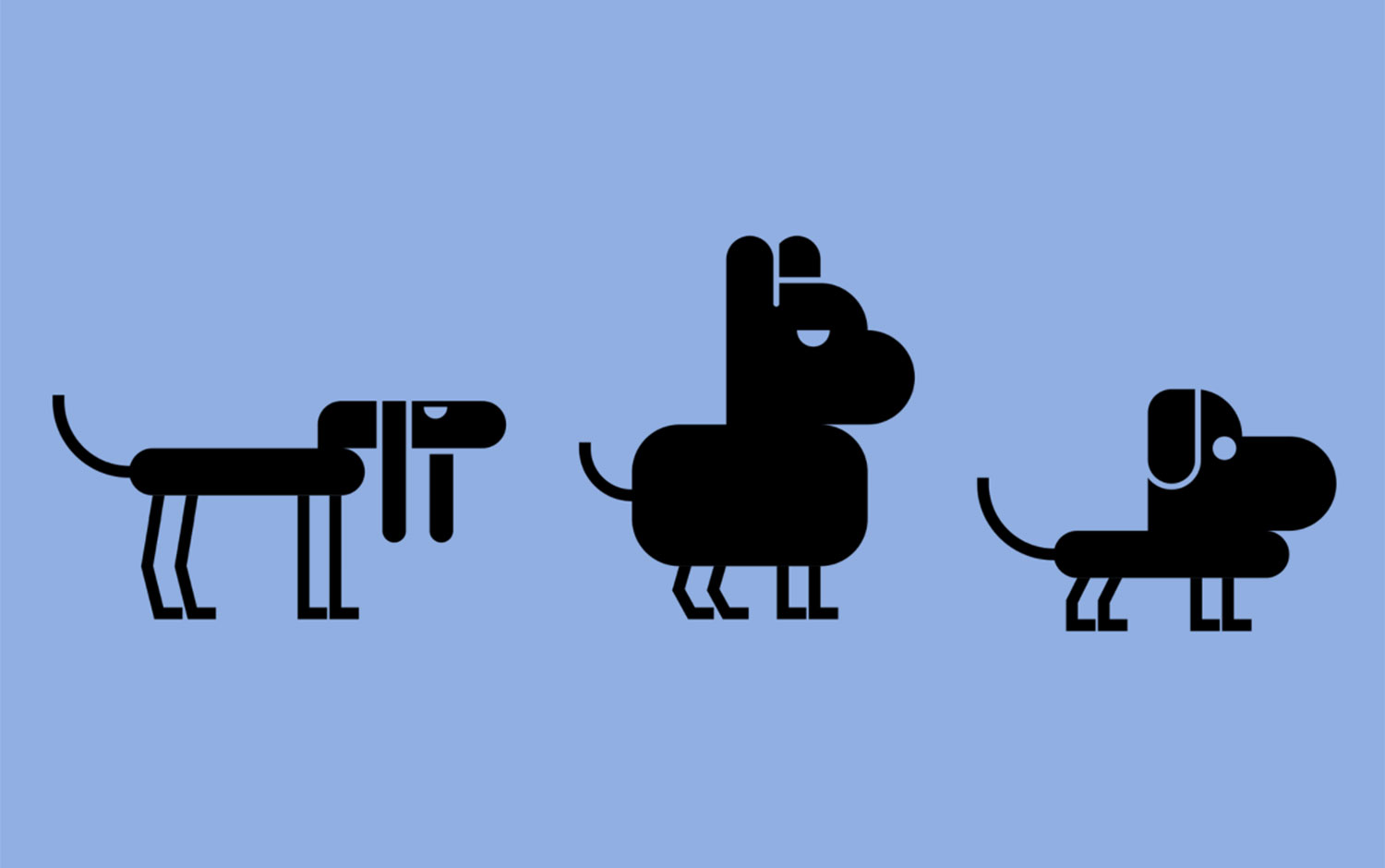
Sacha and Alexis are the brand's creators, offering natural kibbles and treats locally produced in France. Their products adapt to each animal in the form of a subscription. So Brand Brothers developed a collection of animals based on the logotype, which lives and comes to life on the different materials of the brand; print, packaging, and web. The new logo is an original typographic design, chubby and tasty but with a strong structure. It represents the backbone of the graphic environment; it is bright and colorful, maintaining a constant presence of black and monochromatic backgrounds. Also, the brand's initials come together to create the packaging's background pattern. The new identity's launch took place in the spring of 2021 and will include several successive stages until the full rollout is complete. All in all, this project has a super friendly approach and evokes pets' lively spirit. Petty Well's live-hearted style makes us want more of these beautiful packagings inside our cabinets and to lionize our furry friends with the best treats in quality.
Brothers is a design studio that practices graphic and typographic experimentation in the service of visual identity and branding problematics. They think of their projects as functional systems that combine high standards and straightforwardness of content and form.
Credits: Brand Brothers


