Plus
Plus

 Menu
Menu


Y7K
September 05, 2016
Mindsparkle Mag


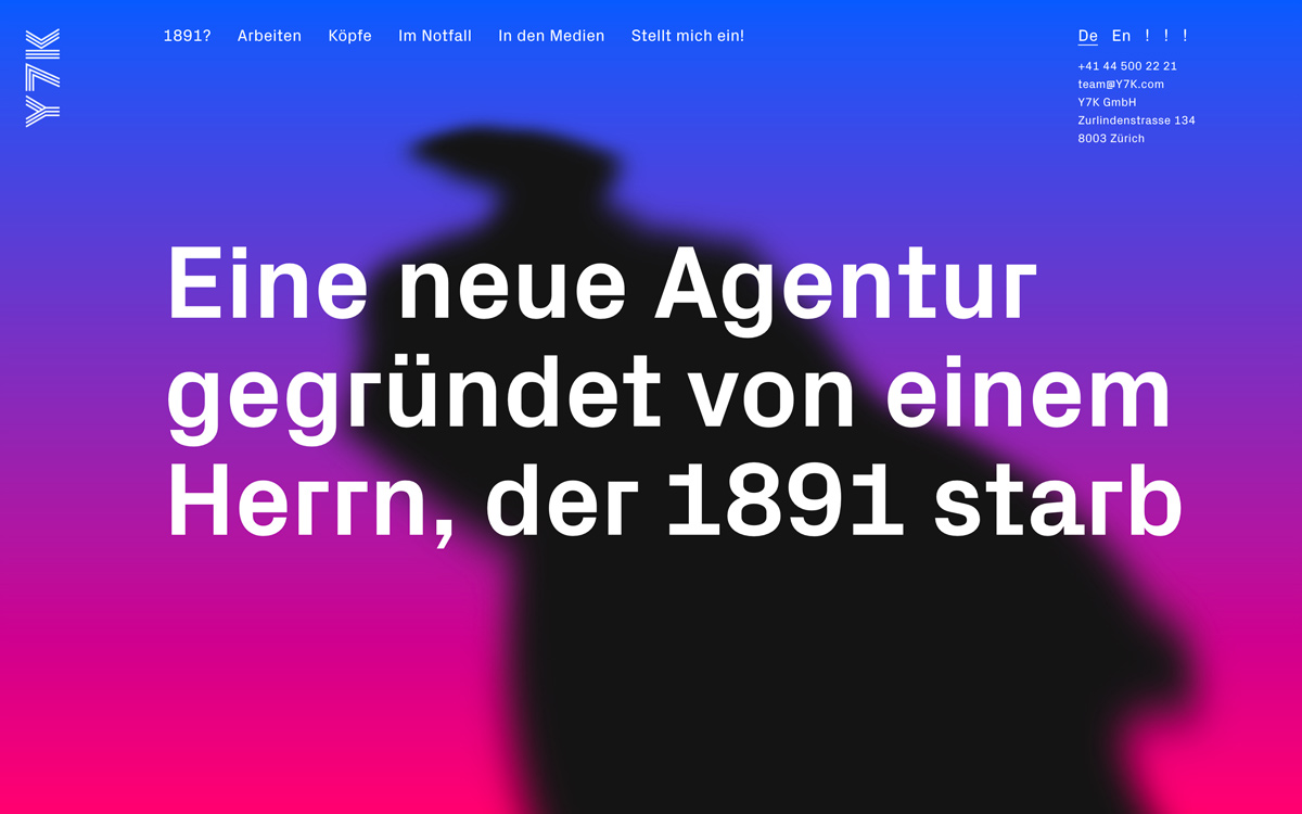
Y7K introduces the Zürich agency’s own site with irreverent confidence and a striking visual voice. A vivid gradient sweeps from electric blue into hot magenta, behind which a blurred silhouette lurks like a ghost from the studio’s tongue-in-cheek origin story. Set over it, an oversized bold headline in crisp white delivers the punchline with typographic swagger. The pared-back navigation and minimal contact block let the colour and type carry the whole experience. It is a bold, playful exercise in typography and self-assured web design.
Credits: Y7K
More in Playful Branding
Includes freebie bundle, unseen BTS insights and more.