Plus
Plus

 Menu
Menu


Toormix
May 31, 2022
Mindsparkle Mag


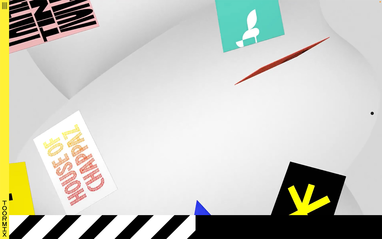
Toormix turns its own portfolio into a playful, gravity-free gallery that captures the Barcelona studio’s love of bold graphics. Fragments of their work — a hot-pink card stamped with heavy black type, a teal tile carrying a sprout mark, a poster of stacked orange lettering — drift through a soft, undulating 3D space. A sunny yellow spine runs down the left edge with the “Toormix” name set vertically, while a black-and-white diagonal barricade stripe grounds the composition at the bottom. The mix of clashing colour, expressive lettering and floating dimensionality feels energetic and unmistakably brand-led. It is a confident, experimental piece of web design that lets the studio’s branding speak for itself at toormix.com.
Includes freebie bundle, unseen BTS insights and more.