Plus
Plus

 Menu
Menu


Sunny at Sea
April 19, 2019
Mindsparkle Mag


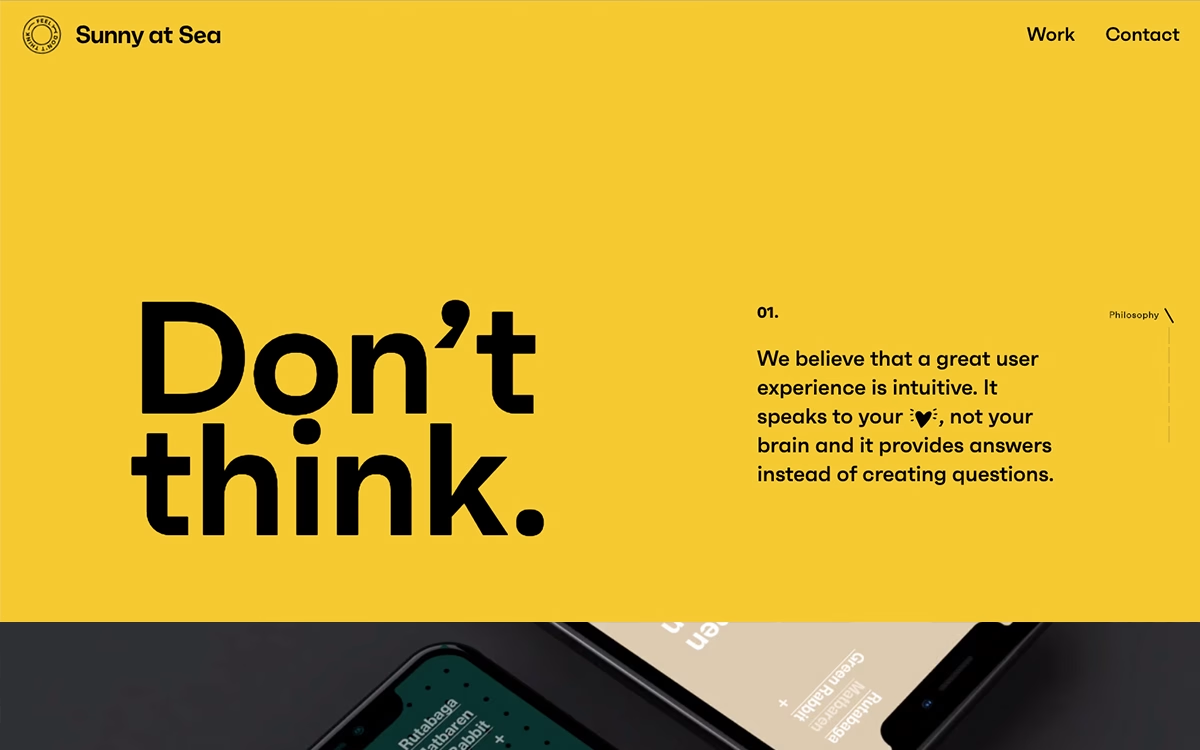
Sunny at Sea brings real swagger to their studio site, opening on a saturated yellow field split by an oversized, ultra-bold "Don't think." set in heavy black type. A numbered philosophy note on the right argues that great user experience should feel intuitive, speaking to the heart rather than the brain, while dark phone mockups peek in from below to hint at the work. The confident colour block, brave scale and tight grid make the whole thing feel energetic and self-assured. It is playful without ever losing its craft. A punchy piece of web design that leans hard on typography.
Credits: Sunny at Sea
More in Design Agency
Stay on top of this week's design. Insights, top picks & more.