Plus
Plus

 Menu
Menu


andstudio + tadas.dev
April 27, 2020
Mindsparkle Mag


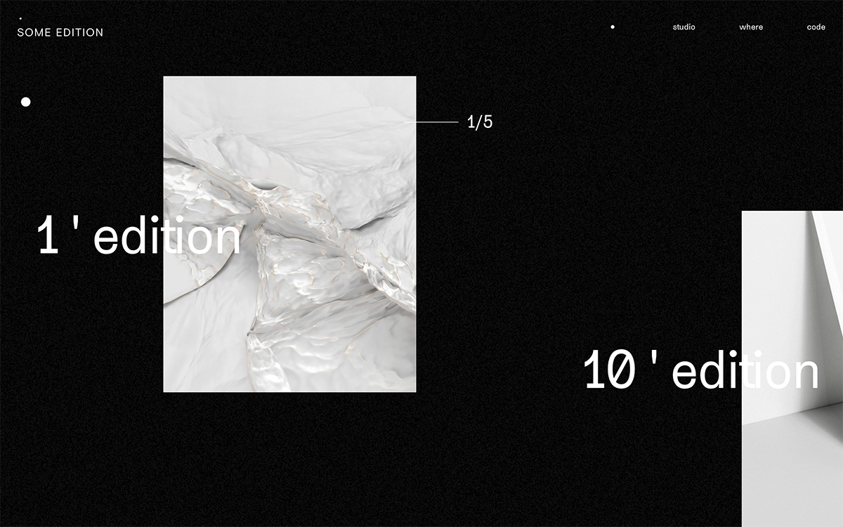
andstudio + tadas.dev designed Some edition with a gallery-like sense of calm. The site sits on a deep, grainy black background, with a small, widely spaced SOME EDITION wordmark and lowercase navigation – studio, where, code – floating at the top. Large images of sculptural, crumpled white forms are placed off-grid and paired with oversized numerals like “1 ' edition” and “10 ' edition” that overlap the pictures, while a delicate “1/5” counter marks the sequence. Monochrome, tactile and quietly confident, it lets each piece breathe like a print on a wall. A refined study in editorial layout and typography.
Credits: andstudio + tadas.dev
More in Design Agency
Stay on top of this week's design. Insights, top picks & more.