Plus
Plus

 Menu
Menu


Extraheer
April 21, 2020
Mindsparkle Mag


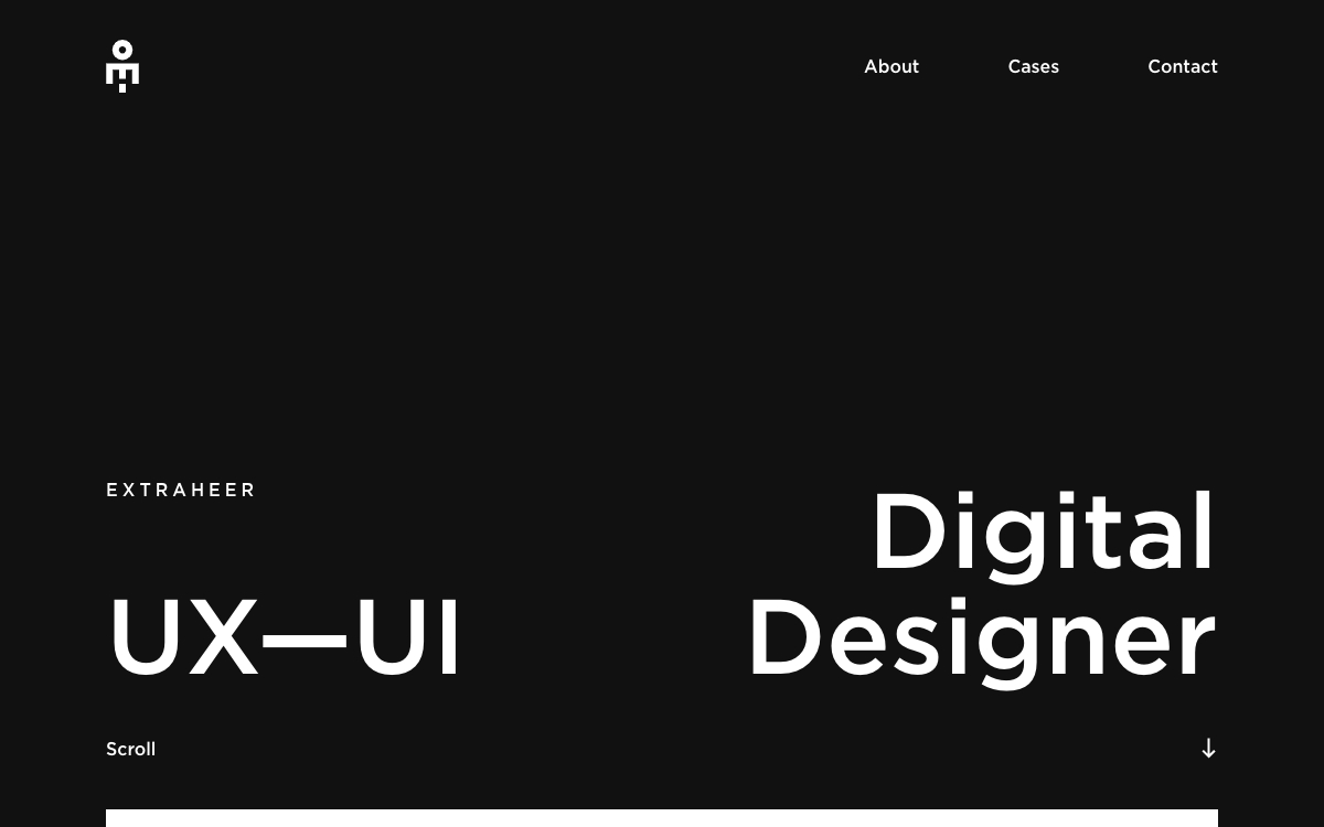
Extraheer keeps this portfolio stark and confident. The site opens on a near-black canvas with a small, pixel-like white logo mark and simple navigation for About, Cases and Contact. Towards the bottom of the screen, oversized white type splits the introduction in two – “UX—UI” on the left and “Digital Designer” on the right – with the name EXTRAHEER set in widely spaced capitals above. A discreet “Scroll” cue and arrow invite visitors to discover the work below. Minimal and bold, it is a clean example of a UI/UX portfolio built on strong typography.
Credits: Extraheer
More in Design Agency
Stay on top of this week's design. Insights, top picks & more.