Plus
Plus

 Menu
Menu


Lee Roy
February 11, 2019
Mindsparkle Mag


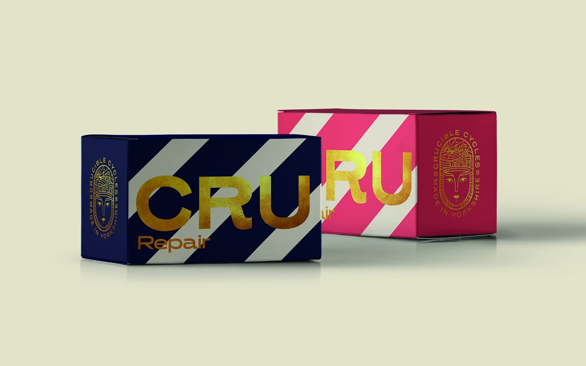
This showcase for Lee Roy leads with one of the studio’s boldest projects: packaging for CRU Repair by Crucible Cycles, presented on studioleeroy.com. Two cartons sit against a soft putty backdrop — one deep navy, one hot magenta — each wrapped in confident diagonal stripes and oversized gold-foil lettering that catches the light. A finely illustrated crest, a serene face framed by the words ‘Crucible Cycles, Made in Yorkshire’, adds a touch of heraldic craft to the muscular type. The colour play of navy, pink and gold feels premium and playful at once, exactly the kind of tactile detail a studio portfolio should lead with. It is a striking lesson in packaging and branding that rewards a closer look.
Credits: Lee Roy
More in Minimal Branding
Includes freebie bundle, unseen BTS insights and more.