Plus

 Menu


Noeeko
August 15, 2016
Mindsparkle Mag


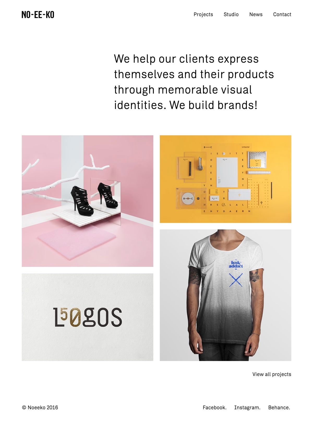
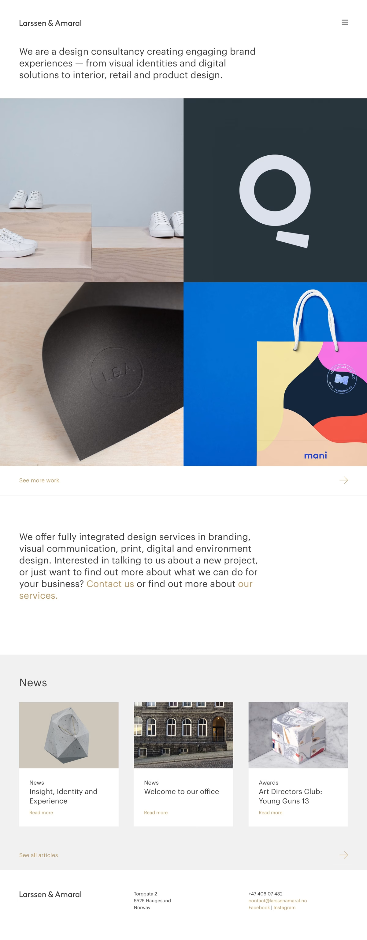
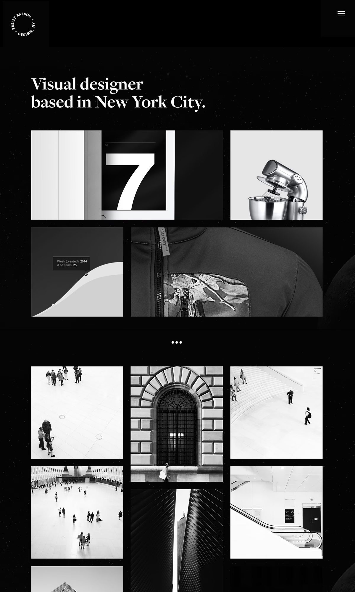
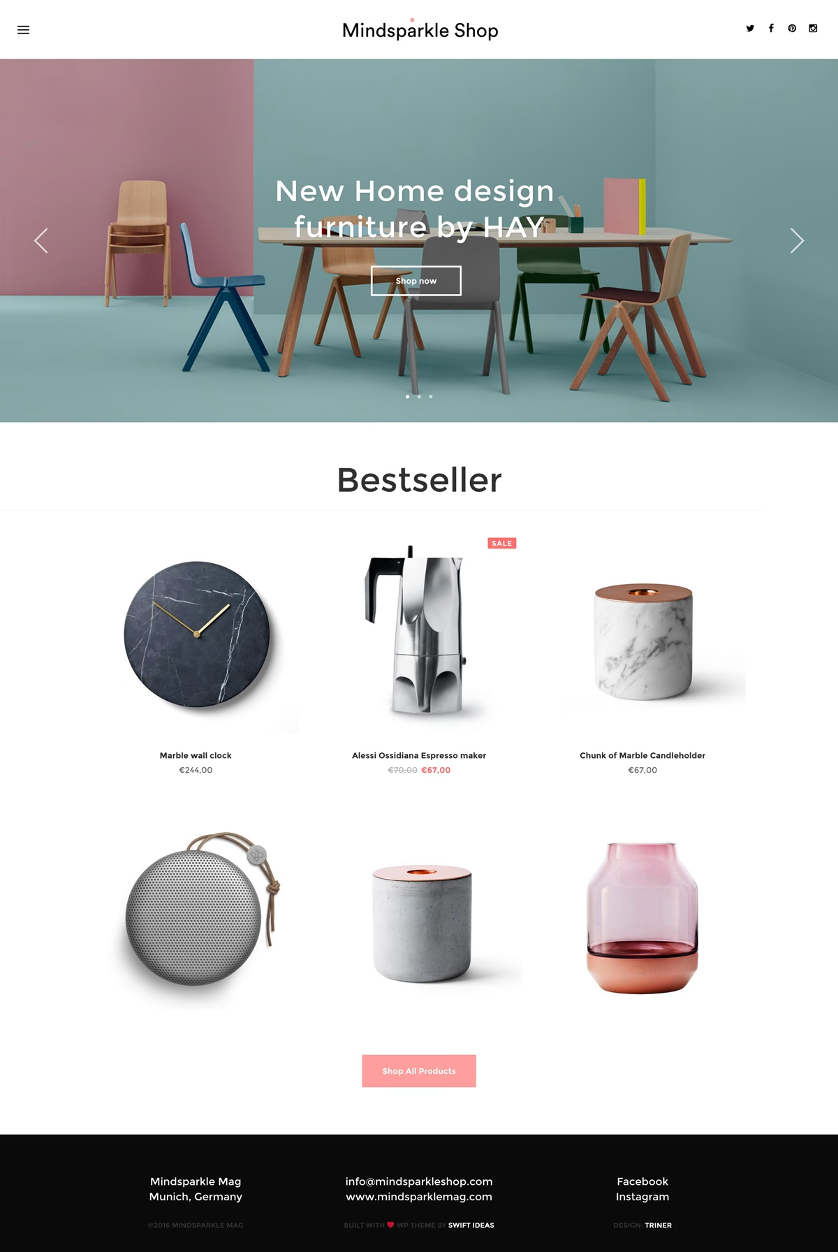
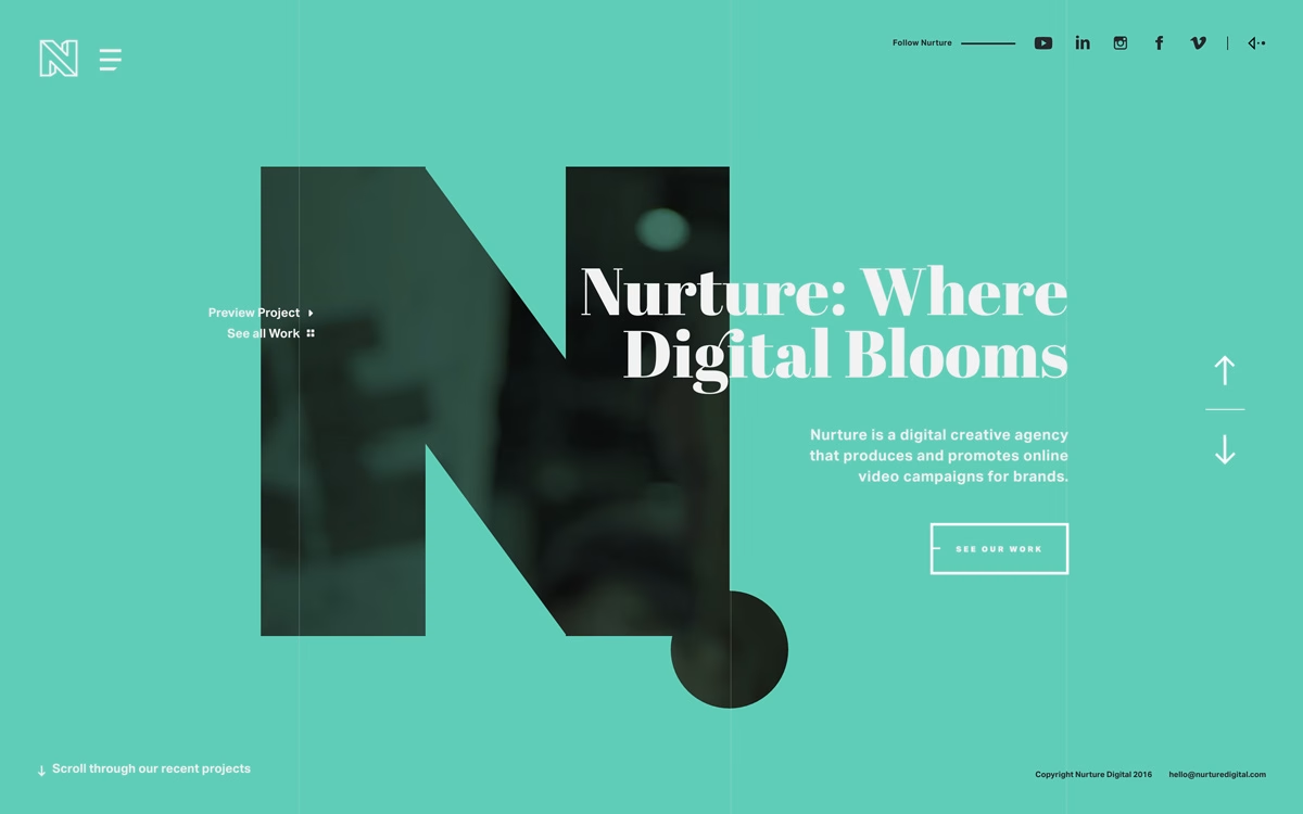
Noeeko put together this crisp, confident portfolio for their own studio, and it doubles as a manifesto: “We help our clients express themselves and their products through memorable visual identities. We build brands!” The layout is all clean white space and a tidy modular grid, letting a run of vivid project thumbnails — a pink still life with strappy heels, a sunny yellow stationery flatlay, a gradient tee and a playful ‘L50gOS’ mark — carry the colour. Restrained typography and generous margins keep everything calm and gallery-like, so each piece of work gets room to breathe. It is a lovely example of how a considered branding studio presents its own visual identity. See more at Noeeko.
Stay on top of this week's design. Insights, top picks & more.